Tuesday 11 December 2012

Distractions...


  I’m afraid my straight up prints have been suffering lately due to my being obsessed with lith printing.  I literally can’t stop doing it.  I shot a wedding a few weeks ago as a backup for my wife and the negatives haven’t even been scanned yet, i’ve been too occupied lithing!

  I did a 16” x 16” lith a few months ago and it is taking forever to scan.  Because it’s so big i have to split it into 6 separate scans and then try and stitch them together in photoshop but it isn’t quite working...yet.  I hope to have it uploaded soon anyway.  I do, however, have two prints which i can show you now:


  This first one was taken using a Lomography Diana F+ and lith printed onto Orwo BN118 paper which i won on EBay for a steal.  I love the brownish tones you get with this paper and im looking forward to trying out some more contrasty negatives soon.

   This second one was taken in an abandoned power station not far from my house using an old Lubitel 166B.  It was my first camera with variable aperture/shutter speed which was a little confusing at the time but operating it is second nature now.  Normally this paper gives me a rich golden yellow tone in the mids but this time i got a pale pinkish brown which was a nice change and (i think) compliments the image well.

  Anyway i just thought id share my latest prints with you all – my next post will (hopefully) have some of these wedding photos on once i pull my finger out and get cracking on them!

  Oh by the way – remember i bought an Epson 4490 to replace my V500 which broke?  Turns out the 4490 power supply will run the V500 which is a major bonus in my opinion!

How To: Save Money on Chemical Storage bottles

  If you're anything like me you'll have more chemicals in your darkroom than storage bottles.  I am always loth to buy photo-chem bottles as (although they are only a few pounds each) buying ten at a time soon adds up and to be honest i'd rather spend that money on film, paper and chemicals.  That being said i also don't like using empty water bottles because they feel too thin and flimsy.  I recently found a simple solution and that is home brewing shops.  Pretty obvious when you think about it - if you make your own beer at home you need something to put it in!  Anyway, i found these bottles in a store pretty close to where i live.  Theyre 1 ltr, plastic and chemical resistant - exactly what i need.  They also do amber glass bottles but only in 500ml unfortunately.  Still, can't complain at 60p a bottle!  They will post within the UK; if you're outside the UK i'm sure you'll be able to find somewhere near you where you can source home brewing supplies.

  Just thought i'd share a quick find with you anyway.


Monday 10 December 2012

Your New Favourite Person... Ellen Rogers


  Do you know who Ellen Rogers is?  If not then prepare to be amazed!  I have been a fan of her work ever since i started getting into photography some two years or so ago.  You know how it is when you first get into something – you’re super-keen and you hit the internet hard soaking up everything about your chosen subject that you can fit into your head.  I came across an article Ellen had written about some of her work (i believe it was on the Lomo website) and the pictures i saw stopped me in my tracks.  I had never seen anything like it, and to be honest i still haven’t even now.  After a bit of research i discovered all her images were analogue and she did all her own darkroom work to get each image how it is.  I just love the look of her photos; how every image is similar yet different.  Im going to stop there or ill just keep going on and on and ill start sounding like a psycho stalker - let's let her photos speak for themselves:


  And that's just a tiny glimpse into her work.  Recently i got talking to Ellen on Twitter and managed to persuade her to let me have a little email interview with her (which i really appreciate as from the sound of it she is one busy body)!  Anyway, here we go...

To start with tell us all a little bit about yourself – who you are and what you do.
Hi there! I am Ellen Rogers, I am a photographer. I only shoot with analogue equipment and all my photography is hand worked, be it colour or the print itself.

How long have you been taking photographs?
For a very long time as my father is a photographer but really I have been shooting with my own eyes ever since I was around 14.

I know it’s always a bit of a silly question to some but how would you describe your photographic style to those who haven’t yet seen your work?
I would urge the viewer to have a look, I relinquish the responsibility to either answer that question or interpret it for you. 

All of your work is produced in the darkroom – what is it that draws you to working with film, paper and chemicals as opposed to computers?
I just like making a mess really, getting my hands dirty and all that. I suppose I can feel more attached to the work also. There are a myriad of reasons why I prefer it but the main one is it suits me and I’m rubbish with computers anyway.

Do you do all your processing yourself or do you have darkroom minions?
All of it that is done by myself, no one is allowed to bother me in the darkroom hehe.
  
      Every photographer has at least one shot they have taken that really speaks to them on a personal level.  Which of your photographs has a special meaning to you and why?
It is the pessimist in me that tells you this (as her voice is strongest) that I don’t have a favourite. I am a constant disappointment to myself, I must try harder. Some have a certain sentimental value to me such as one image of my late mother’s funeral flowers but on a technical level I never feel content. I think this comes from having a father who is a much better technical photographer than I am ever likely to be.

From looking through your gallery it seems that a lot of your photographs have a contrast of gritty textures and soft pastel colours – is this something you intentionally set out to accomplish with each photo or is it just a by-product of your processing that you have adopted into your style?
Yeah my style was and continues to be quite an organic evolution, a gradual shift in technique - and it is just that, a style, not something I am heavily invested in. I hope it constantly evolves and I hope to improve.  But to answer your question no it’s not intentional it’s just instinctive. However you could argue that I am intentionally letting my instincts take over... 

How much thought/research do you put into an idea/shoot before loading your camera?
Ah well that depends on the shoot. If it’s fashion... very little, if it’s something a little more substantial, quite a bit more. I shot a story on the 1888 match girls in London. That took considerable research. 

Without giving away your processing secrets (unless you really want to), can you give us a general outline of how you go from original concept to final print?

Well, the way any photographer works isn’t much of a secret. It’s an idea first then I try and fumble around until it’s executed. Literally in my case, it was Iris Murdoch that said ‘“Every book is the wreck of a perfect idea.” That’s how I feel about my photography; it is a literal manifestation of my own failure.

Gear-wise do you have a favourite camera, film or paper that you tend to be drawn to or do you just use what is to hand at the time?
Yeah I have a few kits but they are ‘hand me downs’, they are also a secret.

What, for you, has been the biggest challenge you have had to face while continuing to use film and darkroom products in an age of digital growth?
Commercial work! ‘Commercial work’ for clients who want things changed or want things exceedingly fast. This poses a problem on a not so regular basis but enough to be a problem. It takes time to do what I do and it’s pretty much unchangeable once it’s done. I’m not going to out the companies that pose these problems though...

You do a fair bit of commission work – what has been your favourite commission to work on and which has been the most challenging.
Piers Atkinson’s look book was great as I loved the team. I just completed a book for a hair stylist too with almost the same team and that was somewhat challenging as I had to make an entire book from 12 hours of solid shooting. It was a great deal of fun but a few people fell asleep on set. I had to make lots of images that looked connected but different enough to keep the viewer interested for a whole book.  I guess you will see if I failed or succeeded, it comes out in February next year.

      Which photographers do you think have influenced your style and which photographers do you admire?
Photographers I admire the most are war correspondents, most notably Don Mccullin but no I don’t think he has influenced my style. 

You made a book called Aberrant Necropolis.  Why did you decide to make it and what was the process like?
I decided to make it because people asked me for it. That is really the only reason. The process was pretty straight forward really; it’s just a selection of images from my first 2 years of fashion photography 2008-2010.

      The world is saturated with photos due to the availability of cameras, apps like instagram and social networking sites.  What advice can you give to those who are trying to carve out a unique style in a world where everything seems to have been done already?
I would say don’t blindly copy your idols; you will only live in their shadows.
  
Any last words?
Thank you very much David! 

  So hopefully that's been informative for some of you fans out there and if you weren't aware of Ellen Rogers before hopefully you've enjoyed learning a little about her and gained some inspiration.  

  All that's left to say is thank you very much for taking part Ellen and her are some links where you can see her work and buy her book:

Flickr Stream
Bloggable Stream
Website
Store

Monday 26 November 2012

How To: Make A Lith Print

  Now that i have finally got a working scanner back in my possession i'm able to write some articles and get some images uploaded.  I have been doing a lot of lith printing lately so i thought id write a tutorial about the equipment you'll need and how to go about the basics.  Be warned - this is a long article and can get a bit detailed.  If you are unfamiliar with darkroom techniques i suggest you first get used to standard black and white printing (which ill get round to writing a "how to" about soon i hope).

  For those of you who don't know what a lith print is allow me to explain.  Its basically a print made on black and white paper which results in very high contrast prints with blocked up shadows, delicate highlights and colourful mid-tones.  Lith prints tend to have a very gritty/grainy look in the lower mid-tones/shadows.  For examples of lith prints follow this link and see the examples below of some of my attempts:


  As you can see lith prints can breathe a whole new life into an image.  I have a few shots i've taken that when printed look quite dull and boring but that i really love when lithed.  What you may find surprising is that many of the prints you have just looked at (certainly none of mine shown above) will not have been toned.  Colour is a natural by-product of the lith process.  Different papers combined with different ratios of developer at different temperatures yield different colours.  There is an almost endless combination of variables in the lith process that can produce different colours and textures.  This can be extended even further by toning the prints but im not going to go into that too much in this article - we've got enough to talk about already!

  When i first started looking into making lith prints i did a lot (and by a lot i mean a looooooooot) of research online.  As the weeks went by i noticed the two same names cropping up over and over again - Wolfgang Moersch and Tim Rudman.  Both of these gentlemen are pioneers of lith printing - trying out every kind of paper and developer at every temperature and dilution; seeing how each print reacts to different toners and even hand colouring the prints.  Tim Rudman has a booked called 'The Master Photographer's Lith Printing Course' which is THE tome to read.  If you are serious about getting into lith printing then this is the book to buy.  The website of Wolfgang Moersch has some extensive articles about various lith procedures and even an area where you can purchase his own brews of lith chemicals and toners.  You can get to Tim Rudman's site here and Wolfgang Moersch's here.

  The following is just some the basics of lith printing, i'm sure ill write further articles about it in the future.

  So, lets begin by talking about what gear you'll need.

Equipment

  Equipment-wise the only thing you will need other than your regular darkroom materials is lith developer and lithable paper.  There are a variety of developers available; as already mentioned, Wolfgang moersch makes and sells his own, but Rollei and Fotospeed also make them.  Personally i use Fotospeed LD-20 many people have mentioned that they dont see much of a difference between that and the Rollei lith so it's really up to you which you buy..

  Papers are a bit trickier.  Some papers with lith nicely, others wont lith at all.  The main lithable papers which are still currently produced are those made by Foma.  Many regard Fomatone (particularly 131) as the best as it can yield a wide variety of colours based upon developer dilution/temperature/age etc.  Fomabrom is also good but seems to give a "grittier" feel to the print which i'm quite fond of.  The Adox MMC papers also lith, as does Ilford Art 300.  I source the majority of my papers on ebay as you can still get hold of out of production papers that lith nicely.  Recently i won some Agfa MCC 118 16 x 20 which liths beautifully and also some Fomaspeed N 313 which is also quite nice.  A friend also gave me some old Sterling paper which has nice qualities when lithed.  Basically if you see a paper you have to hit the internet and see what people say about lithing it.  Once thing i can say is that Ilford papers do not lith very well.  That MGIV RC VC  you have sat on your shelf isnt going to work im afraid.  The only Ilford papers which lith are Art 300 and (if the developer is heated to around 45oC) FB Warmtone, but i haven't tried either of these so i cant comment.

Process

  First off i should mention the "Two Golden Rules" of lith printing as devised by Tim Rudman.  They are as follows:

1. Highlights are controlled by exposure, shadows are controlled by development.

2. Colour, texture and contrast are related to grain size in the emulsion - which is related to development.

  That may not make much sense now but i will explain in due course - just keep those statements in the back of your mind.

  So, you've got your developer and your paper.  The first thing you need to do is mix your developer.  Everyone has a different ratio they like to mix at which they've decided on after months and years of experimenting.  Your best bet is to start at 1:9.  Your developer will come in two parts, A and B - so mix 1:9 A and 1:9 B with water (ie if you want to mix 2ltr mix 100ml A with 900ml water and 100ml B with 900ml water).  You can vary the ratio to make the solution stronger or weaker to fit your needs (this will also have somewhat of an effect on print colour).  Once you've got it all mixed up into a working solution pour it into your tray.  Just keep this process at 20oC for now until you get more experience; higher temperatures speed up the developing process but that's not too important right now.

  If you have looked into doing lith printing before reading this article you may have heard of something called "old brown".  Old brown is basically old, used, expired developer that you add to your freshly mixed developer.  Let me explain - your developer will have a very small window wherein you will get optimum prints both in colour, contrast and detail.  It may take some time for your developer to reach this stage and you may only get three or four prints before this window passes by.  By mixing old developer with your fresh batch this window will arrive much quicker than if you were just printing normally.  One of the advantages of Fotospeed's LD20 developer is that once reached, this window can last for quite some time.  Anyway, you would normally add some of this old brown to your developer (i usually add 100ml to about 2 litres of working solution but you can add any amount you like - it's good to experiment) but seeing as this is your first mixture of development you wont have any.  The best thing to do is find some old fogged paper, expose it to room light for a few seconds and then leave it in the developer to go black.  This will get your developer working and get it ready to receive that lith paper.

  At this point i better tell you something about the development of lith prints.  Its isn't like standard printing in that your image appears evenly and you pull it after a minute or so.  When developing lith prints something called "infectious development" occurs.  What you will see is that the blackest points of your print will slowly start to appear.  These will gradually get darker and darker; as they do the midtones will start to appear and get darker, followed finally by the highlights.  Once the shadows hit black development increases rapidly.  Very quickly the black in the shadows spreads whilst the midtones and highlights still develop at the same rate.  At some point your shadows will reach the maximum black you want them to be and you will need to snatch the print from the developer and very quickly put it into the stop bath.  There is no set amount of time for this - it depends on your developer strength, amount of old brown used, developer exhaustion and the paper.  For example, my Fomaspeed N 313 takes bout 8 minutes of developing before i get the print i want whereas my Agfa MCC 118 takes over an hour!

  Golden rule number one now comes into play.  Highlights are controlled by exposure.  Expose a test strip of your paper and develop it in standard developer (i use Ilford Multigrade).  Pick the exposure that has the highlight detail you want in your print (regardless of dodging and burning - remember you aren't using any filtration so the contrast will be less than you're used to).  Once you have picked the time you think best you are going to need to massively over-expose your print.  The more you over-expose your print the less contrast you will get but the more highlight detail you will have in the end.  An over-exposure of 2 stops is generally speaking the minimum amount you would do.  This would give you massive contrast with very little detail in the highlights.  You can go up to about 5 stops of over-exposure with most lithable papers.  I tend to stick to around 3 to 3.5 stops unless the particular image i want to create requires more.

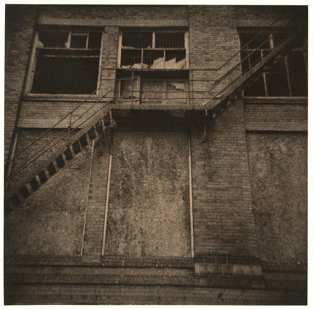
  Let's take a look at a print example to explain.  This is a print i made using Fomaspeed N 313:
  As you can see the shadow on the side of the left arm of the chair is totally blocked up whilst there is very little highlight detail in the snow at the bottom part of the print.  Before the arm of the chair got completely blacked out there was lovely detail - clearly i have kept the print too long in the developer.  In order to get more detail in the highlights and midtones but still retain detail in the arm of the chair i would have to over-expose the paper even further - perhaps even 4 or 5 stops (as opposed to the 2.5 stops used here) and snatch the print sooner.  Ill put that simply - the more you expose, the more highlight and midtone detail you get before your shadows block up.  This leads to an almost endless amount of variations you can get from one single frame on a negative.  Make it grittier with detail everywhere, make it super-high contrast so only the shadows stand out.  Anything goes, it's up to you.

  When over-exposing your paper it is best to extend your exposure time rather than alter the f-stop on your lens as you can maintain image sharpness by using the optimum f-stop.  In the appendices of Tim Rudman's book mentioned earlier there is a chart outlining the over-exposure times for various exposures.  Here's a link to a chart i made based on that (you can also get it in the downloadable resources section of this blog).

  So, over-expose your paper by whatever f-stop you deem fit bearing in mind that the more exposure you give the paper the more highlight and midtone detail you will get.  Try to picture how you want the final print to look in your mind and work towards that.  Once your exposure is complete slip your paper into your developer.  There is no point using a timer as you have to judge development by eye.  Keep rocking your tray intermittently and watching your paper.  At some point you will see an image start to appear - it could be 5 minutes, it could an hour or more.  Your image will continue to build up until suddenly you will see little grains of black appear.  These will spread and spread quicker and quicker until they fill up your shadow areas.  It's ok to bring your safelight down close to the paper to look at it but do this at the very last minutes or you'll fog your paper.  When your print hits the point where your shadows are how you want them to be pull the paper from the developer as quickly as you can and put it into your stop bath.  Stop, fix and rinse as normal then take your print out into the light.

  Hopefully its just how you want it.  There should be nice cool blacks in the shadows, delicate highlights and colourful midtones.  As mentioned earlier different papers go different colours - yellows, golds, browns, purples, blues etc (remember golden rule 2 - colour, texture and contrast are related to development).  If the print isn't how you imagined it then think about what you need to do to change it; perhaps increasing or decreasing exposure to vary detail. Again, Tim Rudman's book is invaluable in that Tim shows how one print looks as exposure time is increased and snatch point (the point at which the print is removed from the developer) is delayed.

  Lith prints react very well to toners.  Selenium toner can vary print colour dramatically from golds through to browns, blues and purples (depending on the paper of course).  It is best to pick a print you aren't happy with, drop it into the toner and leave it there for an hour or so - watching how the print changes colour.  Make a note of these times for future reference.  Beware that some papers show very little change (particularly resin coated paper).  Gold toner turns prints a very soft, delicate blue which can be very appealing.  All the usual split toning rules apply - selenium and gold together are a particulalry nice combination on some prints.  Im not going to go into much detail about toning in this article as it's long enough already.  Look out for an article about it in future, as well as an article on lith bleach and re-developing (where you make a standard print, bleach it and re-develop it in lith).

  If you have managed to make it to this sentence then i salute you!  Hopefully this article has helped you on your way to making your own lith prints.  Looking around on sites like Flickr really does inspire and help you find new things you can try with lith.  I haven't looked back since starting - i absolutely love it and i'm sure you will too.  As always if you have and questions or queries please feel free to comment and ill get back to you.


Friday 23 November 2012

New Scanner/New Feature

  Just a quick one today; my sister is on her way up from London for a visit and conveniently she has picked up a scanner i found for sale on Gumtree for me (nice one sis)!  So hopefully by the end of the week ill be able to upload my latest prints and get some more posts going up on here.

  I also just wanted to direct you to a new feature on the blog - the "downloadable content" page.  Here i will put links to various film photography forms and spreadsheets that i use to keep myself organised and to help me remember things.  Hopefully you will find useful things on there - it will get updated regularly so keep checking in.

  Anyway, if you come back early next week there should be a lot more content uploaded onto here (hopefully) and i can get back on track with the blog!  Thanks for stopping by!

Wednesday 21 November 2012

Darkroom Record Template

  Well i still haven't got my scanner fixed.  I have done loads of prints over the past few weeks and im dying to upload them onto this blog and my flickr page.  My sister is coming up from London way for a visit this weekend and she's bringing with her a scanner i found on Gumtree for a decent price that should keep me going for now; so hopefully this weekend i will get some content uploaded.

  I have been getting very behind in writing up my darkroom records lately.  I normally just roughly jot everything i do down on a pad and then write it up later; but i spent about an hour over the weekend re-writing everything and frankly, it was time i could have used doing other things.  I decided to get myself organised and so in my free time at work i have created this template for you all to download.  Basically, its just a sheet for you to write down all your settings, processes and chemistry etc for each print you do.  Hopefully it will come in handy for some of you.

   I'm afraid i couldn't figure out how to get an image from excel to put into blogger so i have had to take a screenshot of it.  I'm not a member of any file hosting sites so if you want a copy of the spreadsheet just comment at the bottom of this blog with your email address and ill forward it to you.

Update: Ive managed to get it hosted on google docs so just get it from the link here.  Or you can still comment and ill send it you if you'd prefer.


  I should probably explain some of the sections on it.  First, film no and frame are just for how i personally store my negatives.  Each roll is cut up and put into dust sleeves, each sleeve is numbered as is each frame on the roll - so writing it on this sheet helps me sync up the print to the roll.  The process and chemistry section is just in case you are doing something other than standard black and white like lith printing; you'll be able to make a note of the chemicals used and the ratio of fresh developer to old brown etc.

  Anyway, hopefully some of you will find it to be of some use.  Once you have the excel file you can adapt it as you wish to fit your needs.

Friday 26 October 2012

Changes

  As regular readers may have noticed by now i have changed my blog (again).  New logo, new layout and new pages.  I was unhappy with my previous logo and blog layout so i have had an overhaul and i'm really happy with how it looks now.  The main new feature is the pages section at the top of my blog.  This will link you to the about me, contact and (most importantly) the tutorial pages.  The about me page gives you a little background information about me which will hopefully compliment the articles i write.  The contact me page is pretty self explanatory; the tutorials page however is something different.  I have written quite a few tutorials since creating this blog and have every intention of carrying on doing so, so i thought it would be a good idea to collect these all together onto one page so people don't have to trawl through all my previous posts to find a how-to article.  I will keep this page updated as and when i write new how-to's.  That's about it for now - i'm still working on my scanner but rest assured as soon as it is working again ill be back updating (hopefully more often).  Bye for now.

Tuesday 23 October 2012

Oh This Wretched Silence...


  Well there has been a lot going on lately, most notably i have been trying out lith developing. Unfortunately however my scanner has broken down.  I don’t know if its the scanner itself or just the power supply but whatever it is i feel somewhat crippled at the moment as i have now got a big pile of things i need to upload to flickr and this blog.  Hopefully ill get it sorted out soon and get back on track as im dying to upload these lith prints and ive got a pile of colour film to scan.  The curse of technology!