
Making these prints i really got to grips with my new(ish) f-stop timer. I'm pretty sure i used every function on there - dry down compensation, split grade mode, dodging and burning programming
So, to the first print...
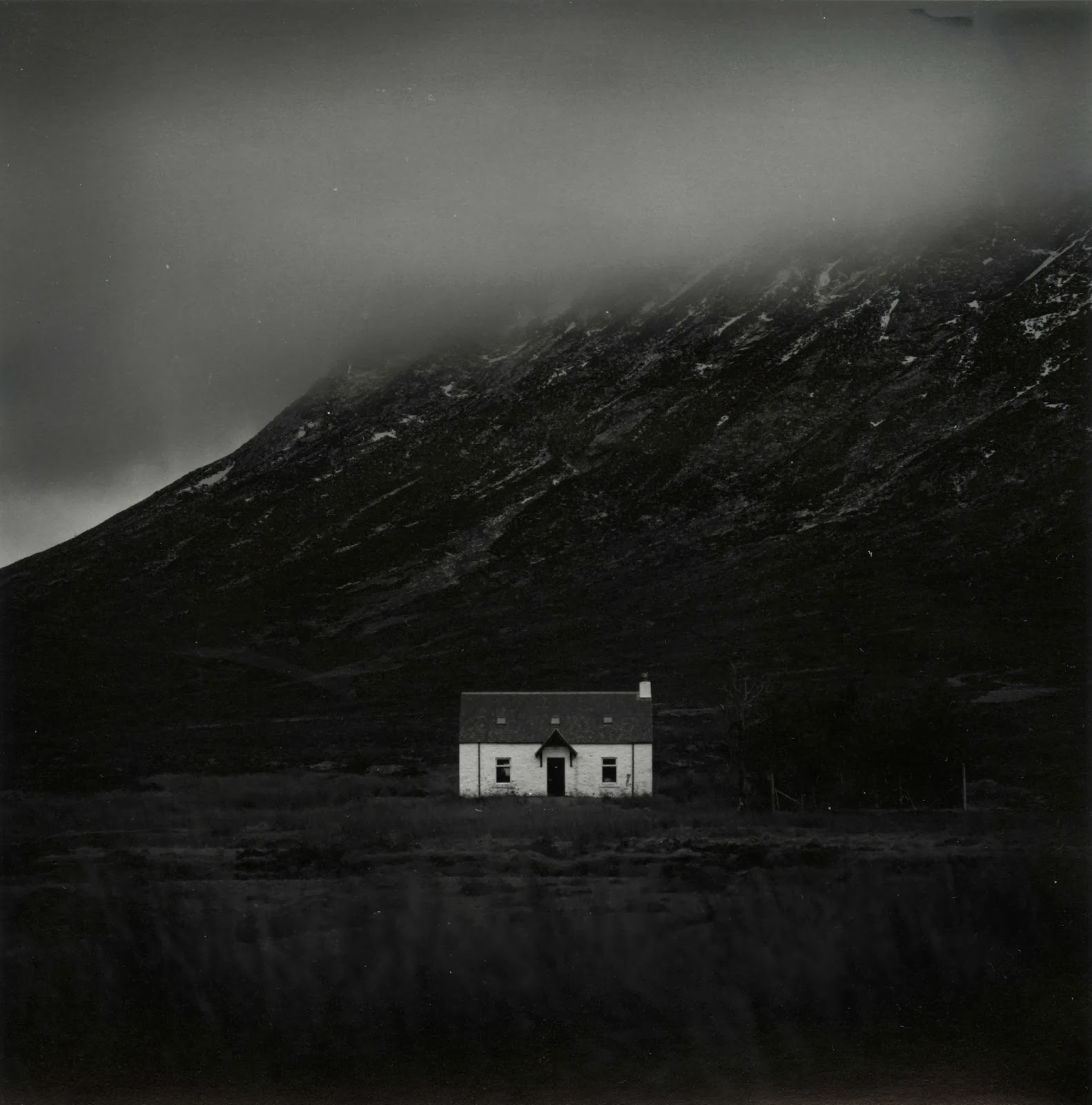
Cottage in Glencoe
Over the week i was away it transpired that i only had one day midweek in which to get over to Glencoe and take some pictures. I could spend a year up there and never run out of things to shoot, it's a truly remarkable place! Unfortunately when i woke up the weather was terrible. The cloud layer was super-low and didn't really have any form, it was just a grey mush. I decided to head out anyway, sod it, it might clear up later. As i got up to Rannoch Moor i hopped in and out of the car a few times to grab a few shots and move further up the road. Jess had lovingly decided to come with me and we brought Ellie (our puppy) along too, and she loved it. I've never seen a dog run so fast and be so excited to be outside!
As we made our way down the Glen we went around a sweeping left hand bend and i saw a large smooth valley which was catching the sun nicely. I parked up in a convenient layby, grabbed my gear and started walking, waving bye to Jess as she had decided she was tired and didn't want to step foot out of the car again! It turned out i was walking through a bit of a bog but i didn't mind as clever me had remembered to wear my waterproof sock liners (get some, thank me later). I took some time setting up the shot and finally exposed the frame (which i haven't yet printed). Then just off to the left a white cottage caught my eye, it was really standing out from the murky grey of the clouds so i decided to head closer and see if it was a workable shot. I found a nice vantage point, focused, metered and then exposed.
Upon my return home i developed the film (in Rodinal of course) and left it to dry. A few days later i freed up some time and made a contact sheet. I spotted quite a few frames which i liked the look of but this one seemed to be the best on the roll so i decided to have a go at it first.
I couldn't get into the darkroom to print for a while but Jess decided to go visit a friend for the day and so i took that as a sign to go print! I haven't really had a decent chance to fully get to grips with all the functions of my recently acquired RH Designs Stopclock Pro f-stop timer. i decided to put it through it's paces today and do some split grade printing. I setup the negative in the enlarger, focused, set the contrast grade to 00 and did my soft test sheet. I used to just use offcuts of paper for making test strips but i have found that because i am doing lots of dodging and burning to my prints these days a whole sheet makes it easier to deduce times for all parts of the image. My test sheets tend to go from around 5 seconds up in 1/6 of a stop intervals, if i need anymore i will just do a new one.

Next i did my grade 4 1/2 test sheet (i can't do grade 5 with the colour filters on my enlarger).

After much trial and error i got the dodging and burning times i wanted. During the soft exposure i dodged the sky for 3/4 of a stop and the trees to the right of the cottage received a 1/3 of a stop burn. Then the right, left and bottom edges of the print received an extra 1/4 of a stop each. Then i switched to the grade 4 1/2 filter and dodged the sky 1/3 of a stop. The trees received another 1/3 of a stop burn (if you don't do the same dodging/burning on the same part of the print with both filters then you change the contrast) and the bottom edge of the print received an extra 1/3 of a stop. The right edge then received 1/6 of a stop to balance it out whilst the cloud received 1/6 of a stop burn in a series of small up and down gradations of a rectangular piece of card. This added a slight gradational effect to the sky. Finally each corner got an extra 1/6 of a stop just to add a slight vignette. This left me with this:


Kinlochleven Island
I decided to keep going and work on another print i thought could be good. This was taken whilst exploring around Glencoe. I went up a random road and ended up at the village of Kinlochleven. A lovely place that i'm pretty sure i could live in happily! It was raining pretty heavily when i was taking this but it was worth it as you'll see.
As before i decided to split grade print. I setup and made my soft test sheet:


For the hard exposure i chose a base exposure of 16 seconds. I made a flat sheet of the two exposures together and came up with this:

Good but it needs some work. The top left corner is a bit dark and i want the final print to be darker and more ominous. I got to work figuring out what dodging and burning was required. During the soft exposure I added and extra 1 1/2 stops to the foreground and and extra 3/4 of a stop to the right, bottom and left edges of the print. I then switched to the hard exposure and dodged the top left corner for 1/3 of a stop and dodged the mountains in the distance on the right for 1 1/6 stop to balance them with the mountains on the right. I then added 1 5/6 to the sky and 1/2 a stop to the foreground. The top half of the sky then received and extra 1 1/2, the right corner got +1 stop and the bottom left and bottom right corners received an extra 1/3 of a stop. I then locally bleached the sky directly above the island with potassium ferricyanide/potassium bromide to emphasize the light coming from there.
After a dip in selenium i got this print which is much moodier and ominous:


Well i hope that's been interesting for some of you who read this blog (if indeed anyone does read this blog). I hope that my experiences will help you in some way. As always if you have any questions or comments then please feel free to get in touch - i love hearing from you all about your own printing and photography and i love learning new things from you all. Happy printing!