Monday, 6 January 2014

Surprisingly Pleasing Surprises


  Most of the time when I go into the darkroom I have a pretty good idea of what I want to achieve.  This isn’t really due to any forward planning or meditation, I just can’t get in there as much as I would like and so I tend to have a few days between sessions where I can be thinking about what I want to do with certain negatives.  So when I went into the darkroom last week I knew what I wanted to do with my latest negative.

  I had taken Ellie (our dog) for a walk on the beach with Jess earlier in the week.  The tide was out so there were small pools everywhere filled with starfish, crabs, shells and seaweed.  As I had a few doggy poo bags in my pocket I decided to fill one with various shells and things from the beach so I could shoot some still life (I hadn’t shot any film in ages and I was starting to get twitchy)!  So I filled my bag, tired out the dog and headed home.

  The next day I setup my new Bronica body (yes, I replaced the broken one at last) on my new tripod, setup some lights and got shooting.  I used the S-36 extension tube to get up nice and close, then added close up filters where necessary.  Side lighting came from a table lamp shining from above and slightly to the right of “the subject”.  I used the auto prism I had received with my new body for exposure as I (shamefully) couldn’t be bothered spot metering it.

  Once done I loaded the film into the tank and mixed up my chemistry.  I developed the Pan F+ for 15 minutes in ID11 1:3, stopped, fixed and washed as usual.  Unfortunately the negative came out very thin indeed.  I’m assuming the developer stock solution had expired as I mixed it up about a month and a half ago, but maybe the auto metering wasn’t up to scratch; I don’t see why though as it was a very low contrast scene.  I don’t really use ID11 so that’s my excuse, I should have just stuck to Rodinal but I didn’t want to waste chemistry.  That’ll teach me!

  So, with dry negative in hand I entered the darkroom.  I started, as usual, by making a contact sheet; I’ve been doing that a lot more lately as it’s a good practice to get into.  I could see from that that there were only two or three frames I liked enough to print so I loaded the first and made a test strip.  After fiddling with contrast filters and exposure times I settled on Grade 4 at 4.00 seconds on Kentmere VC Select.  That’s a tiny amount of exposure.  Normally my base exposures are in the 18 seconds mark at grade 3, so you can see just how thin the negative was!  Fortunately, for this frame, all the detail I wanted was recorded on the negative.

  What I had planned for this negative was some second pass lith. If you’re not familiar with it please see here.  Basically you overexpose a print, bleach it back as far as you like then put it into lith developer.  So, I made my overexposed base print as described above:

 Then I bleached it back until the border shadows were just starting to be affected:

   Then I redeveloped in lith, stopped and fixed as normal.  What I found interesting is that the print did not redevelop as much as I thought it would.  Theoretically the print should just keep developing until it is all black, but this print didn’t and I’m not too sure why.  I haven’t really done much experimentation with second pass lith, I really should devote more time to it. 

  So here is the final print.  Note I didn’t get the usual greys and pinks with this paper, but a paler grey and some yellowy highlights which, although unexpected, are still pleasing to the eye:
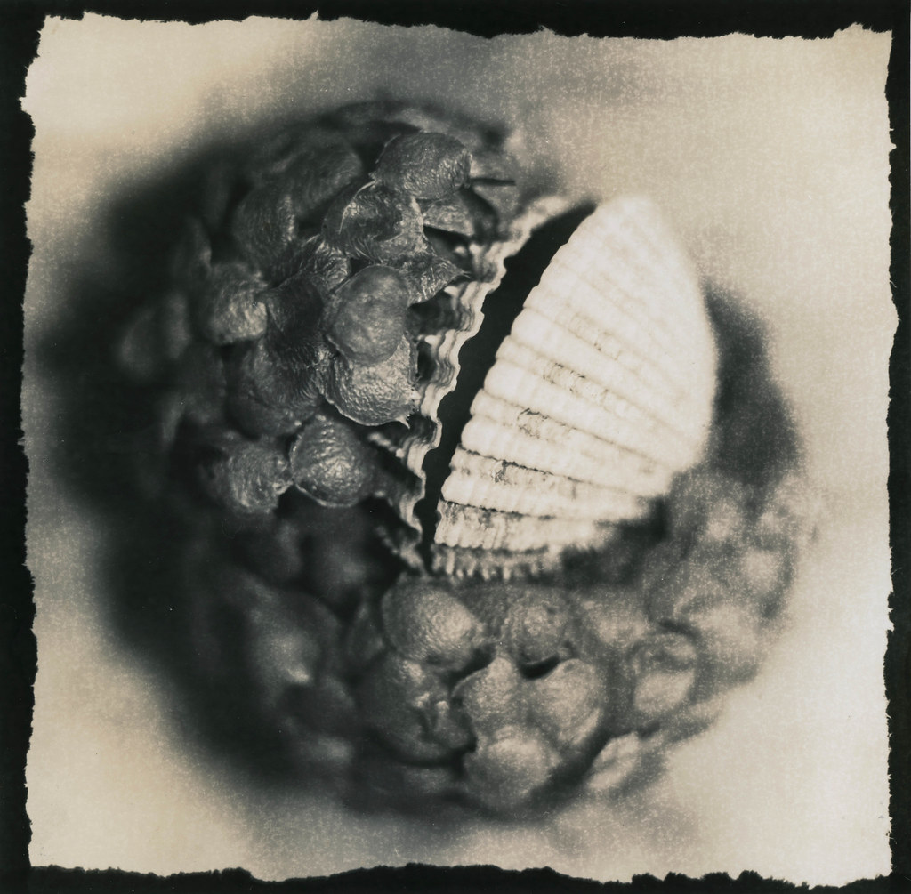

  So what do we learn?  Sometimes what you plan isn’t what you get.  Often something surprising can happen, and often that surprise is something good.

Friday, 20 December 2013

Branching Out With Slavich Unibrom


  I have made no secret on this blog and on various groups and forums of the struggles I have had with Slavich Unibrom.  I have had no end of trouble trying to get even development and retain highlight detail and I have pretty much given up on it until I can try out an alternative developer to Fotospeed’s LD20, which is all i have in my stock at the moment.

  Having a few hours free (a rare gift from Jess) to print I made a lith print using some old Agfa Brovira (see previous post).  I had to mix up some fresh standard developer for the test strip so instead of letting that go to waste I decided to try some straight up printing on Unibrom (sacrilege?) using a negative from about a year ago when I went on holiday to Scotland.  The image is of a very small plant that I discovered growing out of a bed of moss on the edge of a forest.  It has good contrast and was well exposed so I thought it would be ideal for seeing what Unibrom can deliver when it comes to straight up printing. 

  I made a test strip, chose an exposure and did a flat print.  It looked good, strong cool blacks and good highlights.  

Ignore the dust etc, my scanner is currently filthy!

   It would need some dodging and burning to get the most out of it though, and i was considering what needed to be done i found my thoughts turning to the lith developer I had just used.  It still had some life left in it so why not try some second pass lith?  I have seen some fine examples of this paper using the second pass method and now seemed like a good opportunity to try it out.  I got out my potassium ferricyanide/bromide bleach, bleached the print all the way back, rinsed it and then put it in the lith developer.  The colours were superb!  The shadows started to build up from a dark coppery red through to a vivid orange before finally cooling off into grey. 


Sorry about the orientation - blogger wont let me rotate the images!


  Unfortunately I pulled the print too late and lost the lovely copper tones in the foreground foliage so I re-bleached it and tried again.  Alas the print solarised (I’m no fan of solarisation) so I made a fresh print and tried again.  Unfortunately it failed this time too.  It is going to take a bit of work to make sure I keep the colour in the foreground at the same time the highlight detail comes in.  That’s something for me to work on in my next darkroom session – maybe only partial bleaching…

Here's the solarised version
   The only drawback I discovered is that once the print goes into the fixer the lovely copper tones disappear and turn into a pale golden yellow – still very pleasing but something of a disappointment after the copper tones.  It's something to keep in mind for future prints though.

The print after the fixing bath.  I need to try and get this lovely colour into the foreground more.  This print is going to take some work i think.
  But still, at least I have found a new use for my supply of Unibrom – it’s a lovely paper and it’s a shame that I can’t seem to get it to work for me with straight lith.  As I mentioned before, perhaps a different developer would serve me better.  Until I can try that out second pass seems to be the order of the day.  I’m looking forward to trying it out with some other negatives, hopefully this weekend.

Thursday, 19 December 2013

Lithing Glen Coe


  As I STILL haven’t replaced my broken Bronica SQ-A body I am stuck without a camera.  That being the case I have hardly been in the darkroom at all lately.  I managed to get an evening a few nights ago though and decided to dig through my negative file and see if there was something I missed.  I ended up looking at some rolls I had shot on holiday in Scotland earlier this year.  I had printed most of the good frames from it but there was one frame in particular I just couldn’t get a print I liked from.  It was of some mountains in Glen Coe close to dusk and the shadows were all blocked up.  I was in a rush at the time of exposure so it’s not really the best negative I could have got from the scene, and what’s more there are spots, marks and scratches all over it (bad processing on my part)!  

  I decided that maybe it was time to give it another try.  I went through a few sheets of paper but couldn’t really get anything close to what I liked, and those spots and marks were an annoyance.  I decided to try and lith it and settled on Agfa Brovira as my paper of choice.  With Brovira I can get a good range of tones and it still retains great highlight detail so was ideal for this situation.  Plus with lith marks and spots annoy me much less for some reason, maybe it's because of the gritty nature of hte final print.  

 I mixed up the developer, exposed the paper and slid it into the tray.  It took about 25 minutes to get to an appropriate snatch point, but unlike most of my other prints I pulled it just before the shadows became too dark.  There is shadow detail in this negative that would be lost if I let the blacks fully develop – a road and the texture of the mountainside – and I wanted them to still be discernible in the final print.   

  I’m pleased with the final print, there are patches of a golden yellowy tone that appeared upon drying.  I’m not sure if that’s to do with the lith process or just down to the age of the paper, I like it anyway.  I’m starting to run low on Brovira so I need to start saving it for the most important negatives, or find someone with a huge stash for sale!


  It just goes to show how important it is to keep going back to old negatives as well as printing new ones as your printing skills improve with time and you may be able to get more from your negative than you could when you first tried.

Thursday, 7 November 2013

Feeding The Monkey


  After not shooting a roll in months to say my trigger finger is itchy is an understatement.  To satisfy my urges last weekend I dug out some old 35mm film and loaded up my Yashica FR-1 and took some randomly selected shots around the house and out and about.  Mostly of Jess eating her tea (much to her disdain).  I do not like Ilford Delta in Rodinal so I opened a pack of ID11 I got with my darkroom and gave that a try.  The negative seems to have come out with good contrast and hopefully I will be able to do some printing this weekend.

  Now, on to the main point of this post.  Due to the complete lack of recent shooting I decided to dig through my old negatives.  I decided to try and print an image I had tried and failed before.  It’s from a trip Jess and I took to Bowland back in summer of an animal shelter in the hills with a nice puff of cloud above it.  The problem is I just can’t seem to get it right using straight printing.  The image is extremely low contrast due to the fact I used too heavy a grad on the sky.  I should probably dedicate more time to it I suppose (and learn to master my metering and filtration better).  But for this short session I decided to try and lith it.  I have been suing Agfa Brovira a lot lately but didn’t think it would suit this image and I didn't want to use my few remaining pieces of Fotospeed Lith.  I wanted something gritty and super-high contrast.  I decided to once again try Slavich Unibrom.  Here I learn't an important lesson.  When trying to “feed the darkroom monkey”, don’t use a paper you haven’t mastered yet.  As usual I got grossly uneven development.  I tried a few sheets changing my method slightly; a pre-soak, more diluted developer, but didn’t get anything near the image I had in my head.  I gave up after a few hours and went inside.

  The next day I was looking through a few of the prints and found one I actually rather liked.  Although the development wasn’t as even as I had hoped the image was still quite pleasing.  And at this point we learn lesson number two – don’t immediately dismiss a print.  Sleep on it (not literally) and come back to it the next day.  Don’t rush towards the final image because you may discover something different that you prefer.  It’s advice I have read in books many times but far too often I get carried away trying to get something finished, but maybe it’s just me that does that.

  So lessons learned – I need to slow down and I need to work harder at finding my own way of taming Slavich Unibrom.  For now I leave you with the image I made and the promise of further updates soon: