Showing posts with label scotland. Show all posts

Saturday, 22 March 2014

Finishing in the Mountains & Digging into the past

  My previous post was regarding the prints i made from a roll of film i shot whilst away on holiday in Glencoe, Scotland... and so is this post!  This week has been one of those wonderful weeks where Jess has had a lot on in the evenings, so i've been pretty much left to my own devices.  An we all know what that means don't we - key out, gate open, electric cable in, red light on!

  On the roll i shot there were two more prints i wanted to make.  I may end up printing some of the other frames at some point in the future but at the moment i don't find the "subjects" particularly interesting on one of them and the other one is ever so slightly out of focus (dammit)! 

  I started off in my usual manner on my first print - test strips, proof prints etc but after an hour or so i couldn't seem to get a decent looking print.  I knew i wanted to lith print the other two so i decided to try and lith this first one as well.  I mixed up some LD20 (15A, 15B, 10 old brown and make it up to an 800ml solution).  For the first print i decided to dig into my mini-stash of Orwo BN118 which is a paper i know nthing about except i have used it on a few prints previously and it tends to give a nice brown colour overall with not very much infectious development (much like Agfa Brovira which i'm a huge huge huge fan of).  Previous prints i have made on this paper didn't really have many highlight tones so i was interesting to see how it would handle the sky in this shot.  I did a test strip, determined the correct exposure, added 3 stops, exposed and started developing.  Eventually i pulled the print, stoppped, fixed and rinsed as usual, gave it a little dunk in selenium toner (1:9) and this is what i got:

  Not the greatest print i've ever done i reckon but a good start.  The paper has handled the highlights well (not that there are tonnes) and the shadows are nice and gritty.  To be honest the composition and light on this shot isn't the best but not much i can do about that now is there?!

  My next print was one i took on the road to Glencoe.  There's a huge layby on a sweeping bend of the road which was practically made for tourists.  I was there for about 45 minutes and i think at least 5 coach loads of people came and went in that time, compact cameras a-flashing.  I found myself chuckling when i pondered how their images would turn out.  For some reason people's holiday photos just amuse me - "here's a lovely landscape with my wife stood in front; here's an interesting statue with my daughter in front, here's a hedge with my brother in front".  Bizarre how most people seem to think shots are improved by having family members stood in front of them.  I think it may stem from my parents who overload on holiday photos, every single one having my mum or dad stuck right bang in the middle of the scene!  Anyway - back on track!  I did two exposures at this scene, one standard and one using a cheapo 10 stop filter i got off ebay/amazon (i can't quite remember).  After inspecting the contact sheet i decided to print the long exposure one (seriously, the exposure was like 8 minutes or something - i'd give you an exact figure but my notebook is buried in the under-stairs cupboard and going in there is an undertaking that requires at least half a day and a hearty breakfast, neither of which i have), predominantly because the sky had a better looking shape and also because there was a huge drying mark on the standard one.  I decided to use my precious precious supply of Fotospeed Lith paper for this print.  This paper is long gone but i got 20 sheets on ebay months ago and i'm saving it for very special prints and this felt like one of those.  In my mind i pictured something dark with emphasis put on the lake and sky.  I chose an exposure accordingly and started to develop.  When the time seemed right i pulled the print, processed and selenium toned in 1:9 again.  This caused a boost in the blacks as usual which resulted in some slight loss of detail in the foreground landscape - i expected this though and it was what i wanted.  I wanted the foreground to look almost blocked up so as to add further emphasis to the lake (which took on a lovely pale lilac type colour).  Here's the final result:

  I think it works well and i like the pale pastel tones taken on by the highlights.  Now if only Fotospeed would bring the lith paper back out (only 16 sheets left)!  On your screen you may be seeing some brownish areas in the dark foreground, that's just come from scanning - the print wasn't entirely flat and so some light got in, a bit of a pain but i'm not going to rescan and edit it all over again - just imagine everything in the balck areas is entirely black!

  For regular readers of this blog (if indeed there are any) you may pick up on the vibe that i begrudge wasting chemicals - they're expensive and i want to squeeze everything out of them that i can.  Some would coll that anal, i call it thrifty!  I knew that would be power for at least one more print in the lith developer so i hit the negative folder hard in search of something to print from my past.  I eventually stumbled upon  roll of film i shot at Whitby Abbey a few years ago on my honeymoon (7th May 2011 - a real man remembers when he got married) and realised i had never really printed from it (at that time i was still scanning all my negatives - terrible)!  The whole roll was pretty much a write-off mostly due to lack of ability to not chop the tops of images off when using a Diana camera.  One shot looked great though (even if it is from the exact same angle that everyone seems to take pictures of Whitby abbey from) so i decided to lith it and see what we got.  I spent a few minutes pondering what paper to use (because as you should all know by now paper choice has a massive effect on final print in lith).  As i was feeling somewhat devil-may-care a decided to use a sheet of my even-rarer-than-fotospeed-lith tapestry paper.  This is a textured "art" paper that liths incredibly well and when put into selenium toner will give at least 3 colour splits.  I have used one sheet before to create a watercolour style effect - see here for details.  I decided to give it a go with this print as it was somewhat heavier on the shadows and lower midtones than i have previously lithed on this paper, i was interested to see what i would end up with.  I determined exposure, processed and dipped into the selenium toner (1:9 again) and as expected colours kept changing from the shadows up through to the highlights.  I kept the print in the selenium until i got a nice cool grey in the lower mids and lovely pale pastel yellows and lilacs in the tones of the sky.  When using this paper previously i would paint the toner onto areas i want to alter the colours of but i thought this print looked fine as it was so i left it to dry (keeping in mind that when wet it is a yellowy colour but would dry-down to a salmon pink tone).  Once dry i was pleased with how it looked:

  Again - scanning problems!  Because this paper is heavily textured it wouldn't render the blacks actually black so they have the kind of look you get when you're trying to scan through dense colour film.  Again, just imagine that the shadow areas are solid black! 

  So, a successful darkroom session from which i learnt the following things:
  • I hate scanning
  • Lith printing continues to rule
  All i need to do now is actually go out and shoot some more film (it's been 2 months since i've even touched my camera - naughty me) so i can crack on printing.  Perhaps in the meantime i should go back through my old negatives and see if there's anything i've missed.  until next time - happy printing!

Monday, 24 February 2014

Starting My Glencoe Prints

  As mentioned at the end of the previous post i have been working on some prints from my recent trip away to Scotland.  What with Blogger being such a temperamental website i haven't been able to upload any images for ages, but now, finally, i can!  I have made two prints of the roll i shot so far and i really feel like they have been a huge step forward for me in my printing.  I put a lot of time and effort into realising in print form what i saw in my mind at the time of exposure.  In this post i will show you how i created each print and hopefully this may give you some ideas or maybe even some inspiration.

  Making these prints i really got to grips with my new(ish) f-stop timer.  I'm pretty sure i used every function on there - dry down compensation, split grade mode, dodging and burning programming

So, to the first print...

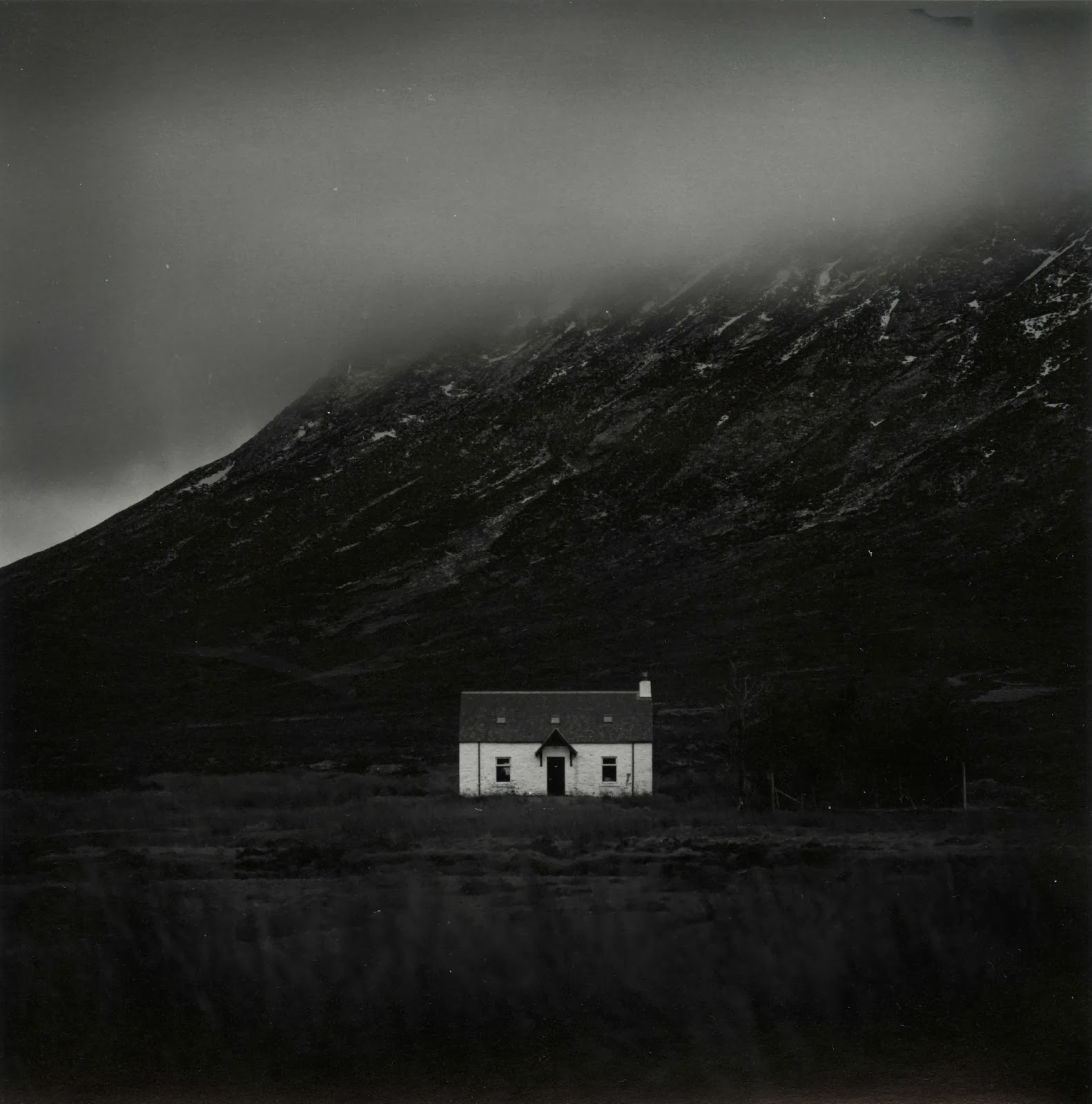
Cottage in Glencoe
  Over the week i was away it transpired that i only had one day midweek in which to get over to Glencoe and take some pictures.  I could spend a year up there and never run out of things to shoot, it's a truly remarkable place!  Unfortunately when i woke up the weather was terrible.  The cloud layer was super-low and didn't really have any form, it was just a grey mush.  I decided to head out anyway, sod it, it might clear up later.  As i got up to Rannoch Moor i hopped in and out of the car a few times to grab a few shots and move further up the road.  Jess had lovingly decided to come with me and we brought Ellie (our puppy) along too, and she loved it.  I've never seen a dog run so fast and be so excited to be outside!

  As we made our way down the Glen we went around a sweeping left hand bend and i saw a large smooth valley which was catching the sun nicely.  I parked up in a convenient layby, grabbed my gear and started walking, waving bye to Jess as she had decided she was tired and didn't want to step foot out of the car again!  It turned out i was walking through a bit of a bog but i didn't mind as clever me had remembered to wear my waterproof sock liners (get some, thank me later).  I took some time setting up the shot and finally exposed the frame (which i haven't yet printed).  Then just off to the left a white cottage caught my eye, it was really standing out from the murky grey of the clouds so i decided to head closer and see if it was a workable shot.  I found a nice vantage point, focused, metered and then exposed.

  Upon my return home i developed the film (in Rodinal of course) and left it to dry.  A few days later i freed up some time and made a contact sheet.  I spotted quite a few frames which i liked the look of but this one seemed to be the best on the roll so i decided to have a go at it first.

  I couldn't get into the darkroom to print for a while but Jess decided to  go visit a friend for the day and so i took that as a sign to go print!  I haven't really had a decent chance to fully get to grips with all the functions of my recently acquired RH Designs Stopclock Pro f-stop timer.  i decided to put it through it's paces today and do some split grade printing.  I setup the negative in the enlarger, focused, set the contrast grade to 00 and did my soft test sheet.  I used to just use offcuts of paper for making test strips but i have found that because i am doing lots of dodging and burning to my prints these days a whole sheet makes it easier to deduce times for all parts of the image.  My test sheets tend to go from around 5 seconds up in 1/6 of a stop intervals, if i need anymore i will just do a new one.

  I chose the strip with a base exposure of 8.98 seconds because it gave tone to the snows on the mountain top.  I knew i would want the cottage walls to be lighter but more on that later.

  Next i did my grade 4 1/2 test sheet (i can't do grade 5 with the colour filters on my enlarger).

  Again i chose the 8.98 second exposure time as it gave me good, deep blacks.  I was happy with the contrast overall so i turned my attention to dodging and burning.  I knew i wanted to lighten the cloud somewhat and darken the foreground to really made the cottage stand out.  This is where offcuts of paper come in really handy - any dodging and burning times i cannot figure out from the test sheets i made earlier i can deduce using small strips of paper placed in the relevant parts of the image. 

  After much trial and error i got the dodging and burning times i wanted.  During the soft exposure i dodged the sky for 3/4 of a stop and the trees to the right of the cottage received a 1/3 of a stop burn.  Then the right, left and bottom edges of the print received an extra 1/4 of a stop each.  Then i switched to the grade 4 1/2 filter and dodged the sky 1/3 of a stop.  The trees received another 1/3 of a stop burn (if you don't do the same dodging/burning on the same part of the print with both filters then you change the contrast) and the bottom edge of the print received an extra 1/3 of a stop.  The right edge then received 1/6 of a stop to balance it out whilst the cloud received 1/6 of a stop burn in a series of small up and down gradations of a rectangular piece of card.  This added a slight gradational effect to the sky.  Finally each corner got an extra 1/6 of a stop just to add a slight vignette.  This left me with this:

  I was close but the cottage wasn't quite popping enough.  I brushed some dilute potassium ferricyanide/potassium bromide bleach over the cottage which lightened the highlights slightly and added extra pop.  I re-fixed and then toned in selenium1:5 for 2 minutes.  This gave me this print:

  The selenium has added extra pop (I love selenium) but i wasn't quite happy with the print.  I decided to go crazy and dig out the few sheets of warmtone paper i have, I felt that this print was worthy on going onto this expensive paper!  I made an identical print and set the drydown compensation to 5% (drydown is the effect of fibre prints going darker when dry - a pain)!  This time i fully toned in selenium (4:30).  I did try pulling the print from the toner around at 2 minutes but it looked strange being a warm reddish colour all over with a grey sky on top.  After all this work i was left with my final print which i think is my best print yet:


Kinlochleven Island

  I decided to keep going and work on another print i thought could be good.  This was taken whilst exploring around Glencoe.  I went up a random road and ended up at the village of Kinlochleven.  A lovely place that i'm pretty sure i could live in happily!  It was raining pretty heavily when i was taking this but it was worth it as you'll see.

  As before i decided to split grade print.  I setup and made my soft test sheet:

   I chose a base exposure time of 4 seconds and proceeded to make my hard exposure:


  For the hard exposure i chose a base exposure of 16 seconds.  I made a flat sheet of the two exposures together and came up with this:


Good but it needs some work.  The top left corner is a bit dark and i want the final print to be darker and more ominous.  I got to work figuring out what dodging and burning was required.  During the soft exposure I added and extra 1 1/2 stops to the foreground and and extra 3/4 of a stop to the right, bottom and left edges of the print.  I then switched to the hard exposure and dodged the top left corner for 1/3 of a stop and dodged the mountains in the distance on the right for 1 1/6 stop to balance them with the mountains on the right.  I then added 1 5/6 to the sky and 1/2 a stop to the foreground.  The top half of the sky then received and extra 1 1/2, the right corner got +1 stop and the bottom left and bottom right corners received an extra 1/3 of a stop.  I then locally bleached the sky directly above the island with potassium ferricyanide/potassium bromide to emphasize the light coming from there.

  After a dip in selenium i got this print which is much moodier and ominous:

  I then switched to warmtone paper and made an identical print which is my final print (unfortunately when scanning i somehow cropped the very top of the print off - error):

  I learnt a lot making these two prints.  Firstly, it really pays to imagine what you want your final print to look like when you are exposing in camera.  Secondly, it's good to make your test strips and rough prints then rest and come back to the final print at a later date, otherwise you rush to get it all done in one session and you don't get the best print you could have done.  Thirdly, never underestimate the power of bleaching. Fourthly, warmtone paper is worth every penny.  Fifthly, selenium toner remains the greatest thing in the world.  Sixthly, Scotland is one heck of a place!  Seventhly, and perhaps most importantly - never be afraid to get your camera out when it's mirky, grey, grim and wet.

  Well i hope that's been interesting for some of you who read this blog (if indeed anyone does read this blog).  I hope that my experiences will help you in some way.  As always if you have any questions or comments then please feel free to get in touch - i love hearing from you all about your own printing and photography and i love learning new things from you all.  Happy printing!

Thursday, 19 December 2013

Lithing Glen Coe


  As I STILL haven’t replaced my broken Bronica SQ-A body I am stuck without a camera.  That being the case I have hardly been in the darkroom at all lately.  I managed to get an evening a few nights ago though and decided to dig through my negative file and see if there was something I missed.  I ended up looking at some rolls I had shot on holiday in Scotland earlier this year.  I had printed most of the good frames from it but there was one frame in particular I just couldn’t get a print I liked from.  It was of some mountains in Glen Coe close to dusk and the shadows were all blocked up.  I was in a rush at the time of exposure so it’s not really the best negative I could have got from the scene, and what’s more there are spots, marks and scratches all over it (bad processing on my part)!  

  I decided that maybe it was time to give it another try.  I went through a few sheets of paper but couldn’t really get anything close to what I liked, and those spots and marks were an annoyance.  I decided to try and lith it and settled on Agfa Brovira as my paper of choice.  With Brovira I can get a good range of tones and it still retains great highlight detail so was ideal for this situation.  Plus with lith marks and spots annoy me much less for some reason, maybe it's because of the gritty nature of hte final print.  

 I mixed up the developer, exposed the paper and slid it into the tray.  It took about 25 minutes to get to an appropriate snatch point, but unlike most of my other prints I pulled it just before the shadows became too dark.  There is shadow detail in this negative that would be lost if I let the blacks fully develop – a road and the texture of the mountainside – and I wanted them to still be discernible in the final print.   

  I’m pleased with the final print, there are patches of a golden yellowy tone that appeared upon drying.  I’m not sure if that’s to do with the lith process or just down to the age of the paper, I like it anyway.  I’m starting to run low on Brovira so I need to start saving it for the most important negatives, or find someone with a huge stash for sale!


  It just goes to show how important it is to keep going back to old negatives as well as printing new ones as your printing skills improve with time and you may be able to get more from your negative than you could when you first tried.