Showing posts with label chemicals. Show all posts

Wednesday, 21 May 2014

How To: Make a Print Washer on a Budget

  Ah the early stirs of summer, the time when a man decides to re-open his toolbox and turns his mind to possibility.

  I'm tired of washing my prints in the kitchen sink.  It's just too small and i can't leave it alone because the prints sink to the bottom, block the tap; the sink fills and my kitchen starts to flood.  And woe betide me if i decide to print some 12 x 16 paper!


  Suffering from the same problem?  Lo, read on to see how you can make an inexpensive (really, it cost me about £20 in total) print washer.

  First off, materials.  Here's what you will need:

        • Plastic storage container (any size you like),
        • 2 x 2 metre lengths of plastic waste pipe (any diameter you fancy),
        • Some 90 degree joints that will fit your pipe (get about 8),
        • Hosing/tubing (approximately 2 metres),
        • Drill
        • Saw
        • sandpaper
        • Glue gun/silicon sealant
 So how do we build this washer i hear you cry?  Keep reading:

Step 1

  Grab your storage box (mine cost about £11 and can easily fit in 12 x 16 prints) and drill 2 holes roughly the same diameter as your waste pipe just an inch or so below the top of the container towards the left and right hand side.  To do this you may have to use a hole cutter (its like a round saw which you mount on your drill).  Unfortunately i didn't have a hole cutter the right size so i drilled my holes bigger.

Step 2

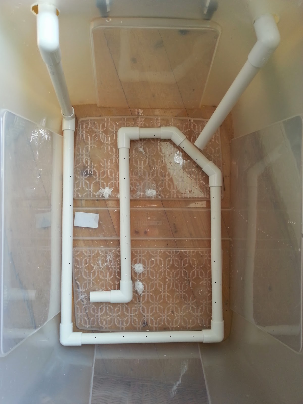
  Cut a small section off your pipe and feed it through the hole on your nearest side, push on a 90 degree joint (making sure you sandpaper down the edge you have just sawed) and then attach a vertical section of pipe which extends just shy of the base of the container.

Step3

   Now do exactly the same with the other hole, but this time saw the tip of the pipe at about 45 degrees to get a spout.


Step4

  Now go back to your first length of piping and measure along the base of your container then cut a length of pipe just a little less than the length you measured.  Smooth off the sawed edges of the pipe with sandpaper and attach it to the pipe you already have.

  At this stage i tried attaching a length of hose to cover the base of the container but it didn't quite work out.  Instead, keep attaching lengths of pipe and joints until you get good all round coverage along the base of the container.  You dont need to cap off the last piece, this will serve as an outlet for the water which flows through the system.

Not like this!

Like this!
Step 5

  Now take your drill and (using a small drill bit) drill holes every 2 inches or so apart along the entire length of the tubing which is sat in the base of the container.

Step 6

  Retreat to the bathroom (or wherever you're planning on setting up this washer) and check out your taps.  If you have the kind of taps you can just push hosing onto then all well and good, connect a length of hosing from the first piece of piping onto your taps.  This will mean water will flow in, down the vertical length and through the loop you have made in the base of your tub; flowing out from the last length to be picked up by the second vertical pipe which will act as a siphon.

  Now, my taps are mixers which means i cant push any hosing over them.  But, i can unscrew the shower and push the hosing onto the screw attachment (yay).

Like so!
Step 6

  Attach a length of hosing onto the second pipe and point it plugwards.  Turn your tap on and you should see water spurting out through the holes you have drilled and the container will start to fill.

  You should see some good agitation in the water as the container starts to fill (which is exciting isn't it).

Step 7

  Now, remember i drilled my holes for the pipe inlets bigger than the pipe?  I'm going to need to seal that up.  Take some plastic (e.g. from a bottle) and cut out a square which more than covers the holes you cut.  Cut out a hole as close to the diameter of the pipe as possible and use a glue gun or some silicon to attach the plastic to the container, with the pipe running through it.  If you don't do this then the water will just leak out of the holes you made and the second pipe won't act as a siphon.

Step 8

  Once that's all done you will have to ma the tap for a while to get the right flow.  Keep adjusting the amount of water coming out of the tap until what's going in matches what's heading out of the second pipe.  It helps to drill a small hole in the top of the second pipe and stick a match in it.  The match can be used to increase and decrease outflow.  Preferably you don't want the water to flow out over the top of the container.

Step 9

  The final step is to make something to support your prints.  It should be easy enough to source some acrylic or perspex sheets, cut them to size, attach them to some rods and put that in the tank.  As i already have a Paterson drying rack, however, i decided to use that.  These are cheap and come up relatively often on Ebay.


  And that's about it.  It's not the most hi-tech thing ever created but it's cheap and cheerful and should wash your prints sufficiently (i can't guarantee that of course).  It's certainly better than flooding my kitchen!

  The way it works is that the water flows in and goes through the loop at the base.  The drill holes allow water to spurt out which agitates the water, causing motion around the prints.  The water picks up the fixer and, as fixer-laden water is denser than clean water, it sinks to the bottom of the container.  It should then be picked up by the outflow pipe and siphoned out down the drain.  Science!  I haven't technically finished mine yet as i haven't sealed up the original drill holes so my siphon isn't really working but it will.  IT WILL I SAY!  Just for fun, here's a super-entertaining video of mine showing this mega-agitating washer in action (caution: may cause your mind to blow, it's that exciting):


  So that's it.  A print washer for those of us on a budget.  Those hundreds of pounds you have now just saved can go on something better like film, paper, chemicals or (woe of woes) rent!  As always keep printing and ill see you again soon.


Saturday, 22 March 2014

Finishing in the Mountains & Digging into the past

  My previous post was regarding the prints i made from a roll of film i shot whilst away on holiday in Glencoe, Scotland... and so is this post!  This week has been one of those wonderful weeks where Jess has had a lot on in the evenings, so i've been pretty much left to my own devices.  An we all know what that means don't we - key out, gate open, electric cable in, red light on!

  On the roll i shot there were two more prints i wanted to make.  I may end up printing some of the other frames at some point in the future but at the moment i don't find the "subjects" particularly interesting on one of them and the other one is ever so slightly out of focus (dammit)! 

  I started off in my usual manner on my first print - test strips, proof prints etc but after an hour or so i couldn't seem to get a decent looking print.  I knew i wanted to lith print the other two so i decided to try and lith this first one as well.  I mixed up some LD20 (15A, 15B, 10 old brown and make it up to an 800ml solution).  For the first print i decided to dig into my mini-stash of Orwo BN118 which is a paper i know nthing about except i have used it on a few prints previously and it tends to give a nice brown colour overall with not very much infectious development (much like Agfa Brovira which i'm a huge huge huge fan of).  Previous prints i have made on this paper didn't really have many highlight tones so i was interesting to see how it would handle the sky in this shot.  I did a test strip, determined the correct exposure, added 3 stops, exposed and started developing.  Eventually i pulled the print, stoppped, fixed and rinsed as usual, gave it a little dunk in selenium toner (1:9) and this is what i got:

  Not the greatest print i've ever done i reckon but a good start.  The paper has handled the highlights well (not that there are tonnes) and the shadows are nice and gritty.  To be honest the composition and light on this shot isn't the best but not much i can do about that now is there?!

  My next print was one i took on the road to Glencoe.  There's a huge layby on a sweeping bend of the road which was practically made for tourists.  I was there for about 45 minutes and i think at least 5 coach loads of people came and went in that time, compact cameras a-flashing.  I found myself chuckling when i pondered how their images would turn out.  For some reason people's holiday photos just amuse me - "here's a lovely landscape with my wife stood in front; here's an interesting statue with my daughter in front, here's a hedge with my brother in front".  Bizarre how most people seem to think shots are improved by having family members stood in front of them.  I think it may stem from my parents who overload on holiday photos, every single one having my mum or dad stuck right bang in the middle of the scene!  Anyway - back on track!  I did two exposures at this scene, one standard and one using a cheapo 10 stop filter i got off ebay/amazon (i can't quite remember).  After inspecting the contact sheet i decided to print the long exposure one (seriously, the exposure was like 8 minutes or something - i'd give you an exact figure but my notebook is buried in the under-stairs cupboard and going in there is an undertaking that requires at least half a day and a hearty breakfast, neither of which i have), predominantly because the sky had a better looking shape and also because there was a huge drying mark on the standard one.  I decided to use my precious precious supply of Fotospeed Lith paper for this print.  This paper is long gone but i got 20 sheets on ebay months ago and i'm saving it for very special prints and this felt like one of those.  In my mind i pictured something dark with emphasis put on the lake and sky.  I chose an exposure accordingly and started to develop.  When the time seemed right i pulled the print, processed and selenium toned in 1:9 again.  This caused a boost in the blacks as usual which resulted in some slight loss of detail in the foreground landscape - i expected this though and it was what i wanted.  I wanted the foreground to look almost blocked up so as to add further emphasis to the lake (which took on a lovely pale lilac type colour).  Here's the final result:

  I think it works well and i like the pale pastel tones taken on by the highlights.  Now if only Fotospeed would bring the lith paper back out (only 16 sheets left)!  On your screen you may be seeing some brownish areas in the dark foreground, that's just come from scanning - the print wasn't entirely flat and so some light got in, a bit of a pain but i'm not going to rescan and edit it all over again - just imagine everything in the balck areas is entirely black!

  For regular readers of this blog (if indeed there are any) you may pick up on the vibe that i begrudge wasting chemicals - they're expensive and i want to squeeze everything out of them that i can.  Some would coll that anal, i call it thrifty!  I knew that would be power for at least one more print in the lith developer so i hit the negative folder hard in search of something to print from my past.  I eventually stumbled upon  roll of film i shot at Whitby Abbey a few years ago on my honeymoon (7th May 2011 - a real man remembers when he got married) and realised i had never really printed from it (at that time i was still scanning all my negatives - terrible)!  The whole roll was pretty much a write-off mostly due to lack of ability to not chop the tops of images off when using a Diana camera.  One shot looked great though (even if it is from the exact same angle that everyone seems to take pictures of Whitby abbey from) so i decided to lith it and see what we got.  I spent a few minutes pondering what paper to use (because as you should all know by now paper choice has a massive effect on final print in lith).  As i was feeling somewhat devil-may-care a decided to use a sheet of my even-rarer-than-fotospeed-lith tapestry paper.  This is a textured "art" paper that liths incredibly well and when put into selenium toner will give at least 3 colour splits.  I have used one sheet before to create a watercolour style effect - see here for details.  I decided to give it a go with this print as it was somewhat heavier on the shadows and lower midtones than i have previously lithed on this paper, i was interested to see what i would end up with.  I determined exposure, processed and dipped into the selenium toner (1:9 again) and as expected colours kept changing from the shadows up through to the highlights.  I kept the print in the selenium until i got a nice cool grey in the lower mids and lovely pale pastel yellows and lilacs in the tones of the sky.  When using this paper previously i would paint the toner onto areas i want to alter the colours of but i thought this print looked fine as it was so i left it to dry (keeping in mind that when wet it is a yellowy colour but would dry-down to a salmon pink tone).  Once dry i was pleased with how it looked:

  Again - scanning problems!  Because this paper is heavily textured it wouldn't render the blacks actually black so they have the kind of look you get when you're trying to scan through dense colour film.  Again, just imagine that the shadow areas are solid black! 

  So, a successful darkroom session from which i learnt the following things:
  • I hate scanning
  • Lith printing continues to rule
  All i need to do now is actually go out and shoot some more film (it's been 2 months since i've even touched my camera - naughty me) so i can crack on printing.  Perhaps in the meantime i should go back through my old negatives and see if there's anything i've missed.  until next time - happy printing!

Friday, 31 January 2014

How To: Make a Black & White Print Part II - Making the Print

  I’ve finally gotten around to making this article!  Sorry it’s taken so long, i’ve been having a hectic time lately with going on holiday and a death in the family but now, at last, here’s part two of my black and white printing articles - making the print.

  So, you’ve followed some (if not all) of the advice in Part I and you’ve got together all the gear you need.  Now it’s time to make your print.  Lets start right at the beginning and take our time...

Step 1 – Prepare the chemicals

  You should have three chemicals – developer, stop and fixer (if you’re using fibre paper you should probably have some hypo clearing agent but that’s not overly critical); and you should have three appropriately sized trays.  I say appropriately sized because there’s no point printing 16”x 20” if your trays are only 5”x 7”.  A good rule of thumb is to use a tray one size bigger than the paper you will be printing on, then you will have lots of room to get your tongs in and pull the paper out.

  Lay your trays out side by side on a flat surface and mark then from left to right “dev”, “stop”, and “fix”.  Now it’s time to mix your chemicals (preferably with distilled/deionised water but tap water is ok as long as it isn’t too hard).  Your chemicals should come with mixing instructions so follow these.  For example i use Ilford Multigrade developer which should be mixed 1:9 with water.  Some people struggle with understanding ratios so let me try and shine some light onto the matter.  1:9 means mix 1 part chemical to every 9 parts water (making 10 parts in total).  In an 8”x 10” tray i like to use 600ml, so 600 ÷ 10 (1+9) = 60.  So you need 60 ml of chemical in a 600ml solution.  That’s 60ml developer + 540ml water.  If the ratio was 1:19 (as it is for the stop bath i use) then that would be 30ml chemical + 570ml water.  I hope that makes sense, if not then comment on this article and i’ll try and help you out as best i can.

  Once your developer, stop and fixer solutions are all mixed pour them out into the appropriate trays.  Get three bottles and label them up ready to pour these solutions into once your darkroom session is finished; you can reuse these chemicals for quite a while before exhaustion.  


  One thing i should say is to make sure that your chemicals aren't near your enlarger or where you store your paper.  Spillages can happen easily and you don't want to ruin your paper by splashing it with chemicals.  Most darkrooms have a "dry" side and a "wet" side which are separate from each other.  If you are working in a bedroom its good to put some plastic sheeting down to protect walls and (in my case) a chest of drawers from splashes.  Silver is a hard stain to remove!

Step 2 – Prepare the negative and load the enlarger

  When you’re choosing a negative to make your first print with it is best to choose a well developed negative with good average contrast.  The last thing you want to be doing on your first attempt to print is to try and burn through base fog and be dodging and burning all over the place.  If it helps try scanning a few frames of your film onto your computer and pick the shot that looks best without too many adjustments.  For this tutorial i will be printing this negative which is a picture of my wife on a bike riding through a park.


  Once you have chosen your negative you need to make sure it is as clean as possible.  Use a soft brush to gently wipe both sides of the negative to remove any dust and particles that may be laying on the surface.  Do the same for your enlargers negative holder (it’s good to get into the habit of doing this regularly).  Glass cleaning wipes are handy for this and i keep a small box in my darkroom especially for holder cleaning.

  Now slot the negative into the enlarger holder emulsion side down.  To find the emulsion side hold the negative up to the light – it should be dull.  Alternatively, look for the writing on the negative edges - if it’s the right way up you’re looking at the non-emulsion side.  Align the negative as straight as you can inside the holder to save problems later.


  Load the holder into your enlarger and clamp it (most enlargers have a little handle that keeps the holder in position).  

Step 2 – Setup the image

  Once the negative is all loaded turn off your room light, put on your safelight and start up your enlarger (to operate my enlarger i have a Paterson timer on which i can set the exposure time.  If you are using a colour head make sure all filtration is off.  Open up your lens to let the maximum amount of light through – this makes it easier to focus.  Make sure you are using a lens of appropriate focal length.  A 50mm lens is good for 35mm negatives, and 80mm for 6x6 (see part I of my black & white printing guide).

  Now, the distance from the light source in your head to the base determines the size of the image (as does focal length of your lens i.e. if you use an 80mm lens on a 35mm negative the head height of the enlarger to make an 8”x 10” print will differ from that when using a 50mm lens).  The greater the distance between the two the larger the image.  I am going to be printing 8”x 10” so my head won’t need to be too high up the enlarger column.  Some enlargers have a size scale printed on the column – if yours does then set it to 8” x 10”.  Mine doesn’t so i have to do it the old fashioned way.  I do this by taking my enlarger easel and setting the blades to a few mm under 8”x 8” (my prints are all square as i shoot 6x6 film).  I then place the easel under the enlarger and adjust the height of the head until the image covers the 8”x 8” area created by the intersection of the easel blades.  


  Take your focus finder and place it in the centre of the image cast by the enlarger.  Whilst looking through it adjust the fine focus of your enlarger until the grain not the image is in sharp focus.  The grain is a constant in your negative but your image is not – it may be blurred and out of focus so by focusing on the grain we are ensuring that maximum sharpness is achieved.  


  Focusing may well have made the image size to big or small for the print we wish to make so adjust the head height again and focus.  Keep doing this until your image is sharply focused at the right size.  Now lock your head (normally there’s a screw knob that prevents the head from being able to move).  Move your easel around until the image is aligned as you want it.  This is the point at which you can straighten any wonky horizons.  Personally i don’t like to crop my shots but that’s just my ethic, you can do what you like.  Once this is done you should have a nice sharp image which covers your print size and slightly overlaps onto your easel blades.  At this point turn off your enlarger, turn on the room light and we’ll look to the paper.

Step 3 – Choosing paper and setting grade

  Now it’s time to choose your paper.  When you gain a little more experience in printing you will start to see that different papers and finishes suit different types of image.  I have a variety of papers in my darkroom that i have on hand depending on the final print i want to achieve.  As this is your first print just use whatever paper you have managed to get a hold of.  In this example i am using Ilford’s MG IV RC VC (resin coated variable contrast) glossy paper which is a good “industry standard” paper (Kentmere’s VC Select is also a very good and slightly cheaper alternative which i also use).
 
  Once you have settled on a paper it’s time to choose a grade to print at.  Paper grade determines the contrast of your print.  Grade 00 is very flat, low contrast whilst grade 5 is very high contrast.  Most well exposed, well developed negatives with good overall contrast will print nicely at about grade 2.  If your negative is of a low contrast scene then printing at a higher grade will help and vice versa.  Personally i like my prints to be of a slightly higher contrast so i tend to print my well exposed, well developed (hopefully at least) negatives at grade 3.  Of course, your artistic interpretation of the negative can change this "rule".  For example, i recently took a shot of a boat on some very still water.  I wanted the sky and water to be very light and the boat to be a dark value almost black.  If i had printed at grade 3 then the water and sky would have been a light-mid grey and the boat black.  By printing at grade 5 however i increased the contrast so the bat stayed black and the sky and water were much lighter.  Once you get more experience in printing you can make decisions like this to change the outcome of your final print.  Throughout this process and even when shooting the photo you should be thinking about how you want that final print to look.  For now though we will choose a middle grade contrast to print at.

  Included in your pack of paper should be a data sheet containing processing information for that particular paper.  Take it out the pack (with the room light off and safelight on) and seal the paper up again.  Go back to room light and look at the sheet (these are also normally available from the paper manufacturers website to download as a PDF files).  If you are using multigrade filters and not a colour head you can skip this step and just put the appropriate filtration in the filter carrier beneath your lens.  If you’re using a colour head then keep reading this section.  Beneath the processing information there should be a section about paper grade (see below):


  This (and the following) tables were taken from the Ilford MGIV RC VC datasheet and is used to determine what group of settings you need to use for your enlarger.  Mine is made by LPL which comes under the Kodak group (note - some papers may not ave such tables, you may need to do a little bit of research online if not).  Remember what group your enlarger falls under and look further down the sheet and you should see these two tables:


  The first table shows single filter values, the second dual values.  Personally i use dual values most of the time but there are times when single values are better (for varying exposure times).  So, i want to print this negative at grade 3 and i need to use Kodak settings so i need to dial in 23Y and 56M on my colour head.  Look at your head and there should be three dials – yellow, magenta and cyan.  You don’t really use cyan in black and white printing so just focus on the yellow and magenta.  Dial in the settings you have just taken from your datasheet and turn your enlarger on.   


 The image cast onto your easel should have changed colour from white to a mix of yellow and magenta.  If it hasn’t look at your head – most colour enlargers have a switch which lifts the filters away from the light source.  Make sure that the switch is down therefore putting the filters in between the light source and the negative.  Stop your lens down to 2 stops away from max.  My 80mm lens goes to f22 so i tend to print at f11 (sometimes f16 if i need a longer exposure time).  Now you are ready to...
 
Step 4 – Make a test strip

  Make sure your room light is off, your enlarger light is off and your safelight is on.  The only source of light in your room should be your safelight (which you should situate at least 1m away from anywhere your paper is going to be to avoid fogging).  Open your paper and remove a sheet.  Place it emulsion side up beneath the blades of your easel.  The emulsion side on RC paper curves away from itself whereas on FB paper it curls towards itself.  Think of it as "n" and "u" - if you're using RC paper then when the paper is the right way up it will be "n" shaped, for FB paper it will be "u" shaped.  If you are using glossy paper then the emulsion side should be pretty obvious at it will shine, satin and matte finished will be a little trickier.  Make sure the paper is aligned and flat in the easel.  Set your exposure time on your enlarger timer to 26 seconds and get a piece of card larger than your print.  Cover the majority of your paper in the easel with this card but leave a few centimetres free.  Now, what’s going to happen is that once we set the enlarger running we will retract the card by a few centimetres every 2 seconds until the countdown reaches zero and the enlarger stops exposing.


  Set the enlarger running and watch the timer count down.  Every 2 seconds move the card back by a few centimetres and keep going until the enlarger stops exposing.  If you have judged it well the last 2 seconds of exposure should be towards the far end of the paper, thus giving you good exposure coverage across the whole print.  

  Remove your paper from your easel and go to your developing tray (which should be away from any paper storage and your enlarger so as to avoid splashing).  Grab a stopwatch/wristwatch (NOT backlit) and as you slide the paper into the developer start it running.  Rock the tray immediately to ensure that the chemical covers the whole print.  For this paper/developer combination i need to develop for 1 minute at 20oC (paper developing just runs to completion - it doesn't matter if you leave the print in for a few minutes, once the print has reached maximum developing it stops).  Ensure that fresh developer keeps moving over the paper by gently rocking the tray back and forth for the duration of the minute.  An image should start to appear at around 15 to 20 seconds (in fresh developer) and keep developing.  Once you reach 1 minute (developing time will increase if the temperature is lower) remove the paper from the developer using tongs and let it drain for 10 seconds.  Then place it into the stop bath for 10 seconds and rock the tray, drain it for 10 seconds and then fix for 30 seconds (these times will vary depending on what chemicals and papers you use – consult the data sheets that come with your equipment and it will tell you what times to use).  After fixing place the print in a tray of water, or if you’re lucky enough to have a sink in your darkroom place it straight into a bath of running water.  For RC papers washing in running water for around 5 minutes is fine, for FB papers an hour is recommended (if you wash with a hypo clearing agent then this time is halved).  Water doesn’t have to be gushing out of the tap, a gentle trickle is fine.  If you wash insufficiently then it is possible that as time goes by your print will turn brown due to fixer which was not removed by the wash  Personally i have to run out of my darkroom to the bathroom and leave my print washing in the sink whilst i occupy myself elsewhere for a few minutes.  Before you go running out of your darkroom however, make sure your package of paper is sealed and packed away before you turn on your room light or you could ruin your whole box of paper. 
 
  You should now have a print with varying exposures over it that looks something like this:


  This is a test sheet showing various exposures from 0 seconds to 26 seconds.  You may have heard the term test strip before - test strips are exactly the same but instead of using a whole sheet you trim a strip off the edge of your paper and expose that as above.  This works out well for people who shoot 6x6 as you can trim and inch or two off the same sheet you are going to be printing on to make the test strip, thus saving on paper.  For now, though, as this is your first print its best to use a whole sheet so you can get an idea of how the whole print looks at different exposures.  As your experience grows you can go to test strips if you choose to.
 
  Now what you need to do (preferably when the test sheet is dry) is analyse which exposure is best to your eye.  Look at the whole print and find which exposure gives you the best combination of shadow and highlight detail with good contrast throughout.  Personally i like my prints to be slightly on the darker side so i for this print i chose the 26 second exposure.  If you don't think any of the exposures are long enough try a test strip from 60 to 30 seconds, or stop your lens down to reduce the amount of light hitting the paper.

  Once you have decided on an exposure time turn the room light off and safelight on and repeat the above steps but with a straight print at the exposure time you have chosen (in my case 26 seconds).  Develop, stop, fix and wash as before and then leave your print to dry, either hung up or on a rack.   

Here’s my print at 26 seconds exposure:

 
  Once dry really look at your print – are you happy with it?  Is it too light/dark, is the contrast too high/low?  To darken simply choose a longer exposure or use a shorter exposure to lighten.  Change the contrast using filtration and see how that effects the print.  
 
  It is entirely up to you how your final print will look.  We have only scratched the surface of printing in this tutorial (we'll go into more detail in the upcoming parts of my printing guide).  There are likely areas of your print that are still too light or dark even though you have a generally good exposure overall.  In part IV of my printing tutorials we will discuss fine tuning a print using dodging and burning.  Part III, however, wil deal with an alternative printing method - Split Grade Printing.  Until then feel free to ask any questions and most of all - happy printing!