I have had both good and bad fortune lately. I thought things were really looking up when i found this stash of photo paper ridiculously cheap (i won't tell you how much i got it for because you will hate me forever and never read this blog again). I saw an advert that someone was getting rid of some darkroom gear so i message them to see if they had any paper. They said they had a few odds and ends so i took a punt and we arranged a price. When the package arrived my head nearly exploded! Inside was an almost full pack of 8x10 Fotospeed Lith paper, a pack of Oriental Seagull, a few packs of Ilford MGIV RC VC, a pack of Kentmere Fineprint VC, some Ilford MG FB WT in 9.5x12 and 12x16, a pretty full pack of Kentmere Art Document, Some Foma papers in 12x16 and a full pack of 16x20 and some Fotospeed Fotolinen which i haven't been able to find much out about yet. And on top of that they sent me some unused Moersch Easylith! What an absolutely fantastic bundle to get in the post!
Naturally i got into the darkroom as soon as i could and that is when misfortune struck. I decided to do some lith and try out some of these new papers. I have used Fotospeed Lith and Art Document before but i tried some again (after all, everyone loves 9.5x12, right), and i also tried some of the seagull as i believe it is great for lith. Unfortunately none of the prints turned out particularly well. I think i chose the wrong negatives and they came out looking dull. But, on the bright side at least i learned how the papers act in lith so i can know what results to expect next time.
The Nab shot is from my recent trip to the east coat, and the one of the boulder is from an old negative i dug out - i am thinking both of these probably deserve a bit of time trying to get a good fine print out of. I have struggled with the nab shot in the past but i put that down to being in a 'funny mood'. Perhaps another session in the darkroom will reveal if i can make anything of it. The boulder shot has great detail in the sky so i may try and make a moody print out of it with lots of lovely cloud contrast. As for the castle shot, i found that on a recent walk with the dog and it would make a great print except for the face that the development messed up. I'm not sure if you can make it out but there are loads of white dots all over the print. For some reason i rated Ilford Pan F+ at 25iso and in Rodinal that doesn't work out too well. Looks like i will have to return there with some FP4+ and re-shoot.
I haven't really done much else lately. I have been toying with doing some zone system testing to determine the best ISO and development times for my setup. It is something i should have done ages ago but, as you should know by now, i am somewhat lazy and it feels like i'm wasting film (even though i know i'm not). No doubt i will write a tutorial all about it (if it is successful). I really do need to get better at getting work done and getting this blog updated more regularly.
Showing posts with label ilford. Show all posts
Wednesday, 30 July 2014
Monday, 14 July 2014
The Power of Selenium
I've spoken many times on this blog of how much i enjoy working a negative until i get the final print that i want. I love working out the dodging and burning for different areas of the print and thinking about the toning i want to do to complete it. That being said, this print was an absolute killer. Once again it is from my recent holiday away to the eats cast of England to enjoy the pleasant life of a fishing village for a week. I have been here many times before and fancied some new spots to shoot so i had a quick look around online before i headed out. A little bit of research revealed a somewhat hidden bay on the coast complete with rock shelves and nabs (a nab is an outcrop of rock which the sea has not eroded - think stack). Perfect! We ended up going there for a day midweek and had a fantastic time walking the dog and relaxing on he sand and rocks. Of course, i had my Bronica kit with me and was going a bit trigger happy. I took this shot low to the ground with a nice shapely rock in the foreground and a distant nab and cliff in the background. The sky seemed good so marvelous, i could burn that in as much as need be upon my return to the darkroom.
After i developed etc i setup a flat print (after determining the best overall exposure using split grade test strips) i got a flat print exposure. And it looked rubbish. So, off i went exploring my dodging and burning options - sheet after sheet after sheet after sheet of paper was used (i was using Slavich Unibrom for it's cold tone and nice heavy weight). I got a print i was semi happy with and decided to tone (after a wash of course). I copper toned for a short period then put it into selenium - after a few minutes large white spots started to appear (this is where we learn to selenium tone before copper) so i scrapped it, deciding it didn't look right anyway.
No amount of dodging and burning that i did made the print look right. I wanted something dark and i just wasn't getting it. Perhaps i'm just not at the skill level to do that kind of print yet - hopefully one day i will be. It's prints like these that really test me!
After hours of trying and eventually running out of Unibrom i knew it wasn't happening - i just couldn't get any "pop" out of the print. I decided to clear my mind and approach it from a lith point of view. Sometimes, if i'm honest, lith feels like a bit of a cop-out. I suppose that's because i'm not spending hours configuring dodging and burning charts, i'm just picking an exposure and slapping some paper in a tray. There is more skill to it than that, and there's nothing wrong with dodging and burning for lith - a fact i had to reassuring myself with.
Now one of mankind's oldest questions - which paper to use. After much deliberation i decided to go for Fotospeed Lith paper as i knew it would give me a dark feel and suitable colouring. So, i picked my exposure and developed until the sky had good detail. After snatching, fixing and washing i was left with this:
Good, i thought, but not quite there. The shadows are a bit...green..! As is usual with my lith prints i like to see how they react to selenium toner. In this instance i chose a dilution of 1:5 as i knew it would give more of a colour change than a weaker ratio. I popped the print into the tray and it went nuclear! The shadows got absolutely obliterated, the sky darkened dramatically and almost all detail was lost in the foreground rock. I felt crushed - all that hard work wasted. I decided to let it dry and think about my next step.
After a few days of moping about and being busy with work i went back to look through my prints and you know what - i decided i liked the final print i got. I was suitably dark and it was moody. It probably isn't going to go down in history as one of my greatest prints but i like it so i decided to leave it there and move on to another negative. But then again - looking at the above photo of my pre-toned print, i'm liking that as well...
One thing we learn - never underestimate the power of selenium!
After i developed etc i setup a flat print (after determining the best overall exposure using split grade test strips) i got a flat print exposure. And it looked rubbish. So, off i went exploring my dodging and burning options - sheet after sheet after sheet after sheet of paper was used (i was using Slavich Unibrom for it's cold tone and nice heavy weight). I got a print i was semi happy with and decided to tone (after a wash of course). I copper toned for a short period then put it into selenium - after a few minutes large white spots started to appear (this is where we learn to selenium tone before copper) so i scrapped it, deciding it didn't look right anyway.
No amount of dodging and burning that i did made the print look right. I wanted something dark and i just wasn't getting it. Perhaps i'm just not at the skill level to do that kind of print yet - hopefully one day i will be. It's prints like these that really test me!
![]() |
| This is the best i got alas. |
Now one of mankind's oldest questions - which paper to use. After much deliberation i decided to go for Fotospeed Lith paper as i knew it would give me a dark feel and suitable colouring. So, i picked my exposure and developed until the sky had good detail. After snatching, fixing and washing i was left with this:
Good, i thought, but not quite there. The shadows are a bit...green..! As is usual with my lith prints i like to see how they react to selenium toner. In this instance i chose a dilution of 1:5 as i knew it would give more of a colour change than a weaker ratio. I popped the print into the tray and it went nuclear! The shadows got absolutely obliterated, the sky darkened dramatically and almost all detail was lost in the foreground rock. I felt crushed - all that hard work wasted. I decided to let it dry and think about my next step.
After a few days of moping about and being busy with work i went back to look through my prints and you know what - i decided i liked the final print i got. I was suitably dark and it was moody. It probably isn't going to go down in history as one of my greatest prints but i like it so i decided to leave it there and move on to another negative. But then again - looking at the above photo of my pre-toned print, i'm liking that as well...
One thing we learn - never underestimate the power of selenium!
Tuesday, 10 June 2014
The Thoughtful Cliff
So despite saying in my previous post that i was going to update more i haven't updated in over two weeks! Sorry! But, good news - i have made my first print from my recent holiday to the north east coast of England, and here it be:
I shot this on a very sunny day in the town of Saltburn. It is printed onto Ilford MGIV FB Warmtone paper using Ethol LPD diluted 1:4 and toned using selenium 1:9 and a bit of sepia. This is my first time using a non-neutral developer and i have to say i loved it. If you are unfamiliar with LPD it is a wonderful developer which allows you to change tonality (not contrast) using dilution e.g. use it 1:1 for cool tones and around 1:4 for warmer tones (obviously tonality will depend very much on the paper you are using too).
I'm pretty pleased with this print, i really feel like i am starting to get into a rhythm and personal style with my printing.
I made this print using the split grade printing technique, as i have done with so many others. I did a soft exposure test strip, selected the best exposure for highlights (remembering to go a bit heavy as the sepia toning i had planned would lose a little highlight detail), then i did a hard exposure test strip and selected the best exposure for that (again, taking into account the added density that selenium toning would yield). It's always good to have a good think about toning either before printing or during proofing so that you can account for any lost/added density that may result form the toners you use (that reminds me - i should really do a few tutorials covering toning). I knew with this print that i wanted a selenium/sepia split so i deliberately overexposed the highlights and very slightly underexposed the shadows.
So, after making a base print of my combined soft and hard exposures it was time to think about dodging and burning. The cliff was looking pretty blocked up so i did a bit of a burn on the soft exposure and a dodge on the hard exposure - this evened out the contrast a little whilst maintaining the "pop" of the cliff. Then i did a very slight hard exposure burn on the sky to add a little extra depth to the clouds (the use of a grad filter at the time of exposure had already helped darken the sky to a pleasing tone). Then i did a bit of an edge burn around the sides and base of the print to draw the eye into the centre (i did this on both the soft and hard exposure). I think this really works on the base of the print as if the sand was all the same mid tone the eye would be drawn off the bottom of the image.
To finish off the print i did some very very light bleaching (followed by a fix) of the cloud highlights and the band of light across the sand (i used potassium ferricyanide/potassium bromide bleach from a sepia kit diluted 1:9). This helped add a bit more "pop" to the highlights but i had to be carfeul that this combined with sepia toning would not cause any highlight detail to be lost.
After a good wash (in my newly constructed print washer) i bleached back the print until the upper midtones were just starting to be affected and then toned in standard sepia toner. After a quick wash i then transferred the print into selenium toner mixed 1:5 for a few minutes which added a nice dark purplish hue to the print. I then did a final wash and left the print to dry before scanning.
I'm really pleased with how this print turned out and i am loving Ethol LPD as a print developer. I'm going to try some coldtone papers with it soon and a stronger dilution and see what effects i can get. In the meantime i've still got plenty more frames to be printing from my trip away.
I hope some of you have found this post useful and, as always, keep printing.
I shot this on a very sunny day in the town of Saltburn. It is printed onto Ilford MGIV FB Warmtone paper using Ethol LPD diluted 1:4 and toned using selenium 1:9 and a bit of sepia. This is my first time using a non-neutral developer and i have to say i loved it. If you are unfamiliar with LPD it is a wonderful developer which allows you to change tonality (not contrast) using dilution e.g. use it 1:1 for cool tones and around 1:4 for warmer tones (obviously tonality will depend very much on the paper you are using too).
![]() |
| I like to think of the clouds as little thought bubbles coming out of the cliff. |
I made this print using the split grade printing technique, as i have done with so many others. I did a soft exposure test strip, selected the best exposure for highlights (remembering to go a bit heavy as the sepia toning i had planned would lose a little highlight detail), then i did a hard exposure test strip and selected the best exposure for that (again, taking into account the added density that selenium toning would yield). It's always good to have a good think about toning either before printing or during proofing so that you can account for any lost/added density that may result form the toners you use (that reminds me - i should really do a few tutorials covering toning). I knew with this print that i wanted a selenium/sepia split so i deliberately overexposed the highlights and very slightly underexposed the shadows.
So, after making a base print of my combined soft and hard exposures it was time to think about dodging and burning. The cliff was looking pretty blocked up so i did a bit of a burn on the soft exposure and a dodge on the hard exposure - this evened out the contrast a little whilst maintaining the "pop" of the cliff. Then i did a very slight hard exposure burn on the sky to add a little extra depth to the clouds (the use of a grad filter at the time of exposure had already helped darken the sky to a pleasing tone). Then i did a bit of an edge burn around the sides and base of the print to draw the eye into the centre (i did this on both the soft and hard exposure). I think this really works on the base of the print as if the sand was all the same mid tone the eye would be drawn off the bottom of the image.
To finish off the print i did some very very light bleaching (followed by a fix) of the cloud highlights and the band of light across the sand (i used potassium ferricyanide/potassium bromide bleach from a sepia kit diluted 1:9). This helped add a bit more "pop" to the highlights but i had to be carfeul that this combined with sepia toning would not cause any highlight detail to be lost.
After a good wash (in my newly constructed print washer) i bleached back the print until the upper midtones were just starting to be affected and then toned in standard sepia toner. After a quick wash i then transferred the print into selenium toner mixed 1:5 for a few minutes which added a nice dark purplish hue to the print. I then did a final wash and left the print to dry before scanning.
I'm really pleased with how this print turned out and i am loving Ethol LPD as a print developer. I'm going to try some coldtone papers with it soon and a stronger dilution and see what effects i can get. In the meantime i've still got plenty more frames to be printing from my trip away.
I hope some of you have found this post useful and, as always, keep printing.
Monday, 24 February 2014
Starting My Glencoe Prints
As mentioned at the end of the previous post i have been working on some prints from my recent trip away to Scotland. What with Blogger being such a temperamental website i haven't been able to upload any images for ages, but now, finally, i can! I have made two prints of the roll i shot so far and i really feel like they have been a huge step forward for me in my printing. I put a lot of time and effort into realising in print form what i saw in my mind at the time of exposure. In this post i will show you how i created each print and hopefully this may give you some ideas or maybe even some inspiration.
Making these prints i really got to grips with my new(ish) f-stop timer. I'm pretty sure i used every function on there - dry down compensation, split grade mode, dodging and burning programming
So, to the first print...
Cottage in Glencoe
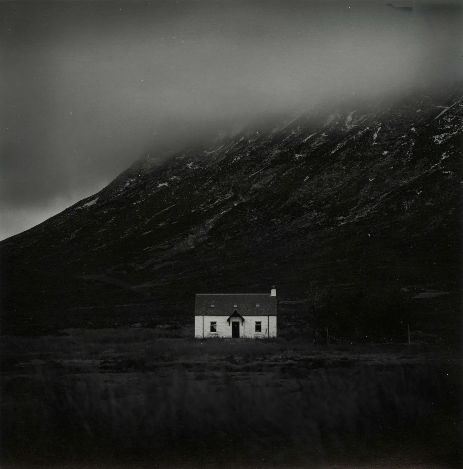
Over the week i was away it transpired that i only had one day midweek in which to get over to Glencoe and take some pictures. I could spend a year up there and never run out of things to shoot, it's a truly remarkable place! Unfortunately when i woke up the weather was terrible. The cloud layer was super-low and didn't really have any form, it was just a grey mush. I decided to head out anyway, sod it, it might clear up later. As i got up to Rannoch Moor i hopped in and out of the car a few times to grab a few shots and move further up the road. Jess had lovingly decided to come with me and we brought Ellie (our puppy) along too, and she loved it. I've never seen a dog run so fast and be so excited to be outside!
As we made our way down the Glen we went around a sweeping left hand bend and i saw a large smooth valley which was catching the sun nicely. I parked up in a convenient layby, grabbed my gear and started walking, waving bye to Jess as she had decided she was tired and didn't want to step foot out of the car again! It turned out i was walking through a bit of a bog but i didn't mind as clever me had remembered to wear my waterproof sock liners (get some, thank me later). I took some time setting up the shot and finally exposed the frame (which i haven't yet printed). Then just off to the left a white cottage caught my eye, it was really standing out from the murky grey of the clouds so i decided to head closer and see if it was a workable shot. I found a nice vantage point, focused, metered and then exposed.
Upon my return home i developed the film (in Rodinal of course) and left it to dry. A few days later i freed up some time and made a contact sheet. I spotted quite a few frames which i liked the look of but this one seemed to be the best on the roll so i decided to have a go at it first.
I couldn't get into the darkroom to print for a while but Jess decided to go visit a friend for the day and so i took that as a sign to go print! I haven't really had a decent chance to fully get to grips with all the functions of my recently acquired RH Designs Stopclock Pro f-stop timer. i decided to put it through it's paces today and do some split grade printing. I setup the negative in the enlarger, focused, set the contrast grade to 00 and did my soft test sheet. I used to just use offcuts of paper for making test strips but i have found that because i am doing lots of dodging and burning to my prints these days a whole sheet makes it easier to deduce times for all parts of the image. My test sheets tend to go from around 5 seconds up in 1/6 of a stop intervals, if i need anymore i will just do a new one.
I chose the strip with a base exposure of 8.98 seconds because it gave tone to the snows on the mountain top. I knew i would want the cottage walls to be lighter but more on that later.
Next i did my grade 4 1/2 test sheet (i can't do grade 5 with the colour filters on my enlarger).
Again i chose the 8.98 second exposure time as it gave me good, deep blacks. I was happy with the contrast overall so i turned my attention to dodging and burning. I knew i wanted to lighten the cloud somewhat and darken the foreground to really made the cottage stand out. This is where offcuts of paper come in really handy - any dodging and burning times i cannot figure out from the test sheets i made earlier i can deduce using small strips of paper placed in the relevant parts of the image.
After much trial and error i got the dodging and burning times i wanted. During the soft exposure i dodged the sky for 3/4 of a stop and the trees to the right of the cottage received a 1/3 of a stop burn. Then the right, left and bottom edges of the print received an extra 1/4 of a stop each. Then i switched to the grade 4 1/2 filter and dodged the sky 1/3 of a stop. The trees received another 1/3 of a stop burn (if you don't do the same dodging/burning on the same part of the print with both filters then you change the contrast) and the bottom edge of the print received an extra 1/3 of a stop. The right edge then received 1/6 of a stop to balance it out whilst the cloud received 1/6 of a stop burn in a series of small up and down gradations of a rectangular piece of card. This added a slight gradational effect to the sky. Finally each corner got an extra 1/6 of a stop just to add a slight vignette. This left me with this:
I was close but the cottage wasn't quite popping enough. I brushed some dilute potassium ferricyanide/potassium bromide bleach over the cottage which lightened the highlights slightly and added extra pop. I re-fixed and then toned in selenium1:5 for 2 minutes. This gave me this print:
The selenium has added extra pop (I love selenium) but i wasn't quite happy with the print. I decided to go crazy and dig out the few sheets of warmtone paper i have, I felt that this print was worthy on going onto this expensive paper! I made an identical print and set the drydown compensation to 5% (drydown is the effect of fibre prints going darker when dry - a pain)! This time i fully toned in selenium (4:30). I did try pulling the print from the toner around at 2 minutes but it looked strange being a warm reddish colour all over with a grey sky on top. After all this work i was left with my final print which i think is my best print yet:
Kinlochleven Island
I decided to keep going and work on another print i thought could be good. This was taken whilst exploring around Glencoe. I went up a random road and ended up at the village of Kinlochleven. A lovely place that i'm pretty sure i could live in happily! It was raining pretty heavily when i was taking this but it was worth it as you'll see.
As before i decided to split grade print. I setup and made my soft test sheet:
I chose a base exposure time of 4 seconds and proceeded to make my hard exposure:
For the hard exposure i chose a base exposure of 16 seconds. I made a flat sheet of the two exposures together and came up with this:
Good but it needs some work. The top left corner is a bit dark and i want the final print to be darker and more ominous. I got to work figuring out what dodging and burning was required. During the soft exposure I added and extra 1 1/2 stops to the foreground and and extra 3/4 of a stop to the right, bottom and left edges of the print. I then switched to the hard exposure and dodged the top left corner for 1/3 of a stop and dodged the mountains in the distance on the right for 1 1/6 stop to balance them with the mountains on the right. I then added 1 5/6 to the sky and 1/2 a stop to the foreground. The top half of the sky then received and extra 1 1/2, the right corner got +1 stop and the bottom left and bottom right corners received an extra 1/3 of a stop. I then locally bleached the sky directly above the island with potassium ferricyanide/potassium bromide to emphasize the light coming from there.
After a dip in selenium i got this print which is much moodier and ominous:
I then switched to warmtone paper and made an identical print which is my final print (unfortunately when scanning i somehow cropped the very top of the print off - error):
I learnt a lot making these two prints. Firstly, it really pays to imagine what you want your final print to look like when you are exposing in camera. Secondly, it's good to make your test strips and rough prints then rest and come back to the final print at a later date, otherwise you rush to get it all done in one session and you don't get the best print you could have done. Thirdly, never underestimate the power of bleaching. Fourthly, warmtone paper is worth every penny. Fifthly, selenium toner remains the greatest thing in the world. Sixthly, Scotland is one heck of a place! Seventhly, and perhaps most importantly - never be afraid to get your camera out when it's mirky, grey, grim and wet.
Well i hope that's been interesting for some of you who read this blog (if indeed anyone does read this blog). I hope that my experiences will help you in some way. As always if you have any questions or comments then please feel free to get in touch - i love hearing from you all about your own printing and photography and i love learning new things from you all. Happy printing!
Making these prints i really got to grips with my new(ish) f-stop timer. I'm pretty sure i used every function on there - dry down compensation, split grade mode, dodging and burning programming
So, to the first print...
Cottage in Glencoe
Over the week i was away it transpired that i only had one day midweek in which to get over to Glencoe and take some pictures. I could spend a year up there and never run out of things to shoot, it's a truly remarkable place! Unfortunately when i woke up the weather was terrible. The cloud layer was super-low and didn't really have any form, it was just a grey mush. I decided to head out anyway, sod it, it might clear up later. As i got up to Rannoch Moor i hopped in and out of the car a few times to grab a few shots and move further up the road. Jess had lovingly decided to come with me and we brought Ellie (our puppy) along too, and she loved it. I've never seen a dog run so fast and be so excited to be outside!
As we made our way down the Glen we went around a sweeping left hand bend and i saw a large smooth valley which was catching the sun nicely. I parked up in a convenient layby, grabbed my gear and started walking, waving bye to Jess as she had decided she was tired and didn't want to step foot out of the car again! It turned out i was walking through a bit of a bog but i didn't mind as clever me had remembered to wear my waterproof sock liners (get some, thank me later). I took some time setting up the shot and finally exposed the frame (which i haven't yet printed). Then just off to the left a white cottage caught my eye, it was really standing out from the murky grey of the clouds so i decided to head closer and see if it was a workable shot. I found a nice vantage point, focused, metered and then exposed.
Upon my return home i developed the film (in Rodinal of course) and left it to dry. A few days later i freed up some time and made a contact sheet. I spotted quite a few frames which i liked the look of but this one seemed to be the best on the roll so i decided to have a go at it first.
I couldn't get into the darkroom to print for a while but Jess decided to go visit a friend for the day and so i took that as a sign to go print! I haven't really had a decent chance to fully get to grips with all the functions of my recently acquired RH Designs Stopclock Pro f-stop timer. i decided to put it through it's paces today and do some split grade printing. I setup the negative in the enlarger, focused, set the contrast grade to 00 and did my soft test sheet. I used to just use offcuts of paper for making test strips but i have found that because i am doing lots of dodging and burning to my prints these days a whole sheet makes it easier to deduce times for all parts of the image. My test sheets tend to go from around 5 seconds up in 1/6 of a stop intervals, if i need anymore i will just do a new one.
I chose the strip with a base exposure of 8.98 seconds because it gave tone to the snows on the mountain top. I knew i would want the cottage walls to be lighter but more on that later.
Next i did my grade 4 1/2 test sheet (i can't do grade 5 with the colour filters on my enlarger).
Again i chose the 8.98 second exposure time as it gave me good, deep blacks. I was happy with the contrast overall so i turned my attention to dodging and burning. I knew i wanted to lighten the cloud somewhat and darken the foreground to really made the cottage stand out. This is where offcuts of paper come in really handy - any dodging and burning times i cannot figure out from the test sheets i made earlier i can deduce using small strips of paper placed in the relevant parts of the image.
After much trial and error i got the dodging and burning times i wanted. During the soft exposure i dodged the sky for 3/4 of a stop and the trees to the right of the cottage received a 1/3 of a stop burn. Then the right, left and bottom edges of the print received an extra 1/4 of a stop each. Then i switched to the grade 4 1/2 filter and dodged the sky 1/3 of a stop. The trees received another 1/3 of a stop burn (if you don't do the same dodging/burning on the same part of the print with both filters then you change the contrast) and the bottom edge of the print received an extra 1/3 of a stop. The right edge then received 1/6 of a stop to balance it out whilst the cloud received 1/6 of a stop burn in a series of small up and down gradations of a rectangular piece of card. This added a slight gradational effect to the sky. Finally each corner got an extra 1/6 of a stop just to add a slight vignette. This left me with this:
I was close but the cottage wasn't quite popping enough. I brushed some dilute potassium ferricyanide/potassium bromide bleach over the cottage which lightened the highlights slightly and added extra pop. I re-fixed and then toned in selenium1:5 for 2 minutes. This gave me this print:
The selenium has added extra pop (I love selenium) but i wasn't quite happy with the print. I decided to go crazy and dig out the few sheets of warmtone paper i have, I felt that this print was worthy on going onto this expensive paper! I made an identical print and set the drydown compensation to 5% (drydown is the effect of fibre prints going darker when dry - a pain)! This time i fully toned in selenium (4:30). I did try pulling the print from the toner around at 2 minutes but it looked strange being a warm reddish colour all over with a grey sky on top. After all this work i was left with my final print which i think is my best print yet:
Kinlochleven Island
I decided to keep going and work on another print i thought could be good. This was taken whilst exploring around Glencoe. I went up a random road and ended up at the village of Kinlochleven. A lovely place that i'm pretty sure i could live in happily! It was raining pretty heavily when i was taking this but it was worth it as you'll see.
As before i decided to split grade print. I setup and made my soft test sheet:
I chose a base exposure time of 4 seconds and proceeded to make my hard exposure:
For the hard exposure i chose a base exposure of 16 seconds. I made a flat sheet of the two exposures together and came up with this:
Good but it needs some work. The top left corner is a bit dark and i want the final print to be darker and more ominous. I got to work figuring out what dodging and burning was required. During the soft exposure I added and extra 1 1/2 stops to the foreground and and extra 3/4 of a stop to the right, bottom and left edges of the print. I then switched to the hard exposure and dodged the top left corner for 1/3 of a stop and dodged the mountains in the distance on the right for 1 1/6 stop to balance them with the mountains on the right. I then added 1 5/6 to the sky and 1/2 a stop to the foreground. The top half of the sky then received and extra 1 1/2, the right corner got +1 stop and the bottom left and bottom right corners received an extra 1/3 of a stop. I then locally bleached the sky directly above the island with potassium ferricyanide/potassium bromide to emphasize the light coming from there.
After a dip in selenium i got this print which is much moodier and ominous:
I then switched to warmtone paper and made an identical print which is my final print (unfortunately when scanning i somehow cropped the very top of the print off - error):
I learnt a lot making these two prints. Firstly, it really pays to imagine what you want your final print to look like when you are exposing in camera. Secondly, it's good to make your test strips and rough prints then rest and come back to the final print at a later date, otherwise you rush to get it all done in one session and you don't get the best print you could have done. Thirdly, never underestimate the power of bleaching. Fourthly, warmtone paper is worth every penny. Fifthly, selenium toner remains the greatest thing in the world. Sixthly, Scotland is one heck of a place! Seventhly, and perhaps most importantly - never be afraid to get your camera out when it's mirky, grey, grim and wet.
Well i hope that's been interesting for some of you who read this blog (if indeed anyone does read this blog). I hope that my experiences will help you in some way. As always if you have any questions or comments then please feel free to get in touch - i love hearing from you all about your own printing and photography and i love learning new things from you all. Happy printing!
Labels:
analogue,
darkroom,
fp4+. film,
glencoe,
ilford,
kinlochleven,
landscape,
printing,
rodinal,
scotland,
selenium,
warmtone
Friday, 31 January 2014
Thankyou Eddie!
Have you ever had a
moment of pure coincidence, where you were in the right place at the right time
for something great to happen? I had one
a few months ago – it was early May and Jess and I were out celebrating our 2nd
wedding anniversary (how time has flown).
We had had an expensive month what with moving house and Jess changing
jobs so we didn’t really want to go away for a break. We decided to just have some nice time off to
relax and enjoy each others company. We
had a few outings, one of which included a shopping trip to Manchester.
Even though i’m a
manly man with a manly mans beard, i do enjoy a shopping trip. And when you get to spend it with your
beloved even better (see how i am laying on the affection – although soppy this
will earn me darkroom time at a later date).
We wandered round for hours, pottering around the usual shops, enjoying
our time together. When you live in
Preston, Manchester is like shopping heaven – which brings me to the focal
point of this tale. Manchester houses
the closest analogue camera/darkroom store to where i live, namely the Real
Camera Co (yes i am aware Calumet have a store in Manchester also, but it isn’t
in the city centre is it). Whenever i am
in the area i make a point to pop in, even if i don’t need anything. The chance for me to go into such a store is
a such a rarity that to pass it up seems foolish. No amount of googling or apugging can ever
make up for seeing cameras in the flesh.
Hasselbalds, Mamiyas, Bronicas, leicas, Graflexes etc are all lined up ready to be drooled over.
They also have a
nice little book section to peruse through. I
decided to have a pick through as darkroom books are always a treat to have and
you never know, there may be a few hidden gems.
Eventually i stumbled upon a book called Creative Elements by Eddie
Ephraums. I wasn’t familiar with his
work but i bought the book anyway as it was on a couple of pounds and it seemed
interesting. Only when i got home and
started reading did i realise the magnificence of what i held in my hands! If you are unfamiliar with this book i
recommend you go onto amazon immediately and fork out the paltry sum of £2.04
so that you too can own it. Unlike other
darkroom books Ephraums takes a number of his own images and talks you through
what he did from setting up the camera, developing the film and creating
the final print. He includes his dodging
and burning charts, and most importantly he reveals his mistakes throughout the
process.
The best part of
this book, however, lies in what Eddie shows us can be done with a "mediocre" negative. Almost every developed film has at least one
frame (be it landscape, portrait or whatever) that is dull, flat and
lifeless. Whilst we usually pass these
by in favour of “superior” negatives, Ephraums shows us that these frames
should not be so forgotten.
Take, for example,
the following three frames (sorry about the quality, they are just mobile phone
pictures taken straight from the book):
If i had these shots on a negative, i'd probably play around with them for a while but then end up moving on to something else. Now look at what Ephraums did with these shots (again, sorry about the quality):
A complete transformation! By effective use of dodging & burning, creative choice of paper grade and use of toning & bleaching, Ephraums is able to completely change the look and feel of the image.
And that is something i hadn't really come across before. Naturally i had read and seen may examples of dodging and burning etc at work, but i had never considered how they could be used so extensively in completely changing an image. Which i guess is where 'art' and 'expression' come into photography. This revelation led me to look back over my old negatives. Unfortunately the reason most frames on my old negatives didn't get printed was because of scratches, fingerprints and blemishes on the emulsion. However, i remembered the roll of film i had recenty shot on a day out with a friend.
We had gone up to Ribblehead so that i could take some photos and he could paint the majestic viaduct. The weather was grey and overcast with sunny spells so i didn't hold out much hope for getting any great photos. But still, it was nice to be out for a day with a close friend. We took an appropriately oversized picnic, set up our chairs and took in the beautiful scenery. The moors of the Forest of Bowland and Yorkshire, although quite bleak, are beautiful places which are often overlooked by many in favour of the Lake District.
Unfortunately the viaduct was very popular with walkers that day so i couldn't get a clear shot. Also some moron thought it was fine to drive his van down the footpath and park right in front of the viaduct, thus saving himself 5 minutes of walking time. I didn't really visualise having a bright white van in the foreground of my final print! On another note, why oh why do people use trekking poles when walking along the flattest and widest footpaths in the world? The only time you need to use trekking poles are if your walking up a mountain. And i mean a mountain, not some little hump in the Lake District! Anyway, i decided to leave Daniel painting and go for an explore of the local area. I found a few small caverns and limestone pavements, but nothing that i fancied shooting. I looked to the horizon and saw a distant hill, small and long, with fields in the foreground and some nice clouds in the sky above it. I thought "what the heck", setup my tripod, composed and exposed. I only shot two frames that day which felt wrong, but at least i had a good time doing it.
Fast-forward a week or so and my film is developed and dry (i used up the rest of the roll a few days later on a day out with Jess). By the way i promise i don't just go out all the time - i do some work too! Anyway, the film was dry and i did a quick contact sheet. A few frames looked promising so i stored that information in my head for when i got a chance to print.
Friday. Jess is out at a wedding all day and it looks like she's not getting home until late. That means i've got at least 2 hours after work for some quality me time. Into the darkroom i go. I didn't really fancy doing any lith printing and i was in a landscape mood so i reached for the Ribblehead and Bowland negatives. I decided to give the hill shot a try, even though it looked a bit dull and uninteresting. Everything was a flat grey and seemed a bit "meh". I decided to have a quick thumb through Ephraums book to get some inspiration before i cracked on. A few test strips and proofs and i was in the area with my base exposure. I did a few more strips for dodging and burning and then tied it all together onto one print. A bit more work required. A little more dodge, a little more burn and then suddenly a decent-looking print started to appear. A few sheets later and i had a print i was very happy with indeed.
I decided to switch from RC to FB paper as i wanted the look FB gets with the sepia-selenium toning i had in mind. I adjusted my exposure accordingly and compensated for drydown. A few minutes later i had the print in my hand and it looked good.
I ran into the kitchen and set the tap running whilst i set up my toning gear. I previsualised sepia and selenium for the final print so i laid out my trays. After the wash i slid the print into the bleach for around 8 minutes, pulling it just as the shadows were starting to lose density. I didn't want to bleach back the whole way because then the selenium would have nothing to work with. A quick rinse and then into the sepia for a few minutes. The print turned a lovely sepia tone, better on the FB paper than it would have been on RC. Once toning was complete i did another wash and then put the print in the selenium. I used a mix of 1:9 as i only wanted a slight colour shift. The shadows went a deep brown and the sepia highlights and midtones turned from a yellow to a deeper, richer brown which was exactly what i wanted.
After leaving the print to dry i was left with exactly what i wanted;
Compared to the original flat print the final print is so different and i'm really happy with it.
So what do we learn from this long and winding tale? Never ignore a seemingly dull or uninteresting negative. With a little work and dedication you can breathe new life and energy into an image. Plus, everyone loves seeing a complicated set of dodging and burning plans written down don't they?! And it feels good to really work at a print and shape it.
All that is left for me to say is "thankyou Eddie", without your book i may never have unlocked the potential of many of my negatives.
Labels:
analogue,
bowland,
bronica,
creative elements,
darkroom,
eddie ephraums,
film,
fp4+,
ilford,
landscape,
photography,
print,
ribblehead,
rodinal,
selenium,
sepia
How To: Make a Black & White Print Part II - Making the Print
I’ve finally gotten around to making this article! Sorry it’s taken so
long, i’ve been having a hectic time lately with going on holiday and a death
in the family but now, at last, here’s part two of my black and white printing
articles - making the print.
So, you’ve followed some (if not all) of the advice in Part I and you’ve got together all the gear you need. Now it’s time to make your print. Lets start right at the beginning and take our time...
Step 1 – Prepare the chemicals
You should have three chemicals – developer, stop and fixer (if you’re using fibre paper you should probably have some hypo clearing agent but that’s not overly critical); and you should have three appropriately sized trays. I say appropriately sized because there’s no point printing 16”x 20” if your trays are only 5”x 7”. A good rule of thumb is to use a tray one size bigger than the paper you will be printing on, then you will have lots of room to get your tongs in and pull the paper out.
Lay your trays out side by side on a flat surface and mark then from left to right “dev”, “stop”, and “fix”. Now it’s time to mix your chemicals (preferably with distilled/deionised water but tap water is ok as long as it isn’t too hard). Your chemicals should come with mixing instructions so follow these. For example i use Ilford Multigrade developer which should be mixed 1:9 with water. Some people struggle with understanding ratios so let me try and shine some light onto the matter. 1:9 means mix 1 part chemical to every 9 parts water (making 10 parts in total). In an 8”x 10” tray i like to use 600ml, so 600 ÷ 10 (1+9) = 60. So you need 60 ml of chemical in a 600ml solution. That’s 60ml developer + 540ml water. If the ratio was 1:19 (as it is for the stop bath i use) then that would be 30ml chemical + 570ml water. I hope that makes sense, if not then comment on this article and i’ll try and help you out as best i can.
Once your developer, stop and fixer solutions are all mixed pour them out into the appropriate trays. Get three bottles and label them up ready to pour these solutions into once your darkroom session is finished; you can reuse these chemicals for quite a while before exhaustion.
One thing i should say is to make sure that your chemicals aren't near your
enlarger or where you store your paper. Spillages can happen easily and
you don't want to ruin your paper by splashing it with chemicals. Most
darkrooms have a "dry" side and a "wet" side which are
separate from each other. If you are working in a bedroom its good to put
some plastic sheeting down to protect walls and (in my case) a chest of drawers
from splashes. Silver is a hard stain to remove!
Step 2 – Prepare the negative and load the enlarger
When you’re choosing a negative to make your first print with it is best to choose a well developed negative with good average contrast. The last thing you want to be doing on your first attempt to print is to try and burn through base fog and be dodging and burning all over the place. If it helps try scanning a few frames of your film onto your computer and pick the shot that looks best without too many adjustments. For this tutorial i will be printing this negative which is a picture of my wife on a bike riding through a park.
Once you have chosen your negative
you need to make sure it is as clean as possible. Use a soft brush to
gently wipe both sides of the negative to remove any dust and particles that
may be laying on the surface. Do the same for your enlargers negative
holder (it’s good to get into the habit of doing this regularly). Glass
cleaning wipes are handy for this and i keep a small box in my darkroom
especially for holder cleaning.
Now slot the negative into the enlarger holder emulsion side down. To find the emulsion side hold the negative up to the light – it should be dull. Alternatively, look for the writing on the negative edges - if it’s the right way up you’re looking at the non-emulsion side. Align the negative as straight as you can inside the holder to save problems later.
Load the holder into your enlarger and clamp it (most enlargers have a little handle that keeps the holder in position).
Step
2 – Setup the image
Once the negative is all loaded turn off your room light, put on your safelight and start up your enlarger (to operate my enlarger i have a Paterson timer on which i can set the exposure time. If you are using a colour head make sure all filtration is off. Open up your lens to let the maximum amount of light through – this makes it easier to focus. Make sure you are using a lens of appropriate focal length. A 50mm lens is good for 35mm negatives, and 80mm for 6x6 (see part I of my black & white printing guide).
Now, the distance from the light source in your head to the base determines the size of the image (as does focal length of your lens i.e. if you use an 80mm lens on a 35mm negative the head height of the enlarger to make an 8”x 10” print will differ from that when using a 50mm lens). The greater the distance between the two the larger the image. I am going to be printing 8”x 10” so my head won’t need to be too high up the enlarger column. Some enlargers have a size scale printed on the column – if yours does then set it to 8” x 10”. Mine doesn’t so i have to do it the old fashioned way. I do this by taking my enlarger easel and setting the blades to a few mm under 8”x 8” (my prints are all square as i shoot 6x6 film). I then place the easel under the enlarger and adjust the height of the head until the image covers the 8”x 8” area created by the intersection of the easel blades.
Take your focus finder and place it in the centre of the image cast by the enlarger. Whilst looking through it adjust the fine focus of your enlarger until the grain not the image is in sharp focus. The grain is a constant in your negative but your image is not – it may be blurred and out of focus so by focusing on the grain we are ensuring that maximum sharpness is achieved.
Focusing may well have made the image size to big or small for the print we
wish to make so adjust the head height again and focus. Keep doing this
until your image is sharply focused at the right size. Now lock your head
(normally there’s a screw knob that prevents the head from being able to move).
Move your easel around until the image is aligned as you want it. This is
the point at which you can straighten any wonky horizons. Personally i
don’t like to crop my shots but that’s just my ethic, you can do what you like.
Once this is done you should have a nice sharp image which covers your print
size and slightly overlaps onto your easel blades. At this point turn off
your enlarger, turn on the room light and we’ll look to the paper.
Step 3 – Choosing paper and setting grade
Now it’s time to choose your paper. When you gain a little more experience in printing you will start to see that different papers and finishes suit different types of image. I have a variety of papers in my darkroom that i have on hand depending on the final print i want to achieve. As this is your first print just use whatever paper you have managed to get a hold of. In this example i am using Ilford’s MG IV RC VC (resin coated variable contrast) glossy paper which is a good “industry standard” paper (Kentmere’s VC Select is also a very good and slightly cheaper alternative which i also use).
Once you have settled on a paper it’s time to choose a grade to print at. Paper grade determines the contrast of your print. Grade 00 is very flat, low contrast whilst grade 5 is very high contrast. Most well exposed, well developed negatives with good overall contrast will print nicely at about grade 2. If your negative is of a low contrast scene then printing at a higher grade will help and vice versa. Personally i like my prints to be of a slightly higher contrast so i tend to print my well exposed, well developed (hopefully at least) negatives at grade 3. Of course, your artistic interpretation of the negative can change this "rule". For example, i recently took a shot of a boat on some very still water. I wanted the sky and water to be very light and the boat to be a dark value almost black. If i had printed at grade 3 then the water and sky would have been a light-mid grey and the boat black. By printing at grade 5 however i increased the contrast so the bat stayed black and the sky and water were much lighter. Once you get more experience in printing you can make decisions like this to change the outcome of your final print. Throughout this process and even when shooting the photo you should be thinking about how you want that final print to look. For now though we will choose a middle grade contrast to print at.
Included in your pack of paper should be a data sheet containing processing information for that particular paper. Take it out the pack (with the room light off and safelight on) and seal the paper up again. Go back to room light and look at the sheet (these are also normally available from the paper manufacturers website to download as a PDF files). If you are using multigrade filters and not a colour head you can skip this step and just put the appropriate filtration in the filter carrier beneath your lens. If you’re using a colour head then keep reading this section. Beneath the processing information there should be a section about paper grade (see below):
The first table shows single filter values, the second dual values. Personally i use dual values most of the time but there are times when single values are better (for varying exposure times). So, i want to print this negative at grade 3 and i need to use Kodak settings so i need to dial in 23Y and 56M on my colour head. Look at your head and there should be three dials – yellow, magenta and cyan. You don’t really use cyan in black and white printing so just focus on the yellow and magenta. Dial in the settings you have just taken from your datasheet and turn your enlarger on.
The image cast onto your easel should have changed colour from white to a mix of yellow and magenta. If it hasn’t look at your head – most colour enlargers have a switch which lifts the filters away from the light source. Make sure that the switch is down therefore putting the filters in between the light source and the negative. Stop your lens down to 2 stops away from max. My 80mm lens goes to f22 so i tend to print at f11 (sometimes f16 if i need a longer exposure time). Now you are ready to...
Step 4 – Make a test strip
Make sure your room light is off, your enlarger light is off and your safelight is on. The only source of light in your room should be your safelight (which you should situate at least 1m away from anywhere your paper is going to be to avoid fogging). Open your paper and remove a sheet. Place it emulsion side up beneath the blades of your easel. The emulsion side on RC paper curves away from itself whereas on FB paper it curls towards itself. Think of it as "n" and "u" - if you're using RC paper then when the paper is the right way up it will be "n" shaped, for FB paper it will be "u" shaped. If you are using glossy paper then the emulsion side should be pretty obvious at it will shine, satin and matte finished will be a little trickier. Make sure the paper is aligned and flat in the easel. Set your exposure time on your enlarger timer to 26 seconds and get a piece of card larger than your print. Cover the majority of your paper in the easel with this card but leave a few centimetres free. Now, what’s going to happen is that once we set the enlarger running we will retract the card by a few centimetres every 2 seconds until the countdown reaches zero and the enlarger stops exposing.
Set the enlarger running and watch the timer count down. Every 2 seconds move the card back by a few centimetres and keep going until the enlarger stops exposing. If you have judged it well the last 2 seconds of exposure should be towards the far end of the paper, thus giving you good exposure coverage across the whole print.
Remove your paper from your easel and go to your developing tray (which should be away from any paper storage and your enlarger so as to avoid splashing). Grab a stopwatch/wristwatch (NOT backlit) and as you slide the paper into the developer start it running. Rock the tray immediately to ensure that the chemical covers the whole print. For this paper/developer combination i need to develop for 1 minute at 20oC (paper developing just runs to completion - it doesn't matter if you leave the print in for a few minutes, once the print has reached maximum developing it stops). Ensure that fresh developer keeps moving over the paper by gently rocking the tray back and forth for the duration of the minute. An image should start to appear at around 15 to 20 seconds (in fresh developer) and keep developing. Once you reach 1 minute (developing time will increase if the temperature is lower) remove the paper from the developer using tongs and let it drain for 10 seconds. Then place it into the stop bath for 10 seconds and rock the tray, drain it for 10 seconds and then fix for 30 seconds (these times will vary depending on what chemicals and papers you use – consult the data sheets that come with your equipment and it will tell you what times to use). After fixing place the print in a tray of water, or if you’re lucky enough to have a sink in your darkroom place it straight into a bath of running water. For RC papers washing in running water for around 5 minutes is fine, for FB papers an hour is recommended (if you wash with a hypo clearing agent then this time is halved). Water doesn’t have to be gushing out of the tap, a gentle trickle is fine. If you wash insufficiently then it is possible that as time goes by your print will turn brown due to fixer which was not removed by the wash Personally i have to run out of my darkroom to the bathroom and leave my print washing in the sink whilst i occupy myself elsewhere for a few minutes. Before you go running out of your darkroom however, make sure your package of paper is sealed and packed away before you turn on your room light or you could ruin your whole box of paper.
You should now have a print with varying exposures over it that looks something like this:
This is a test sheet showing various
exposures from 0 seconds to 26 seconds. You may have heard the term test
strip before - test strips are exactly the same but instead of using a whole
sheet you trim a strip off the edge of your paper and expose that as above.
This works out well for people who shoot 6x6 as you can trim and inch or two
off the same sheet you are going to be printing on to make the test strip, thus
saving on paper. For now, though, as this is your first print its best to
use a whole sheet so you can get an idea of how the whole print looks at
different exposures. As your experience grows you can go to test strips
if you choose to.
Now what you need to do (preferably when the test sheet is dry) is analyse which exposure is best to your eye. Look at the whole print and find which exposure gives you the best combination of shadow and highlight detail with good contrast throughout. Personally i like my prints to be slightly on the darker side so i for this print i chose the 26 second exposure. If you don't think any of the exposures are long enough try a test strip from 60 to 30 seconds, or stop your lens down to reduce the amount of light hitting the paper.
Once you have decided on an exposure time turn the room light off and safelight on and repeat the above steps but with a straight print at the exposure time you have chosen (in my case 26 seconds). Develop, stop, fix and wash as before and then leave your print to dry, either hung up or on a rack.
Here’s my print at 26 seconds exposure:
Once dry really look at your print – are you happy with it? Is it too light/dark, is the contrast too high/low? To darken simply choose a longer exposure or use a shorter exposure to lighten. Change the contrast using filtration and see how that effects the print.
It is entirely up to you how your final print will look. We have only scratched the surface of printing in this tutorial (we'll go into more detail in the upcoming parts of my printing guide). There are likely areas of your print that are still too light or dark even though you have a generally good exposure overall. In part IV of my printing tutorials we will discuss fine tuning a print using dodging and burning. Part III, however, wil deal with an alternative printing method - Split Grade Printing. Until then feel free to ask any questions and most of all - happy printing!
So, you’ve followed some (if not all) of the advice in Part I and you’ve got together all the gear you need. Now it’s time to make your print. Lets start right at the beginning and take our time...
Step 1 – Prepare the chemicals
You should have three chemicals – developer, stop and fixer (if you’re using fibre paper you should probably have some hypo clearing agent but that’s not overly critical); and you should have three appropriately sized trays. I say appropriately sized because there’s no point printing 16”x 20” if your trays are only 5”x 7”. A good rule of thumb is to use a tray one size bigger than the paper you will be printing on, then you will have lots of room to get your tongs in and pull the paper out.
Lay your trays out side by side on a flat surface and mark then from left to right “dev”, “stop”, and “fix”. Now it’s time to mix your chemicals (preferably with distilled/deionised water but tap water is ok as long as it isn’t too hard). Your chemicals should come with mixing instructions so follow these. For example i use Ilford Multigrade developer which should be mixed 1:9 with water. Some people struggle with understanding ratios so let me try and shine some light onto the matter. 1:9 means mix 1 part chemical to every 9 parts water (making 10 parts in total). In an 8”x 10” tray i like to use 600ml, so 600 ÷ 10 (1+9) = 60. So you need 60 ml of chemical in a 600ml solution. That’s 60ml developer + 540ml water. If the ratio was 1:19 (as it is for the stop bath i use) then that would be 30ml chemical + 570ml water. I hope that makes sense, if not then comment on this article and i’ll try and help you out as best i can.
Once your developer, stop and fixer solutions are all mixed pour them out into the appropriate trays. Get three bottles and label them up ready to pour these solutions into once your darkroom session is finished; you can reuse these chemicals for quite a while before exhaustion.
Step 2 – Prepare the negative and load the enlarger
When you’re choosing a negative to make your first print with it is best to choose a well developed negative with good average contrast. The last thing you want to be doing on your first attempt to print is to try and burn through base fog and be dodging and burning all over the place. If it helps try scanning a few frames of your film onto your computer and pick the shot that looks best without too many adjustments. For this tutorial i will be printing this negative which is a picture of my wife on a bike riding through a park.
Now slot the negative into the enlarger holder emulsion side down. To find the emulsion side hold the negative up to the light – it should be dull. Alternatively, look for the writing on the negative edges - if it’s the right way up you’re looking at the non-emulsion side. Align the negative as straight as you can inside the holder to save problems later.
Load the holder into your enlarger and clamp it (most enlargers have a little handle that keeps the holder in position).
Once the negative is all loaded turn off your room light, put on your safelight and start up your enlarger (to operate my enlarger i have a Paterson timer on which i can set the exposure time. If you are using a colour head make sure all filtration is off. Open up your lens to let the maximum amount of light through – this makes it easier to focus. Make sure you are using a lens of appropriate focal length. A 50mm lens is good for 35mm negatives, and 80mm for 6x6 (see part I of my black & white printing guide).
Now, the distance from the light source in your head to the base determines the size of the image (as does focal length of your lens i.e. if you use an 80mm lens on a 35mm negative the head height of the enlarger to make an 8”x 10” print will differ from that when using a 50mm lens). The greater the distance between the two the larger the image. I am going to be printing 8”x 10” so my head won’t need to be too high up the enlarger column. Some enlargers have a size scale printed on the column – if yours does then set it to 8” x 10”. Mine doesn’t so i have to do it the old fashioned way. I do this by taking my enlarger easel and setting the blades to a few mm under 8”x 8” (my prints are all square as i shoot 6x6 film). I then place the easel under the enlarger and adjust the height of the head until the image covers the 8”x 8” area created by the intersection of the easel blades.
Take your focus finder and place it in the centre of the image cast by the enlarger. Whilst looking through it adjust the fine focus of your enlarger until the grain not the image is in sharp focus. The grain is a constant in your negative but your image is not – it may be blurred and out of focus so by focusing on the grain we are ensuring that maximum sharpness is achieved.
Step 3 – Choosing paper and setting grade
Now it’s time to choose your paper. When you gain a little more experience in printing you will start to see that different papers and finishes suit different types of image. I have a variety of papers in my darkroom that i have on hand depending on the final print i want to achieve. As this is your first print just use whatever paper you have managed to get a hold of. In this example i am using Ilford’s MG IV RC VC (resin coated variable contrast) glossy paper which is a good “industry standard” paper (Kentmere’s VC Select is also a very good and slightly cheaper alternative which i also use).
Once you have settled on a paper it’s time to choose a grade to print at. Paper grade determines the contrast of your print. Grade 00 is very flat, low contrast whilst grade 5 is very high contrast. Most well exposed, well developed negatives with good overall contrast will print nicely at about grade 2. If your negative is of a low contrast scene then printing at a higher grade will help and vice versa. Personally i like my prints to be of a slightly higher contrast so i tend to print my well exposed, well developed (hopefully at least) negatives at grade 3. Of course, your artistic interpretation of the negative can change this "rule". For example, i recently took a shot of a boat on some very still water. I wanted the sky and water to be very light and the boat to be a dark value almost black. If i had printed at grade 3 then the water and sky would have been a light-mid grey and the boat black. By printing at grade 5 however i increased the contrast so the bat stayed black and the sky and water were much lighter. Once you get more experience in printing you can make decisions like this to change the outcome of your final print. Throughout this process and even when shooting the photo you should be thinking about how you want that final print to look. For now though we will choose a middle grade contrast to print at.
Included in your pack of paper should be a data sheet containing processing information for that particular paper. Take it out the pack (with the room light off and safelight on) and seal the paper up again. Go back to room light and look at the sheet (these are also normally available from the paper manufacturers website to download as a PDF files). If you are using multigrade filters and not a colour head you can skip this step and just put the appropriate filtration in the filter carrier beneath your lens. If you’re using a colour head then keep reading this section. Beneath the processing information there should be a section about paper grade (see below):
This (and the following) tables were taken
from the Ilford MGIV RC VC datasheet and is used to determine what group of
settings you need to use for your enlarger. Mine is made by LPL which
comes under the Kodak group (note - some papers may not ave such tables, you
may need to do a little bit of research online if not). Remember what
group your enlarger falls under and look further down the sheet and you should
see these two tables:
The first table shows single filter values, the second dual values. Personally i use dual values most of the time but there are times when single values are better (for varying exposure times). So, i want to print this negative at grade 3 and i need to use Kodak settings so i need to dial in 23Y and 56M on my colour head. Look at your head and there should be three dials – yellow, magenta and cyan. You don’t really use cyan in black and white printing so just focus on the yellow and magenta. Dial in the settings you have just taken from your datasheet and turn your enlarger on.
The image cast onto your easel should have changed colour from white to a mix of yellow and magenta. If it hasn’t look at your head – most colour enlargers have a switch which lifts the filters away from the light source. Make sure that the switch is down therefore putting the filters in between the light source and the negative. Stop your lens down to 2 stops away from max. My 80mm lens goes to f22 so i tend to print at f11 (sometimes f16 if i need a longer exposure time). Now you are ready to...
Step 4 – Make a test strip
Make sure your room light is off, your enlarger light is off and your safelight is on. The only source of light in your room should be your safelight (which you should situate at least 1m away from anywhere your paper is going to be to avoid fogging). Open your paper and remove a sheet. Place it emulsion side up beneath the blades of your easel. The emulsion side on RC paper curves away from itself whereas on FB paper it curls towards itself. Think of it as "n" and "u" - if you're using RC paper then when the paper is the right way up it will be "n" shaped, for FB paper it will be "u" shaped. If you are using glossy paper then the emulsion side should be pretty obvious at it will shine, satin and matte finished will be a little trickier. Make sure the paper is aligned and flat in the easel. Set your exposure time on your enlarger timer to 26 seconds and get a piece of card larger than your print. Cover the majority of your paper in the easel with this card but leave a few centimetres free. Now, what’s going to happen is that once we set the enlarger running we will retract the card by a few centimetres every 2 seconds until the countdown reaches zero and the enlarger stops exposing.
Set the enlarger running and watch the timer count down. Every 2 seconds move the card back by a few centimetres and keep going until the enlarger stops exposing. If you have judged it well the last 2 seconds of exposure should be towards the far end of the paper, thus giving you good exposure coverage across the whole print.
Remove your paper from your easel and go to your developing tray (which should be away from any paper storage and your enlarger so as to avoid splashing). Grab a stopwatch/wristwatch (NOT backlit) and as you slide the paper into the developer start it running. Rock the tray immediately to ensure that the chemical covers the whole print. For this paper/developer combination i need to develop for 1 minute at 20oC (paper developing just runs to completion - it doesn't matter if you leave the print in for a few minutes, once the print has reached maximum developing it stops). Ensure that fresh developer keeps moving over the paper by gently rocking the tray back and forth for the duration of the minute. An image should start to appear at around 15 to 20 seconds (in fresh developer) and keep developing. Once you reach 1 minute (developing time will increase if the temperature is lower) remove the paper from the developer using tongs and let it drain for 10 seconds. Then place it into the stop bath for 10 seconds and rock the tray, drain it for 10 seconds and then fix for 30 seconds (these times will vary depending on what chemicals and papers you use – consult the data sheets that come with your equipment and it will tell you what times to use). After fixing place the print in a tray of water, or if you’re lucky enough to have a sink in your darkroom place it straight into a bath of running water. For RC papers washing in running water for around 5 minutes is fine, for FB papers an hour is recommended (if you wash with a hypo clearing agent then this time is halved). Water doesn’t have to be gushing out of the tap, a gentle trickle is fine. If you wash insufficiently then it is possible that as time goes by your print will turn brown due to fixer which was not removed by the wash Personally i have to run out of my darkroom to the bathroom and leave my print washing in the sink whilst i occupy myself elsewhere for a few minutes. Before you go running out of your darkroom however, make sure your package of paper is sealed and packed away before you turn on your room light or you could ruin your whole box of paper.
You should now have a print with varying exposures over it that looks something like this:
Now what you need to do (preferably when the test sheet is dry) is analyse which exposure is best to your eye. Look at the whole print and find which exposure gives you the best combination of shadow and highlight detail with good contrast throughout. Personally i like my prints to be slightly on the darker side so i for this print i chose the 26 second exposure. If you don't think any of the exposures are long enough try a test strip from 60 to 30 seconds, or stop your lens down to reduce the amount of light hitting the paper.
Once you have decided on an exposure time turn the room light off and safelight on and repeat the above steps but with a straight print at the exposure time you have chosen (in my case 26 seconds). Develop, stop, fix and wash as before and then leave your print to dry, either hung up or on a rack.
Here’s my print at 26 seconds exposure:
Once dry really look at your print – are you happy with it? Is it too light/dark, is the contrast too high/low? To darken simply choose a longer exposure or use a shorter exposure to lighten. Change the contrast using filtration and see how that effects the print.
It is entirely up to you how your final print will look. We have only scratched the surface of printing in this tutorial (we'll go into more detail in the upcoming parts of my printing guide). There are likely areas of your print that are still too light or dark even though you have a generally good exposure overall. In part IV of my printing tutorials we will discuss fine tuning a print using dodging and burning. Part III, however, wil deal with an alternative printing method - Split Grade Printing. Until then feel free to ask any questions and most of all - happy printing!
Subscribe to:
Posts (Atom)