RA4 printing is a
lot easier than people credit it to be.
Although tricky to get to grips with at first, once you are used to the
procedures involved it is rewarding and enjoyable. It’s easy to get carried away with black and
white printing and not give colour it’s merit.
True, black and white is much more variable what with toning and split
grade printing etc, but sometimes you just want a little colour in your life.
The main reason i
print my colour negatives is because i hate scanning. I don’t think flatbed scanners can get the
detail, correct colour and saturation of a negative. Many times i have printed a shot and scanned
i as well so i could compare the two. I
can never get my scans to look like my prints, they are often oversaturated,
have a dodgy colour cast and just don’t look like they should. If i had a drum scanner then i’m sure that
wouldn’t be a problem!
It’s worth giving
RA4 printing a try at least once, just so you know what is involved and what
you can create on your final print. So,
let’s get on into it.
What you will need
If you already
develop your own colour film and have an enlarger then you have likely got all
you need to print RA4. I should state
here that there are a couple of ways you can develop colour prints. I will be using my Jobo rotary processor but
it is possible to develop the print in trays.
I haven’t done that before so i can’t really comment on it. As far as i am aware all you need to do is
extended the processing times, but don’t quote me on that. So, let’s run through a quick list of what you’ll
need:
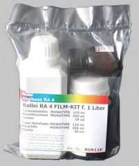
·
RA4 printing chemicals (i use a Rollei Digibase
3 part kit)
·
RA4 paper (such as Kodak Supra Endura or Fuji
Crystal Archive)
·
Enlarger (preferably with inbuilt colour filters
– failing that you will need to buy some colour filters)
·
Jobo rotary processor with print drum/developing
trays
·
Kodak viewing filters (not necessary but they
come in handy)
·
Bottles/graduates/thermometers etc
Step 1 - Chemistry
Ok, you’ve got your
gear together. The first thing you need
to do is fill your Jobo with water and get it heated up to 37.8 degrees, just
like your C41 film. While that’s heating
up let’s get our chemicals mixed. The
Rollei RA4 kit is inexpensive, lasts ages and gives good results:
It comes in 3 parts –
starter, developer and bleach-fix (blix).
On each bottle is mixing instructions to make 1 litre of working
solution. Now, when i am printing i only
like to make few prints at a time. If i
mix up a litre of working solution it is going to expire long before i use it
up. I like to split my chemicals down into
smaller batches so i can do five or so prints at a time. The Jobo drum i use requires 120ml of
solution to process the print properly.
So if i divide the mixing instructions by 8 i can get 125ml of working
solution per batch. A bit of maths is
involved but it’s worth it so you don’t waste any chemical.
So, take your mixing
instructions, divide by 8 and then you will have your 125ml batch for your
first run. What isn’t included is a stop
bath to go between developer and blix.
You can use water but i prefer using a black and white stop bath (in
this case Ilfostop). Mix up 125ml of
stop and add it to a clearly labelled bottle.
Put this bottle as well as your developer and blix bottles in your Jobo
both and leave them to get to temperature.
When using a Jobo
patience is key. All too often when i
first started home processing film i would only leave my Jobo for twenty
minutes or so and that just isn’t long enough for it to get heated up to a
level temperature. You need to leave
your Jobo for an hour minimum.
Step 2 – The Darkroom
While your chemicals
are heating up it’s time to head into the darkroom. Clean your negative and holder in the usual
way and load them into your enlarger, get your box of paper out and ready (but don’t
open it). If you are using
under-enlarger colour filters get them ready.
Take your Jobo drum, remove the top section and look inside. You will notice the drum has a cross section
that looks like this:

One deep ridge at
the top, 3 at the bottom. Make sure
these ridges line up with the corresponding ridges on the drum base or you will
struggle to load your paper. If this is
your first time printing RA4 you’re going to need to put some practice in here
as you will be leading the paper into the drum...in the dark! That’s right – no safelight allowed when it
comes to colour! That means you are
going to be fumbling about blindly – if you haven’t rehearsed that’s going to
be tricky! So, grab and old print and
your drum and have a few practice runs loading.
For this tutorial let’s say we are printing 8 x 10. Take your paper (use an old print) and bend
it gently lengthways into a semicircle, making sure you don’t fold or crease
the print. Imagine putting a poster into
one of those long cardboard tube, that’s the motion were going for. Make sure that the emulsion side is facing
into the print, not the drum wall otherwise you wont get a good
development. Shut your eyes and feel for
the top ridge with your fingers. Align
the long side of the print along this ridge and then feel for the other length
of the paper. Gently push this paper
into the wall of the Jobo drum and you will feel the edge hit the left hand of
the three ridges. Your print should now
be nice and secure. If it feels loose
have a grope around, you may have aligned it with the bottom or right
ridge. Open your eyes and take a look,
if your print is sandwiched between the top and left ridges then well done
you! If not then keep practicing! It may take some time but soon this action
will become second nature.
So, you’re now
competent at loading your drum.
Time to setup
for a test strip.
Open your lens wide
and focus your image (see my
black and white printing tutorial).
If you
look on your box of paper you will be a suggested filter pack.
Dial in the settings either using your
built-in filters or your under-lens filters (usually it’s around 40 magenta 50
yellow – written as 40M 50Y).
Set the
f-stop you want to print at on your enlarger lens.
Now, lay your paper and drum within easy
reach and turn off all room lights and safelights.
Wait a minute or so for your eyes to
adjust.
If you can see light block it
out as it WILL affect your print.
Once
your room is fully dark find your box of paper and take out a sheet.
Feel for the side with the emulsion on (if
glossy it should be obvious, if matt it normally has a slightly rougher texture
than the paper backing).
Put your paper
into you enlarger easel and grab your card to run a test strip (card is used to
sequentially uncover a section of paper so you have varying exposures on one
sheet – again, see my
black and white printing tutorial).
RA4 printing requires much shorter exposure
times than black and white so running a strip from 0 to 10 seconds should be
more than adequate.
Once your test strip
is done, find your print drum and load the paper just as you previously
practiced.
Put the lid on, make sure
your paper box is closed and then fumble for the light switch!
Now it’s time for...
Step 3 – Processing
Your chemicals
should now be nice and warm at 37.8 degrees Celsius so it’s time to get
processing. We’ll start with a prewash, follow
that with the developing and stop, then rinse again, blix and final rinse. The whole process takes just over 5 minutes
so it’s relatively quick. Processing
times are as follows:
Prewash:
30s
Develop:
45s
Stop:
30s
Rinse: 30s
Blix:
45s
Final
Rinse: 1:30s (change of water after 45s)
If you develop your
own film then you will be used to the process, it’s very similar – just shorter. After your processing is complete take a deep
breath and remove the lid of your drum. Peel
the print away from the drum wall and you should have a test strip, much like
this:
You will notice that
your print has blue shadows. As always,
prints are best evaluated when dry so grab a hair dryer and blast it. The good thing about RA4 paper is that it
dries rapidly. Once your print is touch
dry your shadows should have lost the blue and gone black.
Step 4 – Evaluating the print
You will likely see
a strong colour cast, probably magenta.
Ignore that for now – we want to get our exposure correct first. Look over your print and see which exposure
gives you good detail in both highlights and midtones. It all depends on what you want your final
print to look like of course. Once you
have chosen your exposure time make a note of it. Leave your print and head back to the
darkroom. Dial your chosen time into
your enlarger and follow the previous steps to make a straight print at your
chosen time. Process as usual and dry it
out.
Look at the print
closely, still ignoring the colour cast.
Is the exposure correct? Does it
have good detail in critical places? If
you’re not happy with it go back and make a new print with a different
exposure, be it longer or shorter, until you’re happy.
Step 5 – Altering the Cast
This is the first print i came up with from my
test strip. As you can see it is too
dark and too magenta:
We will now use
filtration to add or cancel colour to the print. This is where viewing filters come in handy:
We can look through
the viewing filters at our print and see how it changes the colour. For example, the above print is too
magenta. The opposite of magenta is
green, so if we look at the print through the green viewing filter we will see
the magenta cast reduce. Each viewing
filter has 3 windows with varying strengths of colour. This helps to narrow down the filtration you
will need to get a natural coloured print.
If you don’t have
any viewing filters then that is no problem, it is still relatively simple to
make adjustments. The general rule is
add/subtract 5cc (colour filtration is measured in cc) for a small adjustment,
10cc for a moderate adjustment, and 20cc for a large adjustment. The
most important thing to remember is that to reduce a colour you must increase
filtration. Remember that! In this example we want to reduce the magenta
so we would add magenta filtration. I
made another print and added 40cc of magenta (a drastic change) so you can see
what happens:

We end up with a
very green print indeed! Clearly too
drastic a change. I reduced the magenta
filtration by 20cc (so +20cc from the original) and added 5cc of yellow to
cancel out a slight blue cast i still had in the shadows. I also decreased exposure so as to bring out
more detail in the shadow area beneath the window. This sacrificed some colour and detail in the
trees and sky outside the window, but it made the print feel more natural
overall:
The best thing now
is that this filtration can be used throughout the rest your roll of film. When you try another frame from your negative
you filtration should be in the ballpark area.
You may have to make a few small adjustments depending on your print,
but the filtration should be pretty close so make sure you keep a written
record of it.
Summary
So that is pretty
much the process. A basic tutorial but
it gives you everything you need to get going in RA4 printing. I have described the procedure step by step
once you get accustomed to the process you will alter exposure and filtration
as you go. It is also possible to dodge
and burn colour prints, and even alter filtration whilst dodging and burning so
you can alter the colour of one part of the print. But to be honest it’s a huge pain. My exposure for my final print above was just
over 2 seconds. Imagine trying to dodge
and burn in a fraction of a second! I
suppose if you are printing on much bigger paper like 16 x 20 then your
exposure would be longer which would help, but in all honesty I haven’t needed
to dodge or burn a colour print yet which is a relief!
There is a great
sense of achievement when you finally get the print that you want. Although long-winded and often frustrating,
colour printing is a rewarding process which I urge you all to try at least
once in your lives! Happy printing!