Showing posts with label burning. Show all posts

Thursday, 23 January 2014

Eddie Returns and Brings His Friends


  Last year I went on holiday with Jess and some pals to Loch Awe in Scotland.  We stayed in a lovely cabin by the lake and had a thoroughly good time.  We decided to go again this year so we eventually picked a week and I booked the cabin.  

  I fancied some new reading material for while I was away so I decided to have a search for some new darkroom/photography books.  I already have a couple of books, Creative Elements by Eddie Ephraums, The Negative by Ansel Adams, The Master Photographers Lith Printing Course and The Master Photographers Toning Book - both by Tim Rudman; but let’s face it, extra darkroom books are never going to be a burden.  So I logged onto Amazon and had a look around.  There were plenty to choose from but I settled on three, all of which are very very good…

Gradient Light – Eddie Ephraums
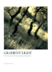
 

  Yes, it turns out that Eddie has another book!  Much like Creative Elements Eddie discusses each image in depth from in-camera capture to final print, providing dodging and burning charts and composition notes.  Then he goes on to talk about procedures i.e. flashing & fogging, dodging & burning, fixing and washing etc.  The thing about this book is that it is entirely focused on using variable contrast (VC) paper.  So Eddie explains how to split grade print and how to use different grades to dodge and burn different parts of the print.  

  I got this book in used but good condition for £1.74. £1.74!!  It’s worth it just for that but it really is a useful and informative book.

Black & White Photographic Printing Workshop - Larry Bartlett 
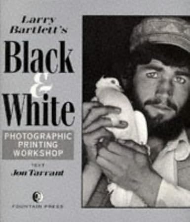


  I bought this book on a bit of a whim and it turned out to be a winner.  As usual in these types of books Larry talks for a little about paper types, processing methods etc but then he goes through his printing procedure for a selection of images.  He basically goes through exactly what he did from the starting negative to the final print - dodging, burning, grade choice etc.  The thing i like about this book is that, even though the pictures aren't really my style (i rarely take portraits), he really shows what can be done with dodging and burning, be that whitening eyes using plasticine on wire, manipulating the tones of background walls to add mood and atmosphere to an image, or subtly changing tonality in small parts of an image to add balance.

  This book i got for, wait for it, 1p!!! 1 tiny, measly, piffling pence!  Worth it?  Yes!!  If you don't have a copy go out and buy it immediately!

Darkroom Dynamics: A Guide To Creative Darkroom Techniques - Jim Stone


  This book is probably my favourite of the three.  I am attracted more to alternative processes than straight up silver gelatin prints (although i still have lots of love for a straight print), i think that is why i do so much lith printing.  Not strictly speaking an alternative process but i love the gritty and different nature of the prints you get with lith.  I think that's why i love this book so much, Stone goes into depth about ways of expanding your darkroom skills and creativity.  He discusses the Sabattier effect, photograms, enlarged photograms, multiple printing, hand colouring, polaroid manipulation and so on.  Have you ever considered putting drops of oil onto pieces of glass, putting them  in your enlarger and making an abstract photogram?  Thought not!  

  This book just makes a really interesting read, and at £1.93 you can't go wrong really.  I can't wait to try some of the processes out.

  On a supply run to the nearest built up area to us (Oban) i decided to pop into a charity shop, and lo, i found...

Infrared Photography Handbook - Laurie White

   I haven't had chance to have a good read of this yet but i'm looking forward to it.  It seems to go into plenty of detail abut using infrared film and how to get the best out of it.  Obviously it doesn't cover more recent films like Efke or Rollei infrared but the principles learned still apply.  Alright for a few quid from a charity shop.


  So, all in all a good haul.  Remember you'll need to pay £2 or so for postage costs, but for books this good that's a paltry sum to pay.  I haven't even read them all properly yet, just skimmed some interesting-looking bits but i plan on sitting down and having a good trawl through soon, i recommend you do the same.

  In the meantime i'll be working on some prints from the negative i shot whilst away (if Jess should ever give me the precious gift of free time that is) and scanning some polaroids i took.  See you soon.

Wednesday, 29 May 2013

How To: Make a Black & White Print Part IV - Dodging & Burning


  Before i got a darkroom dodging and burning confused the hell out of me!  It’s one of those tools that Photoshop just makes overly complicated when it really is so simple.  Dodging and burning are simple tools used by darkroom workers the get the most out of their negatives and once mastered become second nature.  They can be used to simply balance out a print or they can be used creatively t change the mood of a print entirely.

  You don’t need any special tools to do it.  In this this article i showed how you can make your own tools for a meagre sum.  Sometimes all you need is a rectangular piece of cardboard, sometimes a more complicated shape, 

  First off – what is it?  Well think about the light from your enlarger hitting your paper for a second.  If you were to block its path then less light would hit the paper ergo your print would be lighter, if you were to add extra light then your print would be darker.  That’s the basic principle of dodging and burning – blocking light is a dodge, adding light is a burn. 

  When dodging and burning it’s important to make sure that you keep your card/tool moving.  Why?  If you keep it still then once your print is developed you will see the outline of it on your paper which is obviously no good!  By keeping the tool moving you reduce the edge effect it produces.  This is also effected by how close you hold your tool to the paper.  Turn your enlarger on and try moving your tool up and down in the light path.  You’ll note that the closer the tool is to your print, the sharper its edges are and the smaller the area it covers; the closer to your light source the more blurred the edges and the larger the area it effects.  It’s good to practice dodging and burning on some old paper, experimenting with where you place your tool in the light path and how much you move it.  As with many things in the darkroom it takes practice to get used to.

Simple Dodging & Burning

  Let’s now look at a few practical examples of using dodging and burning from the simple to the complex.

  We'll take this print as our first example:

   To be honest it's a scan from a negative but we can still apply the principles.  There is a good overall balance across the image but two areas could use a little extra work - the floor where the sun is coming in is too bright and the roof directly above is too dark.  The floor needs a burn and the roof needs a dodge.  Look at the test strip you made when you created your print - find where you choose your base exposure and then look either side for which time gives you the best exposure for the roof and floor.  

  Let's say for example that my base exposure for this print was 18 seconds.  I look at my test strip and estimate that 22 seconds will give me the best exposure for the floor, while 15 seconds gives me the exposure i want on the roof.  i prepare my tools (probably a disc on a wire for the roof and a piece of card with a hole in for the floor) and set my enlarger running for 18 seconds.  When 3 seconds remain i place my tool in the path of the light so that it blocks off the roof area i want to dodge and keep it in constant motion.  Next i set my enlarger to run for and extra 4 seconds so that i can burn in the floor.  I set my enlarger running and let the light pass through the hole in the card onto the floor.  Develop the print and voila!  

  Let's now take a look at this print.  It's not the best print in the world but it will demonstrate dodging and burning nicely.  When i produced a flat print from one base exposure there were a few areas which needed attention.  Firstly, the grassy floor was too light, secondly the dark tree area in the top right was too light and blended too much with the tree in the foreground.  Both of these areas clearly needed burning in.  For the floor the long edge of a piece of card was perfect.  I dialed in a few extra seconds on the enlarger and used the card to shade the rest of the print - keeping it in constant motion and holding it about halfway between the paper and the enlarger, thereby making sure the edge of the card wasn't too clearly defined.  Next i did the same for the top right area of the print but used a flexible placemat which i could fold into a nice "u" shape.  These burns enabled me to darken the areas of the print that were taking attention away from the main subject.

Let's Get More Complex

  So far we have looked at using simple dodging and burning to balance out a print and keep focus on the main subject.  But as i mentioned earlier, dodging and burning can also be used creatively to change to mood of a print entirely.  This is where your personality comes into play.  If we gave the same negative to ten different people you would get 10 different prints because each individual would have a different idea of how they wanted to present the image.  Dodging and burning allow you to get onto paper what you saw in your head at the time of camera exposure.  Let's take my latest print as an example:


  Obviously that is not what the scene originally looked like when i tripped the shutter.  A straight print from this negative resulted in a very flat print.  The sky was very pale grey with little cloud definition, the grassy foreground was a uniform mid grey, and the sky beneath the clouds just melted into the horizon.  The get to from this flat print to the final print i saw in my mind when i exposed the film was going to take a lot of work. 

  I set my enlarger filters at grade 3 which gave me the contrast i wanted on the wood and i chose my base exposure time of 18 seconds (for an 8 x 8 print).  I used the test strips i had created to determine the exposures i wanted for the rest of the image and planned out my dodges and burns.  It is good to write down the dodges and burns you plan out both for future reference and ease of workflow while you are printing.  Here's a copy of my notes on which you can see my dodging and burning map: 

   You'll note that the dodges and burns are expressed in terms of f-stops not seconds.  That's because i have recently adopted the f-stop method of printing (more on that later).  For the sake of continuity i will talk about these dodge and burns in terms of seconds.

  The first box shows i dodged the sky.  This is because i wanted whiter clouds on a dark sky in my final print.  So, i used the edge of a piece of card to move gently up and down the sky dodging it for 9 seconds.  Next i turned my attention to the foreground.  I wanted that to be dark, moving the viewers eye towards the centre of the frame.  I used my trusty flexible placemat in a "u" shape again to add 4 seconds extra light to the right side and 8 seconds to the left (this balanced it out as in the flat print the left side was much lighter).  Next i added 18 more seconds to the very top of the sky which would significantly darken it and start to create a nice graded effect.  Then i did an edge burn all the way around the print, 4 seconds on each edge.  This slightly darkens all the edges which i feel adds a nice balance to a print and keeps the eye focused on the main subject matter.

  Now, we come to something we haven't mentioned yet.  Multigrade dodging and burning.  If you remember the article where we discussed split grade printing we talked about how grade 00 and 0 are very low contrast and so only really affect the highlights of an image.  On the reverse, grades 4 1/2 and 5 are very high contrast and so only really affect the shadows.  We can use this principle when it comes to dodging and burning.  If we have areas in our print we want to darken but want to preserve shadow detail we can use a soft grade.  This will darken highlights but leave your shadows untouched.  Likewise if we have an area in our print we want to darken without affecting our highlights we can use a hard grade.

  In the example of the print we are discussing i switched from grade 3 to grade 0.  I then used a piece of card with a thin rectangle cut out to burn in a little highlight detail of the pale grass just below the horizon.  On the flat print there was very little detail in this grass and i wanted to bring some of that back.  Had i merely added more time to the base exposure this would have effected the rest of the print.  Burning in at grade 0 allowed me to preserve the rest of the print as i wanted it and bring back some of that highlight detail.

  Next i switched to grade 4 1/2 and burnt in the sky.  This would leave my clouds unaffected but add greater density to the sky.  This burn combined with the previous dodging and burning i had done created a nice gradational effect to the sky but preserved cloud detail.

  As can be seen from my notes i did a little local bleaching and then toned the print - more on that at a later date im sure!

  So, hopefully that's helped some of you out with expanding your darkroom experience.  Have fun printing and as always feel free to get in touch with any questions.