
Saturday, 29 November 2014
Website Update
Hi everyone. Just a quick update - the new website at www.twelvesmallsquares.com has been up and running for a month or two now and it's going great. I appear to be getting good traffic and people seem to be reading my blog which is always nice. Hopefully some (well, hopefully all) of you subscribed to this blog have moved over to follow the new site as that's where i will be posting from now on. Anyway, hope you are all well and enjoy your shooting & printing.
Saturday, 4 October 2014
New Website!
It is with great joy that i have launched www.twelvesmallsquares.com, a site which has galleries for my work and contains a better blog platform that blogger. Itis likely that all my future blog posts will be on the new site, i am going to see how it oes over the coming weeks. I would like to thanks everyone who has supported this blog since its launch a few eyars ago. I hope that you continue to follow me over on the new website where i will continue to upload tutorials and article exlaining how i make my prints. I really appreciate all the feedback i have had on my articles and prints and i hope you have found my tutorials useful. I will be keeping this blog open for people's reference and will transfer many of the articles onto my new site over the coming months.
Thanks to you all for your support!
Thanks to you all for your support!
Saturday, 27 September 2014
Where is Dave?!
I'm acutely aware that i haven't updated this blog in (let me check....) 2 months! You may think this is due to laziness, busyness or other such issues but i'm afraid it's not. I have in fact been building a website for my photography. The good news is it is almost done so i can get back to printing and writing tutorials/blogging. The new site does have a blog function so i am currently deliberating whether to maintain this blog or just start new on my new site. I have already transferred some of the tutorials from here onto the new site in preparation for it's launch. I will be moving a lot of the articles over to, especially the ones where i explain how i made certain prints because they seem to go down well with people. I will, of course, keep you all informed as to whether i will be maintaining this blog or using my new one, but in the meantime please have patience whilst i get this site built and launched.
Thanks all for coming back here every now and then to have a read, i really do appreciate it so much and it's nice to read comments from you all about my articles. Until we speak again, happy printing!
Thanks all for coming back here every now and then to have a read, i really do appreciate it so much and it's nice to read comments from you all about my articles. Until we speak again, happy printing!
Wednesday, 30 July 2014
Fortune
I have had both good and bad fortune lately. I thought things were really looking up when i found this stash of photo paper ridiculously cheap (i won't tell you how much i got it for because you will hate me forever and never read this blog again). I saw an advert that someone was getting rid of some darkroom gear so i message them to see if they had any paper. They said they had a few odds and ends so i took a punt and we arranged a price. When the package arrived my head nearly exploded! Inside was an almost full pack of 8x10 Fotospeed Lith paper, a pack of Oriental Seagull, a few packs of Ilford MGIV RC VC, a pack of Kentmere Fineprint VC, some Ilford MG FB WT in 9.5x12 and 12x16, a pretty full pack of Kentmere Art Document, Some Foma papers in 12x16 and a full pack of 16x20 and some Fotospeed Fotolinen which i haven't been able to find much out about yet. And on top of that they sent me some unused Moersch Easylith! What an absolutely fantastic bundle to get in the post!
 Naturally i got into the darkroom as soon as i could and that is when misfortune struck. I decided to do some lith and try out some of these new papers. I have used Fotospeed Lith and Art Document before but i tried some again (after all, everyone loves 9.5x12, right), and i also tried some of the seagull as i believe it is great for lith. Unfortunately none of the prints turned out particularly well. I think i chose the wrong negatives and they came out looking dull. But, on the bright side at least i learned how the papers act in lith so i can know what results to expect next time.


 The Nab shot is from my recent trip to the east coat, and the one of the boulder is from an old negative i dug out - i am thinking both of these probably deserve a bit of time trying to get a good fine print out of. I have struggled with the nab shot in the past but i put that down to being in a 'funny mood'. Perhaps another session in the darkroom will reveal if i can make anything of it. The boulder shot has great detail in the sky so i may try and make a moody print out of it with lots of lovely cloud contrast. As for the castle shot, i found that on a recent walk with the dog and it would make a great print except for the face that the development messed up. I'm not sure if you can make it out but there are loads of white dots all over the print. For some reason i rated Ilford Pan F+ at 25iso and in Rodinal that doesn't work out too well. Looks like i will have to return there with some FP4+ and re-shoot.
I haven't really done much else lately. I have been toying with doing some zone system testing to determine the best ISO and development times for my setup. It is something i should have done ages ago but, as you should know by now, i am somewhat lazy and it feels like i'm wasting film (even though i know i'm not). No doubt i will write a tutorial all about it (if it is successful). I really do need to get better at getting work done and getting this blog updated more regularly.
I haven't really done much else lately. I have been toying with doing some zone system testing to determine the best ISO and development times for my setup. It is something i should have done ages ago but, as you should know by now, i am somewhat lazy and it feels like i'm wasting film (even though i know i'm not). No doubt i will write a tutorial all about it (if it is successful). I really do need to get better at getting work done and getting this blog updated more regularly.
Monday, 14 July 2014
The Power of Selenium
I've spoken many times on this blog of how much i enjoy working a negative until i get the final print that i want. I love working out the dodging and burning for different areas of the print and thinking about the toning i want to do to complete it. That being said, this print was an absolute killer. Once again it is from my recent holiday away to the eats cast of England to enjoy the pleasant life of a fishing village for a week. I have been here many times before and fancied some new spots to shoot so i had a quick look around online before i headed out. A little bit of research revealed a somewhat hidden bay on the coast complete with rock shelves and nabs (a nab is an outcrop of rock which the sea has not eroded - think stack). Perfect! We ended up going there for a day midweek and had a fantastic time walking the dog and relaxing on he sand and rocks. Of course, i had my Bronica kit with me and was going a bit trigger happy. I took this shot low to the ground with a nice shapely rock in the foreground and a distant nab and cliff in the background. The sky seemed good so marvelous, i could burn that in as much as need be upon my return to the darkroom.
After i developed etc i setup a flat print (after determining the best overall exposure using split grade test strips) i got a flat print exposure. And it looked rubbish. So, off i went exploring my dodging and burning options - sheet after sheet after sheet after sheet of paper was used (i was using Slavich Unibrom for it's cold tone and nice heavy weight). I got a print i was semi happy with and decided to tone (after a wash of course). I copper toned for a short period then put it into selenium - after a few minutes large white spots started to appear (this is where we learn to selenium tone before copper) so i scrapped it, deciding it didn't look right anyway.

No amount of dodging and burning that i did made the print look right. I wanted something dark and i just wasn't getting it. Perhaps i'm just not at the skill level to do that kind of print yet - hopefully one day i will be. It's prints like these that really test me!
After hours of trying and eventually running out of Unibrom i knew it wasn't happening - i just couldn't get any "pop" out of the print. I decided to clear my mind and approach it from a lith point of view. Sometimes, if i'm honest, lith feels like a bit of a cop-out. I suppose that's because i'm not spending hours configuring dodging and burning charts, i'm just picking an exposure and slapping some paper in a tray. There is more skill to it than that, and there's nothing wrong with dodging and burning for lith - a fact i had to reassuring myself with.
Now one of mankind's oldest questions - which paper to use. After much deliberation i decided to go for Fotospeed Lith paper as i knew it would give me a dark feel and suitable colouring. So, i picked my exposure and developed until the sky had good detail. After snatching, fixing and washing i was left with this:
 Good, i thought, but not quite there. The shadows are a bit...green..! As is usual with my lith prints i like to see how they react to selenium toner. In this instance i chose a dilution of 1:5 as i knew it would give more of a colour change than a weaker ratio. I popped the print into the tray and it went nuclear! The shadows got absolutely obliterated, the sky darkened dramatically and almost all detail was lost in the foreground rock. I felt crushed - all that hard work wasted. I decided to let it dry and think about my next step.
After a few days of moping about and being busy with work i went back to look through my prints and you know what - i decided i liked the final print i got. I was suitably dark and it was moody. It probably isn't going to go down in history as one of my greatest prints but i like it so i decided to leave it there and move on to another negative. But then again - looking at the above photo of my pre-toned print, i'm liking that as well...

One thing we learn - never underestimate the power of selenium!
After i developed etc i setup a flat print (after determining the best overall exposure using split grade test strips) i got a flat print exposure. And it looked rubbish. So, off i went exploring my dodging and burning options - sheet after sheet after sheet after sheet of paper was used (i was using Slavich Unibrom for it's cold tone and nice heavy weight). I got a print i was semi happy with and decided to tone (after a wash of course). I copper toned for a short period then put it into selenium - after a few minutes large white spots started to appear (this is where we learn to selenium tone before copper) so i scrapped it, deciding it didn't look right anyway.
No amount of dodging and burning that i did made the print look right. I wanted something dark and i just wasn't getting it. Perhaps i'm just not at the skill level to do that kind of print yet - hopefully one day i will be. It's prints like these that really test me!
 |
| This is the best i got alas. |
Now one of mankind's oldest questions - which paper to use. After much deliberation i decided to go for Fotospeed Lith paper as i knew it would give me a dark feel and suitable colouring. So, i picked my exposure and developed until the sky had good detail. After snatching, fixing and washing i was left with this:
After a few days of moping about and being busy with work i went back to look through my prints and you know what - i decided i liked the final print i got. I was suitably dark and it was moody. It probably isn't going to go down in history as one of my greatest prints but i like it so i decided to leave it there and move on to another negative. But then again - looking at the above photo of my pre-toned print, i'm liking that as well...
One thing we learn - never underestimate the power of selenium!
Sunday, 13 July 2014
Keep on Rolling
Rather excitingly i have a new paper to use for lith - Kodak Polycontrast III.
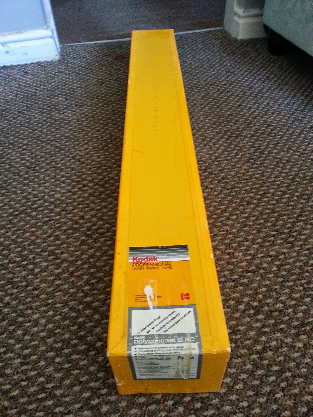

I found it on a classified listing and as you can see - it's a big roll! I haven't used paper on a roll before but £10 for this 40inch wide, 100ft long paper seemed too good an opportunity to miss! I'm hoping to get into the shed this weekend (if Jess let's me - the sun makes her want to go out and do things) and give it a try. A quick dip into the internet has revealed that it is indeed lithable so i'm thinking of either buying or making some huge trays and making some mega lith prints! I will, of course, keep you posted on how it goes.
I found it on a classified listing and as you can see - it's a big roll! I haven't used paper on a roll before but £10 for this 40inch wide, 100ft long paper seemed too good an opportunity to miss! I'm hoping to get into the shed this weekend (if Jess let's me - the sun makes her want to go out and do things) and give it a try. A quick dip into the internet has revealed that it is indeed lithable so i'm thinking of either buying or making some huge trays and making some mega lith prints! I will, of course, keep you posted on how it goes.
Monday, 16 June 2014
A Break From the Norm
By now you're probably fed up of seeing me post landscape after landscape. I'm sorry but that's pretty much all i've been shooting lately. Not even a shipwreck has crossed my path in the last couple of rolls i've shot. I did, however, shoot a test roll when my wife got her new Pentax 67 (yes, i have converted her from digital - jackpot)! There was one frame on it that i decided would potentially look good lithed.
So, i loaded up the enlarger, focused, chose some ancient Foma Neobrom 211N paper and set about making a test strip. Imagine my surprise when the print actually developed well. This paper is old. Really old. It's in a paper packet and even the lightproof sleeve is paper! Surprising, then that it developed so well. In fact, it developed so well i decided not to lith it and just make a straight print. Fortunately the paper i had was the right grade (2 i think) and so i chose an exposure, burned each edge for 1 stop extra to provide a nice border and developed in Ethol LPD 1:4. The keen-eyed among you may note that this is a cold tone paper and i'm developing it in warm tone developer. Deliberate! The final print gave of a lovely sharp silvery tone which was a delight to behold (until i obliterated it with toner that is). As always my hand ended up reaching for the selenium toner. I gave it a few minutes in 1:5 toner until it started taking on a warm brown tone, then i slipped it into some bleach (after a wash of course) and gave it a slight sepia hit in the highlights. This resulted in the final print:
 Yes - rectangular, not square! It's not one of my greatest images but i think it's ok. Sometimes it's nice just to be able to blast out a quick print without having to go round and round sheet after sheet after sheet of paper (speaking of which - i have a post coming up soon which covers an absolute demon of a print).
So what do we learn? Sometimes it's nice to print something simple and easy to give yourself a confidence boost and to get those juices flowing again!
So, i loaded up the enlarger, focused, chose some ancient Foma Neobrom 211N paper and set about making a test strip. Imagine my surprise when the print actually developed well. This paper is old. Really old. It's in a paper packet and even the lightproof sleeve is paper! Surprising, then that it developed so well. In fact, it developed so well i decided not to lith it and just make a straight print. Fortunately the paper i had was the right grade (2 i think) and so i chose an exposure, burned each edge for 1 stop extra to provide a nice border and developed in Ethol LPD 1:4. The keen-eyed among you may note that this is a cold tone paper and i'm developing it in warm tone developer. Deliberate! The final print gave of a lovely sharp silvery tone which was a delight to behold (until i obliterated it with toner that is). As always my hand ended up reaching for the selenium toner. I gave it a few minutes in 1:5 toner until it started taking on a warm brown tone, then i slipped it into some bleach (after a wash of course) and gave it a slight sepia hit in the highlights. This resulted in the final print:
So what do we learn? Sometimes it's nice to print something simple and easy to give yourself a confidence boost and to get those juices flowing again!
Tuesday, 10 June 2014
The Thoughtful Cliff
So despite saying in my previous post that i was going to update more i haven't updated in over two weeks! Sorry! But, good news - i have made my first print from my recent holiday to the north east coast of England, and here it be:
I shot this on a very sunny day in the town of Saltburn. It is printed onto Ilford MGIV FB Warmtone paper using Ethol LPD diluted 1:4 and toned using selenium 1:9 and a bit of sepia. This is my first time using a non-neutral developer and i have to say i loved it. If you are unfamiliar with LPD it is a wonderful developer which allows you to change tonality (not contrast) using dilution e.g. use it 1:1 for cool tones and around 1:4 for warmer tones (obviously tonality will depend very much on the paper you are using too).
I'm pretty pleased with this print, i really feel like i am starting to get into a rhythm and personal style with my printing.
I made this print using the split grade printing technique, as i have done with so many others. I did a soft exposure test strip, selected the best exposure for highlights (remembering to go a bit heavy as the sepia toning i had planned would lose a little highlight detail), then i did a hard exposure test strip and selected the best exposure for that (again, taking into account the added density that selenium toning would yield). It's always good to have a good think about toning either before printing or during proofing so that you can account for any lost/added density that may result form the toners you use (that reminds me - i should really do a few tutorials covering toning). I knew with this print that i wanted a selenium/sepia split so i deliberately overexposed the highlights and very slightly underexposed the shadows.
So, after making a base print of my combined soft and hard exposures it was time to think about dodging and burning. The cliff was looking pretty blocked up so i did a bit of a burn on the soft exposure and a dodge on the hard exposure - this evened out the contrast a little whilst maintaining the "pop" of the cliff. Then i did a very slight hard exposure burn on the sky to add a little extra depth to the clouds (the use of a grad filter at the time of exposure had already helped darken the sky to a pleasing tone). Then i did a bit of an edge burn around the sides and base of the print to draw the eye into the centre (i did this on both the soft and hard exposure). I think this really works on the base of the print as if the sand was all the same mid tone the eye would be drawn off the bottom of the image.
To finish off the print i did some very very light bleaching (followed by a fix) of the cloud highlights and the band of light across the sand (i used potassium ferricyanide/potassium bromide bleach from a sepia kit diluted 1:9). This helped add a bit more "pop" to the highlights but i had to be carfeul that this combined with sepia toning would not cause any highlight detail to be lost.
After a good wash (in my newly constructed print washer) i bleached back the print until the upper midtones were just starting to be affected and then toned in standard sepia toner. After a quick wash i then transferred the print into selenium toner mixed 1:5 for a few minutes which added a nice dark purplish hue to the print. I then did a final wash and left the print to dry before scanning.
I'm really pleased with how this print turned out and i am loving Ethol LPD as a print developer. I'm going to try some coldtone papers with it soon and a stronger dilution and see what effects i can get. In the meantime i've still got plenty more frames to be printing from my trip away.
I hope some of you have found this post useful and, as always, keep printing.
I shot this on a very sunny day in the town of Saltburn. It is printed onto Ilford MGIV FB Warmtone paper using Ethol LPD diluted 1:4 and toned using selenium 1:9 and a bit of sepia. This is my first time using a non-neutral developer and i have to say i loved it. If you are unfamiliar with LPD it is a wonderful developer which allows you to change tonality (not contrast) using dilution e.g. use it 1:1 for cool tones and around 1:4 for warmer tones (obviously tonality will depend very much on the paper you are using too).
 |
| I like to think of the clouds as little thought bubbles coming out of the cliff. |
I made this print using the split grade printing technique, as i have done with so many others. I did a soft exposure test strip, selected the best exposure for highlights (remembering to go a bit heavy as the sepia toning i had planned would lose a little highlight detail), then i did a hard exposure test strip and selected the best exposure for that (again, taking into account the added density that selenium toning would yield). It's always good to have a good think about toning either before printing or during proofing so that you can account for any lost/added density that may result form the toners you use (that reminds me - i should really do a few tutorials covering toning). I knew with this print that i wanted a selenium/sepia split so i deliberately overexposed the highlights and very slightly underexposed the shadows.
So, after making a base print of my combined soft and hard exposures it was time to think about dodging and burning. The cliff was looking pretty blocked up so i did a bit of a burn on the soft exposure and a dodge on the hard exposure - this evened out the contrast a little whilst maintaining the "pop" of the cliff. Then i did a very slight hard exposure burn on the sky to add a little extra depth to the clouds (the use of a grad filter at the time of exposure had already helped darken the sky to a pleasing tone). Then i did a bit of an edge burn around the sides and base of the print to draw the eye into the centre (i did this on both the soft and hard exposure). I think this really works on the base of the print as if the sand was all the same mid tone the eye would be drawn off the bottom of the image.
To finish off the print i did some very very light bleaching (followed by a fix) of the cloud highlights and the band of light across the sand (i used potassium ferricyanide/potassium bromide bleach from a sepia kit diluted 1:9). This helped add a bit more "pop" to the highlights but i had to be carfeul that this combined with sepia toning would not cause any highlight detail to be lost.
After a good wash (in my newly constructed print washer) i bleached back the print until the upper midtones were just starting to be affected and then toned in standard sepia toner. After a quick wash i then transferred the print into selenium toner mixed 1:5 for a few minutes which added a nice dark purplish hue to the print. I then did a final wash and left the print to dry before scanning.
I'm really pleased with how this print turned out and i am loving Ethol LPD as a print developer. I'm going to try some coldtone papers with it soon and a stronger dilution and see what effects i can get. In the meantime i've still got plenty more frames to be printing from my trip away.
I hope some of you have found this post useful and, as always, keep printing.
Wednesday, 21 May 2014
How To: Make a Print Washer on a Budget
Ah the early stirs of summer, the time when a man decides to re-open his toolbox and turns his mind to possibility.
I'm tired of washing my prints in the kitchen sink. It's just too small and i can't leave it alone because the prints sink to the bottom, block the tap; the sink fills and my kitchen starts to flood. And woe betide me if i decide to print some 12 x 16 paper!

Suffering from the same problem? Lo, read on to see how you can make an inexpensive (really, it cost me about £20 in total) print washer.
First off, materials. Here's what you will need:
Step 1
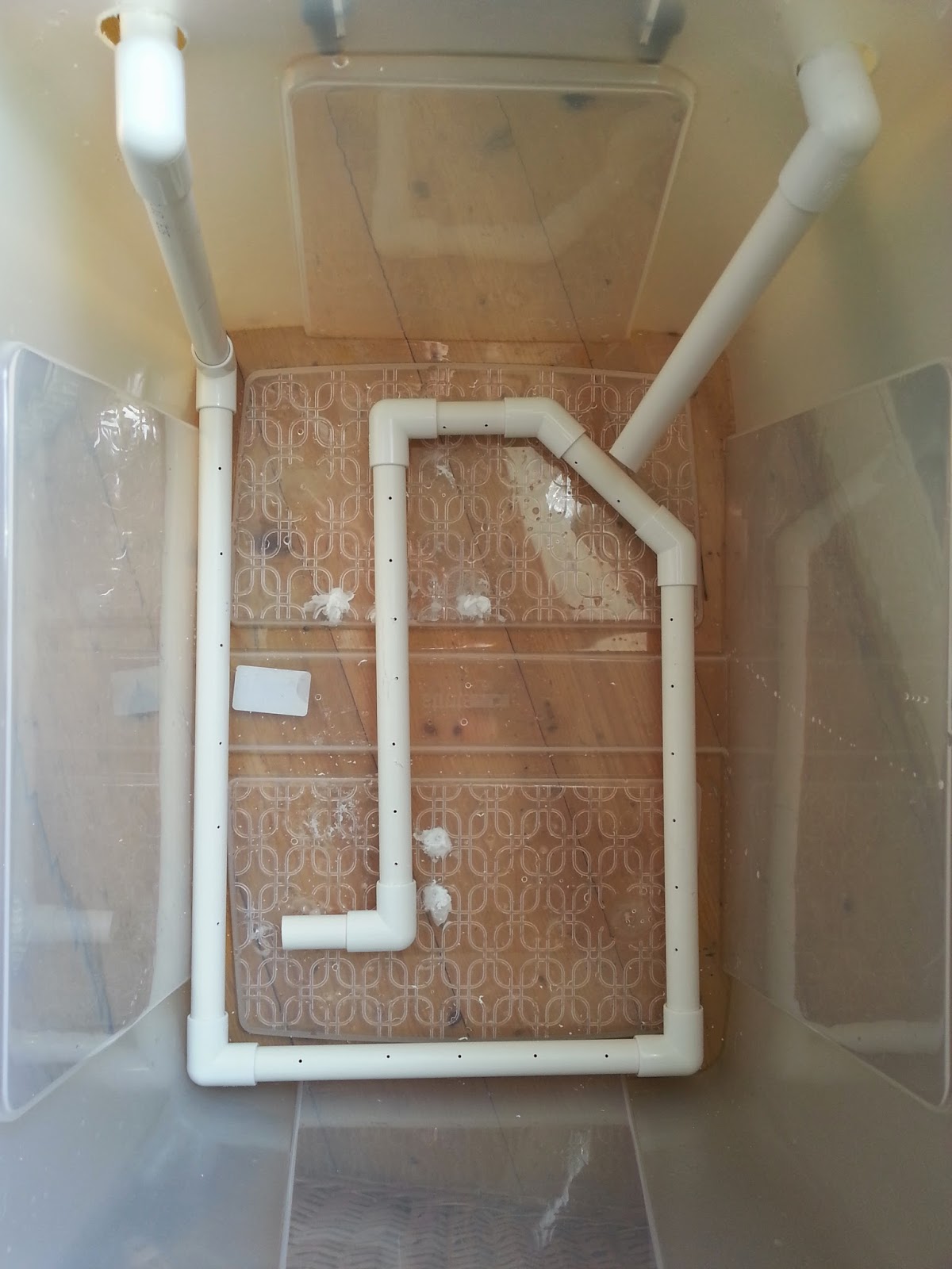
Grab your storage box (mine cost about £11 and can easily fit in 12 x 16 prints) and drill 2 holes roughly the same diameter as your waste pipe just an inch or so below the top of the container towards the left and right hand side. To do this you may have to use a hole cutter (its like a round saw which you mount on your drill). Unfortunately i didn't have a hole cutter the right size so i drilled my holes bigger.
 Step 2
Cut a small section off your pipe and feed it through the hole on your nearest side, push on a 90 degree joint (making sure you sandpaper down the edge you have just sawed) and then attach a vertical section of pipe which extends just shy of the base of the container.
 Step3
Step3
Now do exactly the same with the other hole, but this time saw the tip of the pipe at about 45 degrees to get a spout.

Step4
Now go back to your first length of piping and measure along the base of your container then cut a length of pipe just a little less than the length you measured. Smooth off the sawed edges of the pipe with sandpaper and attach it to the pipe you already have.
At this stage i tried attaching a length of hose to cover the base of the container but it didn't quite work out. Instead, keep attaching lengths of pipe and joints until you get good all round coverage along the base of the container. You dont need to cap off the last piece, this will serve as an outlet for the water which flows through the system.
Step 5
Now take your drill and (using a small drill bit) drill holes every 2 inches or so apart along the entire length of the tubing which is sat in the base of the container.
Step 6
Retreat to the bathroom (or wherever you're planning on setting up this washer) and check out your taps. If you have the kind of taps you can just push hosing onto then all well and good, connect a length of hosing from the first piece of piping onto your taps. This will mean water will flow in, down the vertical length and through the loop you have made in the base of your tub; flowing out from the last length to be picked up by the second vertical pipe which will act as a siphon.
Now, my taps are mixers which means i cant push any hosing over them. But, i can unscrew the shower and push the hosing onto the screw attachment (yay).
Step 6
Attach a length of hosing onto the second pipe and point it plugwards. Turn your tap on and you should see water spurting out through the holes you have drilled and the container will start to fill.
 You should see some good agitation in the water as the container starts to fill (which is exciting isn't it).
Step 7
Now, remember i drilled my holes for the pipe inlets bigger than the pipe? I'm going to need to seal that up. Take some plastic (e.g. from a bottle) and cut out a square which more than covers the holes you cut. Cut out a hole as close to the diameter of the pipe as possible and use a glue gun or some silicon to attach the plastic to the container, with the pipe running through it. If you don't do this then the water will just leak out of the holes you made and the second pipe won't act as a siphon.
Step 8
Once that's all done you will have to ma the tap for a while to get the right flow. Keep adjusting the amount of water coming out of the tap until what's going in matches what's heading out of the second pipe. It helps to drill a small hole in the top of the second pipe and stick a match in it. The match can be used to increase and decrease outflow. Preferably you don't want the water to flow out over the top of the container.
Step 9
The final step is to make something to support your prints. It should be easy enough to source some acrylic or perspex sheets, cut them to size, attach them to some rods and put that in the tank. As i already have a Paterson drying rack, however, i decided to use that. These are cheap and come up relatively often on Ebay.

And that's about it. It's not the most hi-tech thing ever created but it's cheap and cheerful and should wash your prints sufficiently (i can't guarantee that of course). It's certainly better than flooding my kitchen!
The way it works is that the water flows in and goes through the loop at the base. The drill holes allow water to spurt out which agitates the water, causing motion around the prints. The water picks up the fixer and, as fixer-laden water is denser than clean water, it sinks to the bottom of the container. It should then be picked up by the outflow pipe and siphoned out down the drain. Science! I haven't technically finished mine yet as i haven't sealed up the original drill holes so my siphon isn't really working but it will. IT WILL I SAY! Just for fun, here's a super-entertaining video of mine showing this mega-agitating washer in action (caution: may cause your mind to blow, it's that exciting):
So that's it. A print washer for those of us on a budget. Those hundreds of pounds you have now just saved can go on something better like film, paper, chemicals or (woe of woes) rent! As always keep printing and ill see you again soon.
I'm tired of washing my prints in the kitchen sink. It's just too small and i can't leave it alone because the prints sink to the bottom, block the tap; the sink fills and my kitchen starts to flood. And woe betide me if i decide to print some 12 x 16 paper!
Suffering from the same problem? Lo, read on to see how you can make an inexpensive (really, it cost me about £20 in total) print washer.
First off, materials. Here's what you will need:
- Plastic storage container (any size you like),
- 2 x 2 metre lengths of plastic waste pipe (any diameter you fancy),
- Some 90 degree joints that will fit your pipe (get about 8),
- Hosing/tubing (approximately 2 metres),
- Drill
- Saw
- sandpaper
- Glue gun/silicon sealant
Step 1
Grab your storage box (mine cost about £11 and can easily fit in 12 x 16 prints) and drill 2 holes roughly the same diameter as your waste pipe just an inch or so below the top of the container towards the left and right hand side. To do this you may have to use a hole cutter (its like a round saw which you mount on your drill). Unfortunately i didn't have a hole cutter the right size so i drilled my holes bigger.
Cut a small section off your pipe and feed it through the hole on your nearest side, push on a 90 degree joint (making sure you sandpaper down the edge you have just sawed) and then attach a vertical section of pipe which extends just shy of the base of the container.
Now do exactly the same with the other hole, but this time saw the tip of the pipe at about 45 degrees to get a spout.
Step4
Now go back to your first length of piping and measure along the base of your container then cut a length of pipe just a little less than the length you measured. Smooth off the sawed edges of the pipe with sandpaper and attach it to the pipe you already have.
At this stage i tried attaching a length of hose to cover the base of the container but it didn't quite work out. Instead, keep attaching lengths of pipe and joints until you get good all round coverage along the base of the container. You dont need to cap off the last piece, this will serve as an outlet for the water which flows through the system.
 |
| Not like this! |
 |
| Like this! |
Now take your drill and (using a small drill bit) drill holes every 2 inches or so apart along the entire length of the tubing which is sat in the base of the container.
Step 6
Retreat to the bathroom (or wherever you're planning on setting up this washer) and check out your taps. If you have the kind of taps you can just push hosing onto then all well and good, connect a length of hosing from the first piece of piping onto your taps. This will mean water will flow in, down the vertical length and through the loop you have made in the base of your tub; flowing out from the last length to be picked up by the second vertical pipe which will act as a siphon.
Now, my taps are mixers which means i cant push any hosing over them. But, i can unscrew the shower and push the hosing onto the screw attachment (yay).
 |
| Like so! |
Attach a length of hosing onto the second pipe and point it plugwards. Turn your tap on and you should see water spurting out through the holes you have drilled and the container will start to fill.
Step 7
Now, remember i drilled my holes for the pipe inlets bigger than the pipe? I'm going to need to seal that up. Take some plastic (e.g. from a bottle) and cut out a square which more than covers the holes you cut. Cut out a hole as close to the diameter of the pipe as possible and use a glue gun or some silicon to attach the plastic to the container, with the pipe running through it. If you don't do this then the water will just leak out of the holes you made and the second pipe won't act as a siphon.
Step 8
Once that's all done you will have to ma the tap for a while to get the right flow. Keep adjusting the amount of water coming out of the tap until what's going in matches what's heading out of the second pipe. It helps to drill a small hole in the top of the second pipe and stick a match in it. The match can be used to increase and decrease outflow. Preferably you don't want the water to flow out over the top of the container.
Step 9
The final step is to make something to support your prints. It should be easy enough to source some acrylic or perspex sheets, cut them to size, attach them to some rods and put that in the tank. As i already have a Paterson drying rack, however, i decided to use that. These are cheap and come up relatively often on Ebay.
And that's about it. It's not the most hi-tech thing ever created but it's cheap and cheerful and should wash your prints sufficiently (i can't guarantee that of course). It's certainly better than flooding my kitchen!
The way it works is that the water flows in and goes through the loop at the base. The drill holes allow water to spurt out which agitates the water, causing motion around the prints. The water picks up the fixer and, as fixer-laden water is denser than clean water, it sinks to the bottom of the container. It should then be picked up by the outflow pipe and siphoned out down the drain. Science! I haven't technically finished mine yet as i haven't sealed up the original drill holes so my siphon isn't really working but it will. IT WILL I SAY! Just for fun, here's a super-entertaining video of mine showing this mega-agitating washer in action (caution: may cause your mind to blow, it's that exciting):
So that's it. A print washer for those of us on a budget. Those hundreds of pounds you have now just saved can go on something better like film, paper, chemicals or (woe of woes) rent! As always keep printing and ill see you again soon.
Tuesday, 13 May 2014
Back on it!
I don't know what's more shocking - the fact that a) I am actually writing a blog post, or b) that I shot 3 rolls of film whilst away on holiday last week. I'm lazy, i've come to accept that now but it's not really good enough is it. I don't shoot a tremendous amount of film because i'm not one of those people who can go out and fill up a roll of film faster than a teenager can go bankrupt in Primark. I do, however, like to shoot as much as possible when the location and/or composition permits it. Hence, last week whilst away celebrating my 3 year wedding anniversary I shot 3 rolls along the eastern coast of England in the Whitby/Scarborough/Staithes area (yay for me). I have hardly shot anything lately due to a potent mix of lack of inspiration and general laziness. It's all change now though as i have got at least 6 good shots which i want to print (and we all know how I love to print). Surprisingly most of the shots are even well exposed which is pretty much a first for me, i'm terrible at metering.
Even better Jess (my loving wife in case she's reading) got me some Ilford FB Warmtone paper and something I have been coveting for some time - Ethol LPD! For those who don't know, LPD is a paper developer available in liquid or powdered form with the unique (as far as I am aware) property of being able to change tonality through dilution, i.e. a ratio of 1:1 will give a cool tone to the paper and a ratio of 1:4 warmer tones This obviously depends on the paper being used - you won't get warm tones from a cooltone paper, but you can imagine the possibilities now open to me! Thus far i have only used neutral developer on all my papers so I am looking forward to playing around with some dilutions and see how toning is affected. Needless to say I am eager to print (but then again the Lord of the Rings extended edition bluray boxset is keeping me pretty much glued to the TV this week).
As for this blog, well, i'm determined to update it more often. I have a few DIY projects in mind including making my own print washer so no doubt I will put that in a tutorial for you all to read and maybe try out for yourselves (if it's successful that is). Sorry i haven't written much lately but rest assured, i'm back on it with renewed vigour. In the meantime keep printing (or scanning if that's how you like to live your life) and watch out for some Yorkshire prints coming up on here soon.
Saturday, 22 March 2014
Finishing in the Mountains & Digging into the past
My previous post was regarding the prints i made from a roll of film i shot whilst away on holiday in Glencoe, Scotland... and so is this post! This week has been one of those wonderful weeks where Jess has had a lot on in the evenings, so i've been pretty much left to my own devices. An we all know what that means don't we - key out, gate open, electric cable in, red light on!
On the roll i shot there were two more prints i wanted to make. I may end up printing some of the other frames at some point in the future but at the moment i don't find the "subjects" particularly interesting on one of them and the other one is ever so slightly out of focus (dammit)!
I started off in my usual manner on my first print - test strips, proof prints etc but after an hour or so i couldn't seem to get a decent looking print. I knew i wanted to lith print the other two so i decided to try and lith this first one as well. I mixed up some LD20 (15A, 15B, 10 old brown and make it up to an 800ml solution). For the first print i decided to dig into my mini-stash of Orwo BN118 which is a paper i know nthing about except i have used it on a few prints previously and it tends to give a nice brown colour overall with not very much infectious development (much like Agfa Brovira which i'm a huge huge huge fan of). Previous prints i have made on this paper didn't really have many highlight tones so i was interesting to see how it would handle the sky in this shot. I did a test strip, determined the correct exposure, added 3 stops, exposed and started developing. Eventually i pulled the print, stoppped, fixed and rinsed as usual, gave it a little dunk in selenium toner (1:9) and this is what i got:
 Not the greatest print i've ever done i reckon but a good start. The paper has handled the highlights well (not that there are tonnes) and the shadows are nice and gritty. To be honest the composition and light on this shot isn't the best but not much i can do about that now is there?!
My next print was one i took on the road to Glencoe. There's a huge layby on a sweeping bend of the road which was practically made for tourists. I was there for about 45 minutes and i think at least 5 coach loads of people came and went in that time, compact cameras a-flashing. I found myself chuckling when i pondered how their images would turn out. For some reason people's holiday photos just amuse me - "here's a lovely landscape with my wife stood in front; here's an interesting statue with my daughter in front, here's a hedge with my brother in front". Bizarre how most people seem to think shots are improved by having family members stood in front of them. I think it may stem from my parents who overload on holiday photos, every single one having my mum or dad stuck right bang in the middle of the scene! Anyway - back on track! I did two exposures at this scene, one standard and one using a cheapo 10 stop filter i got off ebay/amazon (i can't quite remember). After inspecting the contact sheet i decided to print the long exposure one (seriously, the exposure was like 8 minutes or something - i'd give you an exact figure but my notebook is buried in the under-stairs cupboard and going in there is an undertaking that requires at least half a day and a hearty breakfast, neither of which i have), predominantly because the sky had a better looking shape and also because there was a huge drying mark on the standard one. I decided to use my precious precious supply of Fotospeed Lith paper for this print. This paper is long gone but i got 20 sheets on ebay months ago and i'm saving it for very special prints and this felt like one of those. In my mind i pictured something dark with emphasis put on the lake and sky. I chose an exposure accordingly and started to develop. When the time seemed right i pulled the print, processed and selenium toned in 1:9 again. This caused a boost in the blacks as usual which resulted in some slight loss of detail in the foreground landscape - i expected this though and it was what i wanted. I wanted the foreground to look almost blocked up so as to add further emphasis to the lake (which took on a lovely pale lilac type colour). Here's the final result:
 I think it works well and i like the pale pastel tones taken on by the highlights. Now if only Fotospeed would bring the lith paper back out (only 16 sheets left)! On your screen you may be seeing some brownish areas in the dark foreground, that's just come from scanning - the print wasn't entirely flat and so some light got in, a bit of a pain but i'm not going to rescan and edit it all over again - just imagine everything in the balck areas is entirely black!
For regular readers of this blog (if indeed there are any) you may pick up on the vibe that i begrudge wasting chemicals - they're expensive and i want to squeeze everything out of them that i can. Some would coll that anal, i call it thrifty! I knew that would be power for at least one more print in the lith developer so i hit the negative folder hard in search of something to print from my past. I eventually stumbled upon roll of film i shot at Whitby Abbey a few years ago on my honeymoon (7th May 2011 - a real man remembers when he got married) and realised i had never really printed from it (at that time i was still scanning all my negatives - terrible)! The whole roll was pretty much a write-off mostly due to lack of ability to not chop the tops of images off when using a Diana camera. One shot looked great though (even if it is from the exact same angle that everyone seems to take pictures of Whitby abbey from) so i decided to lith it and see what we got. I spent a few minutes pondering what paper to use (because as you should all know by now paper choice has a massive effect on final print in lith). As i was feeling somewhat devil-may-care a decided to use a sheet of my even-rarer-than-fotospeed-lith tapestry paper. This is a textured "art" paper that liths incredibly well and when put into selenium toner will give at least 3 colour splits. I have used one sheet before to create a watercolour style effect - see here for details. I decided to give it a go with this print as it was somewhat heavier on the shadows and lower midtones than i have previously lithed on this paper, i was interested to see what i would end up with. I determined exposure, processed and dipped into the selenium toner (1:9 again) and as expected colours kept changing from the shadows up through to the highlights. I kept the print in the selenium until i got a nice cool grey in the lower mids and lovely pale pastel yellows and lilacs in the tones of the sky. When using this paper previously i would paint the toner onto areas i want to alter the colours of but i thought this print looked fine as it was so i left it to dry (keeping in mind that when wet it is a yellowy colour but would dry-down to a salmon pink tone). Once dry i was pleased with how it looked:
 Again - scanning problems! Because this paper is heavily textured it wouldn't render the blacks actually black so they have the kind of look you get when you're trying to scan through dense colour film. Again, just imagine that the shadow areas are solid black!
So, a successful darkroom session from which i learnt the following things:
On the roll i shot there were two more prints i wanted to make. I may end up printing some of the other frames at some point in the future but at the moment i don't find the "subjects" particularly interesting on one of them and the other one is ever so slightly out of focus (dammit)!
I started off in my usual manner on my first print - test strips, proof prints etc but after an hour or so i couldn't seem to get a decent looking print. I knew i wanted to lith print the other two so i decided to try and lith this first one as well. I mixed up some LD20 (15A, 15B, 10 old brown and make it up to an 800ml solution). For the first print i decided to dig into my mini-stash of Orwo BN118 which is a paper i know nthing about except i have used it on a few prints previously and it tends to give a nice brown colour overall with not very much infectious development (much like Agfa Brovira which i'm a huge huge huge fan of). Previous prints i have made on this paper didn't really have many highlight tones so i was interesting to see how it would handle the sky in this shot. I did a test strip, determined the correct exposure, added 3 stops, exposed and started developing. Eventually i pulled the print, stoppped, fixed and rinsed as usual, gave it a little dunk in selenium toner (1:9) and this is what i got:

My next print was one i took on the road to Glencoe. There's a huge layby on a sweeping bend of the road which was practically made for tourists. I was there for about 45 minutes and i think at least 5 coach loads of people came and went in that time, compact cameras a-flashing. I found myself chuckling when i pondered how their images would turn out. For some reason people's holiday photos just amuse me - "here's a lovely landscape with my wife stood in front; here's an interesting statue with my daughter in front, here's a hedge with my brother in front". Bizarre how most people seem to think shots are improved by having family members stood in front of them. I think it may stem from my parents who overload on holiday photos, every single one having my mum or dad stuck right bang in the middle of the scene! Anyway - back on track! I did two exposures at this scene, one standard and one using a cheapo 10 stop filter i got off ebay/amazon (i can't quite remember). After inspecting the contact sheet i decided to print the long exposure one (seriously, the exposure was like 8 minutes or something - i'd give you an exact figure but my notebook is buried in the under-stairs cupboard and going in there is an undertaking that requires at least half a day and a hearty breakfast, neither of which i have), predominantly because the sky had a better looking shape and also because there was a huge drying mark on the standard one. I decided to use my precious precious supply of Fotospeed Lith paper for this print. This paper is long gone but i got 20 sheets on ebay months ago and i'm saving it for very special prints and this felt like one of those. In my mind i pictured something dark with emphasis put on the lake and sky. I chose an exposure accordingly and started to develop. When the time seemed right i pulled the print, processed and selenium toned in 1:9 again. This caused a boost in the blacks as usual which resulted in some slight loss of detail in the foreground landscape - i expected this though and it was what i wanted. I wanted the foreground to look almost blocked up so as to add further emphasis to the lake (which took on a lovely pale lilac type colour). Here's the final result:

For regular readers of this blog (if indeed there are any) you may pick up on the vibe that i begrudge wasting chemicals - they're expensive and i want to squeeze everything out of them that i can. Some would coll that anal, i call it thrifty! I knew that would be power for at least one more print in the lith developer so i hit the negative folder hard in search of something to print from my past. I eventually stumbled upon roll of film i shot at Whitby Abbey a few years ago on my honeymoon (7th May 2011 - a real man remembers when he got married) and realised i had never really printed from it (at that time i was still scanning all my negatives - terrible)! The whole roll was pretty much a write-off mostly due to lack of ability to not chop the tops of images off when using a Diana camera. One shot looked great though (even if it is from the exact same angle that everyone seems to take pictures of Whitby abbey from) so i decided to lith it and see what we got. I spent a few minutes pondering what paper to use (because as you should all know by now paper choice has a massive effect on final print in lith). As i was feeling somewhat devil-may-care a decided to use a sheet of my even-rarer-than-fotospeed-lith tapestry paper. This is a textured "art" paper that liths incredibly well and when put into selenium toner will give at least 3 colour splits. I have used one sheet before to create a watercolour style effect - see here for details. I decided to give it a go with this print as it was somewhat heavier on the shadows and lower midtones than i have previously lithed on this paper, i was interested to see what i would end up with. I determined exposure, processed and dipped into the selenium toner (1:9 again) and as expected colours kept changing from the shadows up through to the highlights. I kept the print in the selenium until i got a nice cool grey in the lower mids and lovely pale pastel yellows and lilacs in the tones of the sky. When using this paper previously i would paint the toner onto areas i want to alter the colours of but i thought this print looked fine as it was so i left it to dry (keeping in mind that when wet it is a yellowy colour but would dry-down to a salmon pink tone). Once dry i was pleased with how it looked:

So, a successful darkroom session from which i learnt the following things:
- I hate scanning
- Lith printing continues to rule
Monday, 24 February 2014
Starting My Glencoe Prints
As mentioned at the end of the previous post i have been working on some prints from my recent trip away to Scotland. What with Blogger being such a temperamental website i haven't been able to upload any images for ages, but now, finally, i can! I have made two prints of the roll i shot so far and i really feel like they have been a huge step forward for me in my printing. I put a lot of time and effort into realising in print form what i saw in my mind at the time of exposure. In this post i will show you how i created each print and hopefully this may give you some ideas or maybe even some inspiration.
Making these prints i really got to grips with my new(ish) f-stop timer. I'm pretty sure i used every function on there - dry down compensation, split grade mode, dodging and burning programming
So, to the first print...
Cottage in Glencoe
Over the week i was away it transpired that i only had one day midweek in which to get over to Glencoe and take some pictures. I could spend a year up there and never run out of things to shoot, it's a truly remarkable place! Unfortunately when i woke up the weather was terrible. The cloud layer was super-low and didn't really have any form, it was just a grey mush. I decided to head out anyway, sod it, it might clear up later. As i got up to Rannoch Moor i hopped in and out of the car a few times to grab a few shots and move further up the road. Jess had lovingly decided to come with me and we brought Ellie (our puppy) along too, and she loved it. I've never seen a dog run so fast and be so excited to be outside!
As we made our way down the Glen we went around a sweeping left hand bend and i saw a large smooth valley which was catching the sun nicely. I parked up in a convenient layby, grabbed my gear and started walking, waving bye to Jess as she had decided she was tired and didn't want to step foot out of the car again! It turned out i was walking through a bit of a bog but i didn't mind as clever me had remembered to wear my waterproof sock liners (get some, thank me later). I took some time setting up the shot and finally exposed the frame (which i haven't yet printed). Then just off to the left a white cottage caught my eye, it was really standing out from the murky grey of the clouds so i decided to head closer and see if it was a workable shot. I found a nice vantage point, focused, metered and then exposed.
Upon my return home i developed the film (in Rodinal of course) and left it to dry. A few days later i freed up some time and made a contact sheet. I spotted quite a few frames which i liked the look of but this one seemed to be the best on the roll so i decided to have a go at it first.
I couldn't get into the darkroom to print for a while but Jess decided to go visit a friend for the day and so i took that as a sign to go print! I haven't really had a decent chance to fully get to grips with all the functions of my recently acquired RH Designs Stopclock Pro f-stop timer. i decided to put it through it's paces today and do some split grade printing. I setup the negative in the enlarger, focused, set the contrast grade to 00 and did my soft test sheet. I used to just use offcuts of paper for making test strips but i have found that because i am doing lots of dodging and burning to my prints these days a whole sheet makes it easier to deduce times for all parts of the image. My test sheets tend to go from around 5 seconds up in 1/6 of a stop intervals, if i need anymore i will just do a new one.
 I chose the strip with a base exposure of 8.98 seconds because it gave tone to the snows on the mountain top. I knew i would want the cottage walls to be lighter but more on that later.
Next i did my grade 4 1/2 test sheet (i can't do grade 5 with the colour filters on my enlarger).
 Again i chose the 8.98 second exposure time as it gave me good, deep blacks. I was happy with the contrast overall so i turned my attention to dodging and burning. I knew i wanted to lighten the cloud somewhat and darken the foreground to really made the cottage stand out. This is where offcuts of paper come in really handy - any dodging and burning times i cannot figure out from the test sheets i made earlier i can deduce using small strips of paper placed in the relevant parts of the image.
After much trial and error i got the dodging and burning times i wanted. During the soft exposure i dodged the sky for 3/4 of a stop and the trees to the right of the cottage received a 1/3 of a stop burn. Then the right, left and bottom edges of the print received an extra 1/4 of a stop each. Then i switched to the grade 4 1/2 filter and dodged the sky 1/3 of a stop. The trees received another 1/3 of a stop burn (if you don't do the same dodging/burning on the same part of the print with both filters then you change the contrast) and the bottom edge of the print received an extra 1/3 of a stop. The right edge then received 1/6 of a stop to balance it out whilst the cloud received 1/6 of a stop burn in a series of small up and down gradations of a rectangular piece of card. This added a slight gradational effect to the sky. Finally each corner got an extra 1/6 of a stop just to add a slight vignette. This left me with this:
 I was close but the cottage wasn't quite popping enough. I brushed some dilute potassium ferricyanide/potassium bromide bleach over the cottage which lightened the highlights slightly and added extra pop. I re-fixed and then toned in selenium1:5 for 2 minutes. This gave me this print:
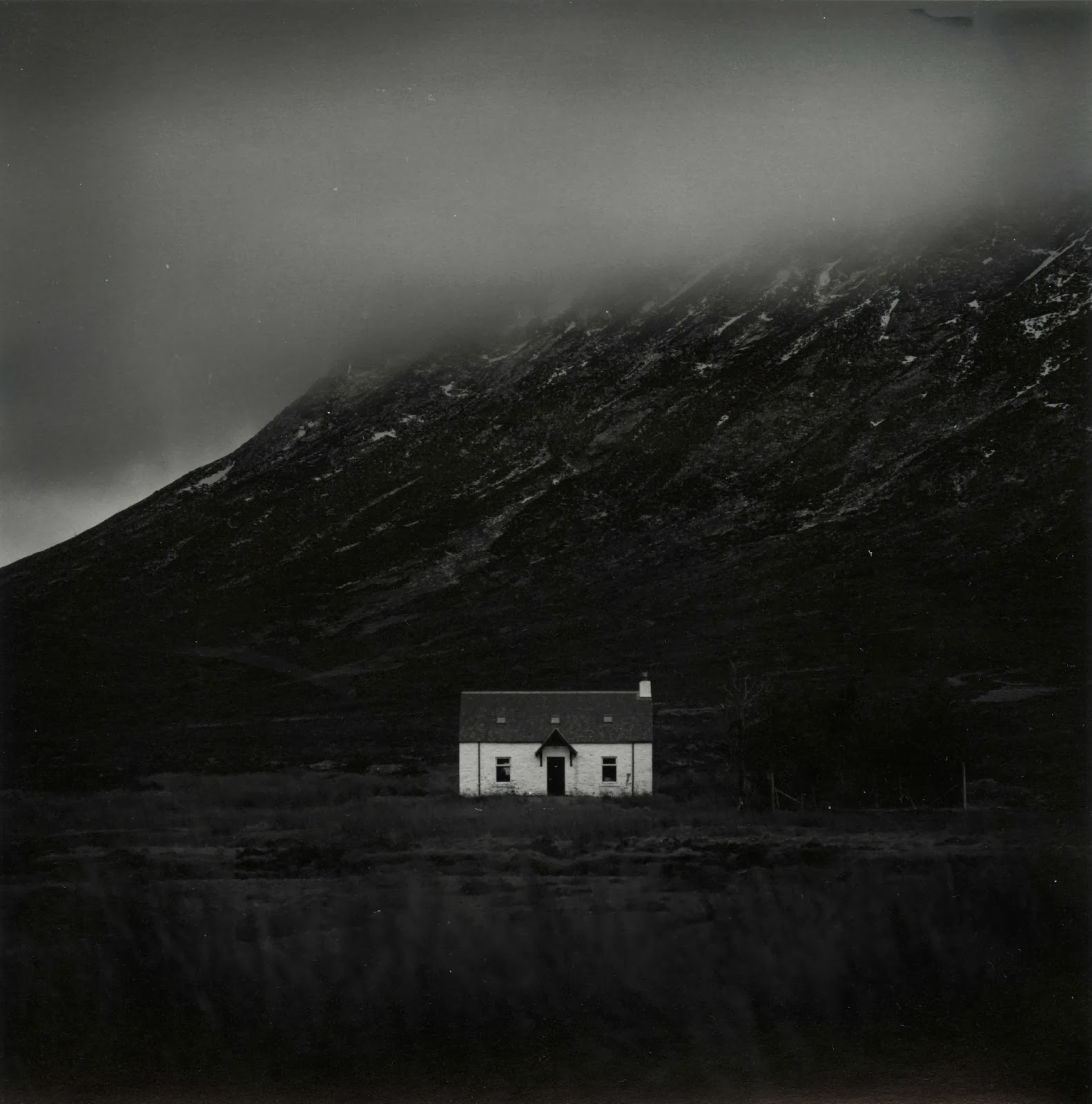 The selenium has added extra pop (I love selenium) but i wasn't quite happy with the print. I decided to go crazy and dig out the few sheets of warmtone paper i have, I felt that this print was worthy on going onto this expensive paper! I made an identical print and set the drydown compensation to 5% (drydown is the effect of fibre prints going darker when dry - a pain)! This time i fully toned in selenium (4:30). I did try pulling the print from the toner around at 2 minutes but it looked strange being a warm reddish colour all over with a grey sky on top. After all this work i was left with my final print which i think is my best print yet:

Kinlochleven Island
I decided to keep going and work on another print i thought could be good. This was taken whilst exploring around Glencoe. I went up a random road and ended up at the village of Kinlochleven. A lovely place that i'm pretty sure i could live in happily! It was raining pretty heavily when i was taking this but it was worth it as you'll see.
As before i decided to split grade print. I setup and made my soft test sheet:
 I chose a base exposure time of 4 seconds and proceeded to make my hard exposure:

For the hard exposure i chose a base exposure of 16 seconds. I made a flat sheet of the two exposures together and came up with this:

Good but it needs some work. The top left corner is a bit dark and i want the final print to be darker and more ominous. I got to work figuring out what dodging and burning was required. During the soft exposure I added and extra 1 1/2 stops to the foreground and and extra 3/4 of a stop to the right, bottom and left edges of the print. I then switched to the hard exposure and dodged the top left corner for 1/3 of a stop and dodged the mountains in the distance on the right for 1 1/6 stop to balance them with the mountains on the right. I then added 1 5/6 to the sky and 1/2 a stop to the foreground. The top half of the sky then received and extra 1 1/2, the right corner got +1 stop and the bottom left and bottom right corners received an extra 1/3 of a stop. I then locally bleached the sky directly above the island with potassium ferricyanide/potassium bromide to emphasize the light coming from there.
After a dip in selenium i got this print which is much moodier and ominous:
 I then switched to warmtone paper and made an identical print which is my final print (unfortunately when scanning i somehow cropped the very top of the print off - error):
 I learnt a lot making these two prints. Firstly, it really pays to imagine what you want your final print to look like when you are exposing in camera. Secondly, it's good to make your test strips and rough prints then rest and come back to the final print at a later date, otherwise you rush to get it all done in one session and you don't get the best print you could have done. Thirdly, never underestimate the power of bleaching. Fourthly, warmtone paper is worth every penny. Fifthly, selenium toner remains the greatest thing in the world. Sixthly, Scotland is one heck of a place! Seventhly, and perhaps most importantly - never be afraid to get your camera out when it's mirky, grey, grim and wet.
Well i hope that's been interesting for some of you who read this blog (if indeed anyone does read this blog). I hope that my experiences will help you in some way. As always if you have any questions or comments then please feel free to get in touch - i love hearing from you all about your own printing and photography and i love learning new things from you all. Happy printing!
Making these prints i really got to grips with my new(ish) f-stop timer. I'm pretty sure i used every function on there - dry down compensation, split grade mode, dodging and burning programming
So, to the first print...
Cottage in Glencoe
Over the week i was away it transpired that i only had one day midweek in which to get over to Glencoe and take some pictures. I could spend a year up there and never run out of things to shoot, it's a truly remarkable place! Unfortunately when i woke up the weather was terrible. The cloud layer was super-low and didn't really have any form, it was just a grey mush. I decided to head out anyway, sod it, it might clear up later. As i got up to Rannoch Moor i hopped in and out of the car a few times to grab a few shots and move further up the road. Jess had lovingly decided to come with me and we brought Ellie (our puppy) along too, and she loved it. I've never seen a dog run so fast and be so excited to be outside!
As we made our way down the Glen we went around a sweeping left hand bend and i saw a large smooth valley which was catching the sun nicely. I parked up in a convenient layby, grabbed my gear and started walking, waving bye to Jess as she had decided she was tired and didn't want to step foot out of the car again! It turned out i was walking through a bit of a bog but i didn't mind as clever me had remembered to wear my waterproof sock liners (get some, thank me later). I took some time setting up the shot and finally exposed the frame (which i haven't yet printed). Then just off to the left a white cottage caught my eye, it was really standing out from the murky grey of the clouds so i decided to head closer and see if it was a workable shot. I found a nice vantage point, focused, metered and then exposed.
Upon my return home i developed the film (in Rodinal of course) and left it to dry. A few days later i freed up some time and made a contact sheet. I spotted quite a few frames which i liked the look of but this one seemed to be the best on the roll so i decided to have a go at it first.
I couldn't get into the darkroom to print for a while but Jess decided to go visit a friend for the day and so i took that as a sign to go print! I haven't really had a decent chance to fully get to grips with all the functions of my recently acquired RH Designs Stopclock Pro f-stop timer. i decided to put it through it's paces today and do some split grade printing. I setup the negative in the enlarger, focused, set the contrast grade to 00 and did my soft test sheet. I used to just use offcuts of paper for making test strips but i have found that because i am doing lots of dodging and burning to my prints these days a whole sheet makes it easier to deduce times for all parts of the image. My test sheets tend to go from around 5 seconds up in 1/6 of a stop intervals, if i need anymore i will just do a new one.
Next i did my grade 4 1/2 test sheet (i can't do grade 5 with the colour filters on my enlarger).
After much trial and error i got the dodging and burning times i wanted. During the soft exposure i dodged the sky for 3/4 of a stop and the trees to the right of the cottage received a 1/3 of a stop burn. Then the right, left and bottom edges of the print received an extra 1/4 of a stop each. Then i switched to the grade 4 1/2 filter and dodged the sky 1/3 of a stop. The trees received another 1/3 of a stop burn (if you don't do the same dodging/burning on the same part of the print with both filters then you change the contrast) and the bottom edge of the print received an extra 1/3 of a stop. The right edge then received 1/6 of a stop to balance it out whilst the cloud received 1/6 of a stop burn in a series of small up and down gradations of a rectangular piece of card. This added a slight gradational effect to the sky. Finally each corner got an extra 1/6 of a stop just to add a slight vignette. This left me with this:
Kinlochleven Island
I decided to keep going and work on another print i thought could be good. This was taken whilst exploring around Glencoe. I went up a random road and ended up at the village of Kinlochleven. A lovely place that i'm pretty sure i could live in happily! It was raining pretty heavily when i was taking this but it was worth it as you'll see.
As before i decided to split grade print. I setup and made my soft test sheet:
For the hard exposure i chose a base exposure of 16 seconds. I made a flat sheet of the two exposures together and came up with this:
Good but it needs some work. The top left corner is a bit dark and i want the final print to be darker and more ominous. I got to work figuring out what dodging and burning was required. During the soft exposure I added and extra 1 1/2 stops to the foreground and and extra 3/4 of a stop to the right, bottom and left edges of the print. I then switched to the hard exposure and dodged the top left corner for 1/3 of a stop and dodged the mountains in the distance on the right for 1 1/6 stop to balance them with the mountains on the right. I then added 1 5/6 to the sky and 1/2 a stop to the foreground. The top half of the sky then received and extra 1 1/2, the right corner got +1 stop and the bottom left and bottom right corners received an extra 1/3 of a stop. I then locally bleached the sky directly above the island with potassium ferricyanide/potassium bromide to emphasize the light coming from there.
After a dip in selenium i got this print which is much moodier and ominous:
Well i hope that's been interesting for some of you who read this blog (if indeed anyone does read this blog). I hope that my experiences will help you in some way. As always if you have any questions or comments then please feel free to get in touch - i love hearing from you all about your own printing and photography and i love learning new things from you all. Happy printing!
Friday, 31 January 2014
Thankyou Eddie!
Have you ever had a
moment of pure coincidence, where you were in the right place at the right time
for something great to happen? I had one
a few months ago – it was early May and Jess and I were out celebrating our 2nd
wedding anniversary (how time has flown).
We had had an expensive month what with moving house and Jess changing
jobs so we didn’t really want to go away for a break. We decided to just have some nice time off to
relax and enjoy each others company. We
had a few outings, one of which included a shopping trip to Manchester.
Even though i’m a
manly man with a manly mans beard, i do enjoy a shopping trip. And when you get to spend it with your
beloved even better (see how i am laying on the affection – although soppy this
will earn me darkroom time at a later date).
We wandered round for hours, pottering around the usual shops, enjoying
our time together. When you live in
Preston, Manchester is like shopping heaven – which brings me to the focal
point of this tale. Manchester houses
the closest analogue camera/darkroom store to where i live, namely the Real
Camera Co (yes i am aware Calumet have a store in Manchester also, but it isn’t
in the city centre is it). Whenever i am
in the area i make a point to pop in, even if i don’t need anything. The chance for me to go into such a store is
a such a rarity that to pass it up seems foolish. No amount of googling or apugging can ever
make up for seeing cameras in the flesh.
Hasselbalds, Mamiyas, Bronicas, leicas, Graflexes etc are all lined up ready to be drooled over.
They also have a
nice little book section to peruse through. I
decided to have a pick through as darkroom books are always a treat to have and
you never know, there may be a few hidden gems.
Eventually i stumbled upon a book called Creative Elements by Eddie
Ephraums. I wasn’t familiar with his
work but i bought the book anyway as it was on a couple of pounds and it seemed
interesting. Only when i got home and
started reading did i realise the magnificence of what i held in my hands! If you are unfamiliar with this book i
recommend you go onto amazon immediately and fork out the paltry sum of £2.04
so that you too can own it. Unlike other
darkroom books Ephraums takes a number of his own images and talks you through
what he did from setting up the camera, developing the film and creating
the final print. He includes his dodging
and burning charts, and most importantly he reveals his mistakes throughout the
process.
The best part of
this book, however, lies in what Eddie shows us can be done with a "mediocre" negative. Almost every developed film has at least one
frame (be it landscape, portrait or whatever) that is dull, flat and
lifeless. Whilst we usually pass these
by in favour of “superior” negatives, Ephraums shows us that these frames
should not be so forgotten.
Take, for example,
the following three frames (sorry about the quality, they are just mobile phone
pictures taken straight from the book):


If i had these shots on a negative, i'd probably play around with them for a while but then end up moving on to something else. Now look at what Ephraums did with these shots (again, sorry about the quality):


A complete transformation! By effective use of dodging & burning, creative choice of paper grade and use of toning & bleaching, Ephraums is able to completely change the look and feel of the image.
And that is something i hadn't really come across before. Naturally i had read and seen may examples of dodging and burning etc at work, but i had never considered how they could be used so extensively in completely changing an image. Which i guess is where 'art' and 'expression' come into photography. This revelation led me to look back over my old negatives. Unfortunately the reason most frames on my old negatives didn't get printed was because of scratches, fingerprints and blemishes on the emulsion. However, i remembered the roll of film i had recenty shot on a day out with a friend.
We had gone up to Ribblehead so that i could take some photos and he could paint the majestic viaduct. The weather was grey and overcast with sunny spells so i didn't hold out much hope for getting any great photos. But still, it was nice to be out for a day with a close friend. We took an appropriately oversized picnic, set up our chairs and took in the beautiful scenery. The moors of the Forest of Bowland and Yorkshire, although quite bleak, are beautiful places which are often overlooked by many in favour of the Lake District.
Unfortunately the viaduct was very popular with walkers that day so i couldn't get a clear shot. Also some moron thought it was fine to drive his van down the footpath and park right in front of the viaduct, thus saving himself 5 minutes of walking time. I didn't really visualise having a bright white van in the foreground of my final print! On another note, why oh why do people use trekking poles when walking along the flattest and widest footpaths in the world? The only time you need to use trekking poles are if your walking up a mountain. And i mean a mountain, not some little hump in the Lake District! Anyway, i decided to leave Daniel painting and go for an explore of the local area. I found a few small caverns and limestone pavements, but nothing that i fancied shooting. I looked to the horizon and saw a distant hill, small and long, with fields in the foreground and some nice clouds in the sky above it. I thought "what the heck", setup my tripod, composed and exposed. I only shot two frames that day which felt wrong, but at least i had a good time doing it.
Fast-forward a week or so and my film is developed and dry (i used up the rest of the roll a few days later on a day out with Jess). By the way i promise i don't just go out all the time - i do some work too! Anyway, the film was dry and i did a quick contact sheet. A few frames looked promising so i stored that information in my head for when i got a chance to print.
Friday. Jess is out at a wedding all day and it looks like she's not getting home until late. That means i've got at least 2 hours after work for some quality me time. Into the darkroom i go. I didn't really fancy doing any lith printing and i was in a landscape mood so i reached for the Ribblehead and Bowland negatives. I decided to give the hill shot a try, even though it looked a bit dull and uninteresting. Everything was a flat grey and seemed a bit "meh". I decided to have a quick thumb through Ephraums book to get some inspiration before i cracked on. A few test strips and proofs and i was in the area with my base exposure. I did a few more strips for dodging and burning and then tied it all together onto one print. A bit more work required. A little more dodge, a little more burn and then suddenly a decent-looking print started to appear. A few sheets later and i had a print i was very happy with indeed.
I decided to switch from RC to FB paper as i wanted the look FB gets with the sepia-selenium toning i had in mind. I adjusted my exposure accordingly and compensated for drydown. A few minutes later i had the print in my hand and it looked good.
I ran into the kitchen and set the tap running whilst i set up my toning gear. I previsualised sepia and selenium for the final print so i laid out my trays. After the wash i slid the print into the bleach for around 8 minutes, pulling it just as the shadows were starting to lose density. I didn't want to bleach back the whole way because then the selenium would have nothing to work with. A quick rinse and then into the sepia for a few minutes. The print turned a lovely sepia tone, better on the FB paper than it would have been on RC. Once toning was complete i did another wash and then put the print in the selenium. I used a mix of 1:9 as i only wanted a slight colour shift. The shadows went a deep brown and the sepia highlights and midtones turned from a yellow to a deeper, richer brown which was exactly what i wanted.
After leaving the print to dry i was left with exactly what i wanted;

So what do we learn from this long and winding tale? Never ignore a seemingly dull or uninteresting negative. With a little work and dedication you can breathe new life and energy into an image. Plus, everyone loves seeing a complicated set of dodging and burning plans written down don't they?! And it feels good to really work at a print and shape it.
All that is left for me to say is "thankyou Eddie", without your book i may never have unlocked the potential of many of my negatives.
Subscribe to:
Posts (Atom)